You may have created an epic video that is binge-worthy and would benefit a broad audience, but as long as a someone does not click on the video link to watch it, your video message will not get across.
If your YouTube video is not garnering as many views as you would like, it may have nothing to do with the content of the video or the SEO optimization, and everything to do with the fact that you are just not managing to pique the interest of the viewers.
When your audience searches for a keyword or stumbles onto a list of videos, the only thing that sets your video apart from the rest is the thumbnail you have created.
This is where the all-important battle of ‘to click or not to click’ is fought and hopefully won by your video. While making a video, there are several things to keep in mind – image quality, sound effects, and content, etc.
Creating a thumbnail may be the last thing on your mind, but that would be an epic mistake. Your video thumbnail is akin to an article title and meta-description – it helps a consumer decide whether or not clicking the link will be worthwhile.
Let’s dive in and learn how to create click-worthy YouTube thumbnails.
Do Not Use YouTube’s Default Thumbnails Still Images
Once your video upload has been processed on YouTube, you have the option of choosing one of three default thumbnails. These are still images snapped from your video and may seem like a quicker and simpler choice. The randomly chosen thumbnails are rarely of good quality and are unlikely to be click-worthy by a long shot.
If You Use a Still Frame, Choose It Manually
As compared to choosing randomly generated thumbnails, manually choosing a still frame from your video is much more likely to work. A thumbnail with no text is still not as effective as we’d want it to be, but choosing your own still frame will be better than the Youtube-generated one.
Alternatively, pick a good representative image and customize it. According to YouTube’s Creator Academy lessons, 90% of top ranking videos on the website have custom thumbnails.
Think of Your Video Thumbnail While Shooting
It is never too early to start thinking of what the perfect video thumbnail would look like. While shooting your video, keep potential images at the back of your mind. You could even shoot a quick still image specifically for this purpose. The benefit of doing this is that you will not have to spend time looking through stills later, and you will have a neat high-resolution image that is ready to be used when you upload your video.
Add Attention-Grabbing Text to Your Thumbnail

You can easily add attention-grabbing text to your video thumbnails using Stencil. Stencil will allow you to fully optimize your thumbnails with text, icons, and your unique designs. As a rule of thumb, keep your thumbnail text to about 4 to 5 words maximum. Your thumbnail text should not be your entire video title; it should be an indication of what your video is about, it’s your chance to grab attention, spark emotions and drive interest to your video.
When you make a viewer wonder what is happening in the video, you have hit click-to-view gold. Action shots or pictures that depict a person showing strong emotions are much more likely to get a click because they evoke a viewer’s curiosity.
As per YouTube’s Creator Academy, face close-ups garner maximum viewer attention. The human brain is wired to focus on the face of another human being. Capitalize on this by putting one in the thumbnail.
Size It Right
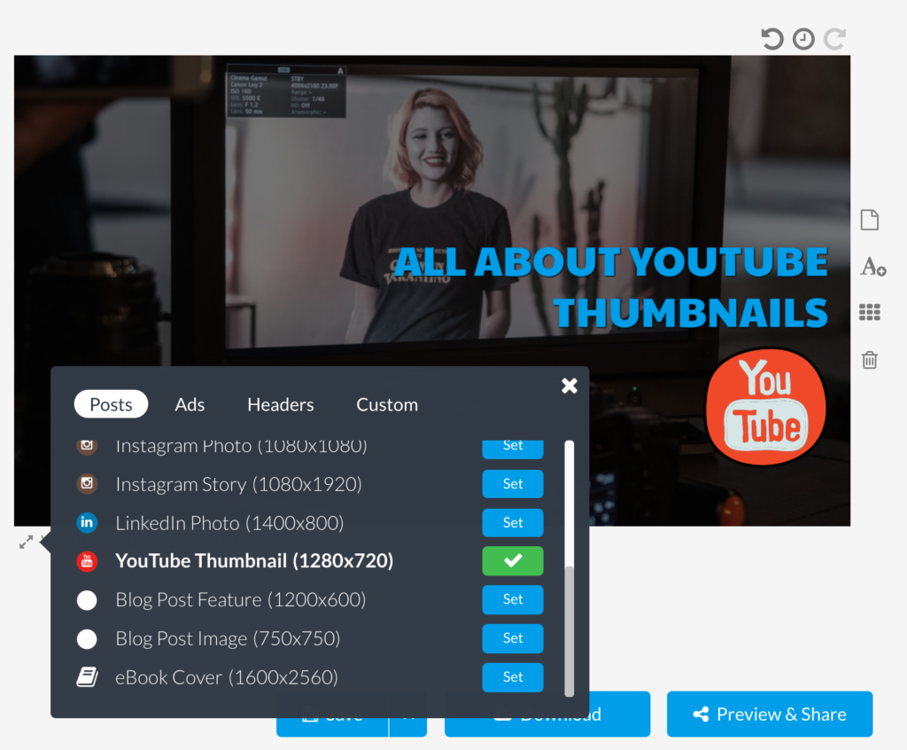
YouTube has very clear guidelines when it comes to video thumbnails. Resize your image to fit the guidelines so that the process is seamless and quick. Standard video sizes include 1280×720 and 1920×1080. Keep the aspect ratio of 16:9, and the file size under 2MB.
Choosing smaller sizes is likely to make the thumbnail blurry and not click-worthy, especially when accessed using bigger screens. You can easily resize or ensure that you are using the proper Youtube thumbnail size with Stencil.

Create a Video Thumbnail Template Collection in Stencil
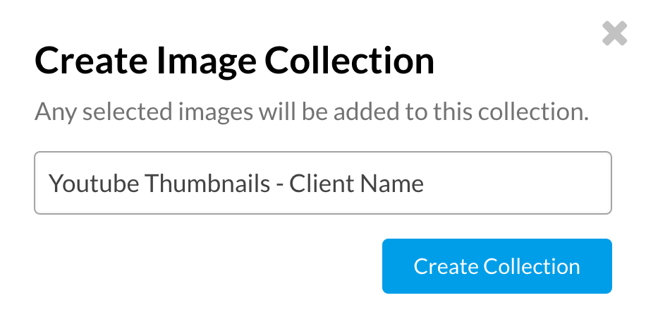
Have you been using Stencil’s collection feature? If not, it’s time to get started. Stencil collections not only allow you to create groups for your designs, one of the ways that our users love to use collections is to create collections by client name or by the platform name. Just make sure that you stay within the 32 character limit for the collection name.
Example:
Youtube Thumbnails – Client Name

As you can see you can label your collections so that they are easy to find and then you can easily access your Youtube thumbnails to modify as needed.
Use the Opportunity to Build Your Brand
For brands using Youtube, one of the essential things to do is to generate brand recall value. Your viewers should associate every single one of your videos with your brand. The video thumbnail gives you a great opportunity to build your brand and familiarize your viewers with it. This is where consistency in not only posting is key but consistency
Don’t be A Click-Bait, be Click-Worthy
There are too many videos and articles out there with click-bait titles that give misleading controversial information just to get one click. Not only will you turn off viewers and discourage them from ever clicking on one of your videos again, but you will also throw the bounce rate for your YouTube channel through the roof.
You may think that there is no difference between the term “click-bait” and “click-worthy” but that couldn’t be further from the truth.
A click-bait is simply that….a click-bait. It doesn’t reflect value and sometimes doesn’t even reflect what the video contains.
Click-worthy is when your thumbnail grabs attention for the right reasons when your thumbnails is an indication of what’s included in your video or at least provides a sense of direction, it sparks emotion and users are drawn to clicking because they want to learn more.

Get The Colors Right
Many of us are visual learners, and one of the first things that viewers notice is the color combinations used in the thumbnails. Balance your overlays well by opting for transparent shades that help the image or text pop. Choose complementary contrasting colors for your background and text. Colors that pop are key.
A YouTube thumbnail acts as a visual call-to-action for viewers. Complement quality content with a visually-appealing, well-articulated custom thumbnail. Ensure that the thumbnail you have in mind is not too similar to those of other videos on similar topics. Be different, allow your brand to stand-out.
Promise a great video with your thumbnail, and deliver on this promise when viewers click through. YouTube recommendations and other traffic sources show you how well your thumbnail is measuring, so you can plan better for the next video thumbnail.
Do you currently use Youtube for your business? Let us know in the comments.


Leave a Reply