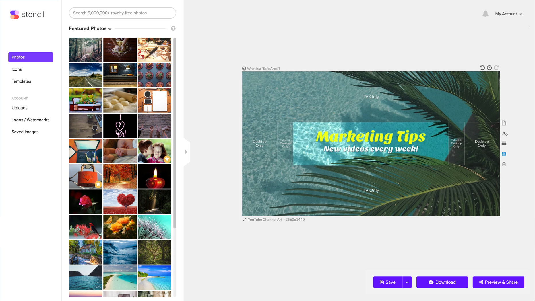
Creating a Perfect YouTube Channel Art
If you haven’t thought about using video as a tool to leverage your company’s goals before, now is the right time to do it. Video campaigns can help you connect with your audience and tell your story in a way that would resonate with it. According to recent studies, 54% of consumers want to see more video content from their favorite brands and businesses.
If you're looking to get into video marketing, there's really no better channel than YouTube. If you think that’s not where your audience is, think again. One-third of total time online is spent watching videos, and YouTube boasts more than a billion active users all over the world. As the world’s second largest search engine, it can help your brand gain more visibility, grow your following, connect with your audience and even improve your SEO.
If you want to take advantage of this incredibly powerful marketing tool, the first step would be setting up or optimizing your channel, which entails making sure you have high-quality eye-catching channel art.
Designing Your YouTube Channel Art for Maximum Impact
Similar to Facebook Cover Photos and Twitter Cover Photos, YouTube channel art appears at the top of your channel like a huge banner. If you want to entice viewers to learn more about your business and encourage them to interact with your content more often, it’s absolutely crucial that it makes a great first impression. Your YouTube art should tell visitors what your brand is all about and what they can expect from your channel. It should be an extension of your brand and support your brand messaging.
Design is key in making your channel art stand out. When creating your YouTube banner, make sure you figure out your channel’s fonts and color scheme first.
The font you choose ultimately plays a hand in conveying the message you want to send your viewers, so make sure it matches the tone of your YouTube channel. Is it neutral, professional, fun or cheeky? If you want to appear practical and mature, you might want to go with a serif font. Consider script fonts for a funny and casual look. If you want to appear assertive, modern fonts might work really well for you.
As with fonts, colors play a huge role in how your audience perceives your message. Colors attract attention to your channel, they can set a tone, and influence the emotions of your viewers. For instance, white represents purity and innocence, red is associated with love and excitement and yellow manifests warmth and energy. Using your brand colors is also a great idea, as it helps to ensure brand consistency across all channels.
Then, pick a layout that will fit the tone of your channel. A centered title layout can make your title look bold and clear.

An asymmetrical layout can make your banner look casual and fun.

If there are a couple of things that you want to include in your banner, like your logo, a CTA and/or slogan, you may try a sectioned layout.


