
Looking to make social posts that wow your readers? Using Stencil’s grid feature to improve your visual content is the way to go. This blog post builds upon the previous posts we’ve shared including how to improve your visual content for Instagram and how to make great color schemes in Stencil. This time, we’ll dig a bit deeper by showing you easy steps to keep your visual content aligned for success.
On the grid: easy ways to keep your content aligned for success
1. Pick a Platform
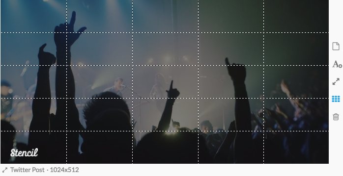
Before you start, make sure you’re formatting your image for the specific platform you’re posting on. Go to the drop menu below the image bottom left-hand side of the image and choose the right platform. Now toggle the grid feature on by selecting the small box with grid lines to the right of the image.
2. Proximity

Group similar elements together to boost the readability of your image. Doing so will help guide readers to different pieces of information in your image.
3. Hierarchy
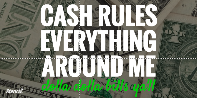
Use the grid to help resize text. Doing this will help your audience read the important elements first. For example, an event name should be the predominant “image” or element in a content.
4. Alignment
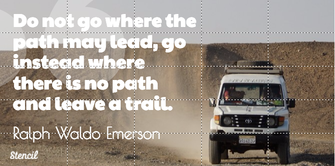
While your first instinct may be to put text in the center of an image, try using our grid to get a bit more creative. Whether you choose to bank text to the left or right, align symmetrically to keep your content nice and buttoned up.
5. White Space
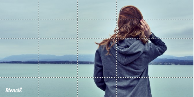
Last but not least, use the grid to help gauge how much white space you have. The image above shows how the grid can help give perspective to how much of your content is being taken up by text or other elements.
6. Facebook Ad Usage
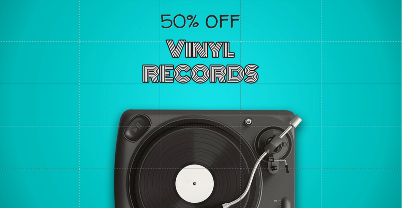
The general rule of thumb for Facebook ad images is the ‘less is more’ concept. Make sure there’s less than 20% of text on the image. You can check the ad image with the Stencil grid. If the text is within 5 grid boxes then you’re set and will most likely get Facebook approved. There are some exceptions like book covers, product images, games, and event posters.
Recap
Stencil’s grid feature is the easiest way to see how your content is being effected by images and text. Start by picking a social platform. When you have this goal set, proximity will help define your message for viewers. Next, tweak the important elements of your content with a visual hierarchy. Play with alignment to add style to your image. Make sure you have some white space in your content to help readability. Finally, take advantage of the grid feature to use in Facebook ads.
Are you using the Stencil grid feature? Let us know in the comments.



Leave a Reply