Look at a few social media giants and their branding and you may notice something in common: the color blue! Most heavy marketers use blue and a palette made of up complimentary shades for their branding. Blue is statistically the most popular color in the world (via Toronto Sun), and it’s no secret that marketers are taking advantage of this fact. Consider using a combination of blue and white for your branding.

Does this mean blue is the only option for boosting brand engagement? On the contrary! A good scheme can make a huge difference as well. Here are three popular color schemes currently trending in social media.
1. Rosequarts and Serenity.
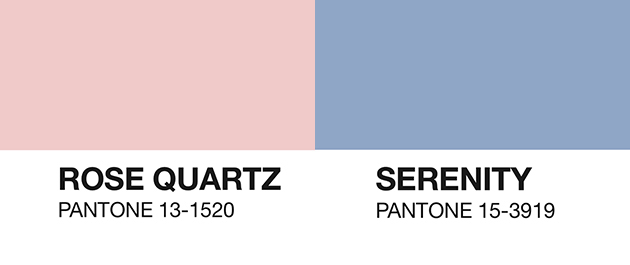
 Pantone has been one of the leading voices in art since the turn of the 20th century. As a color definer, Pantone influences how colors are described, used and what they connote. For 2016, Rosequartz and Serenity are the Pantone shades of the year. This choice signifies that pastels, like the aforementioned shades, are in. The pairing of a a gentle light rose color and a baby blue tone symbolize progressive thinking and gender blurring, which we have seen in various forms of art, and content branding alike.
2. Neonification

Art saw a gradual increase in the use of neon in the 20th century. Since the 60s, neon has been closely associated with Pop culture. While the updated Instagram logo has been criticized by many, the decision marks a rise in neon tones as a popular palette for contemporary branding as well. Spotify has also followed suit, in addition to many others.
3. Gold and Neutral

Starbucks was one of the first brands to use this combination in the 90s. Since then, we’ve seen an increase in other areas of advertising. Neutrals are often tied to colors of the home and evoke a sense of comfort, while the addition of gold adds a flashy tone that grabs attention.
Conclusion: Brand identity benefits greatly from a well-crafted color palette. Your palette should help your customers understand the meaning behind your product. Try using some of the palettes on our list, or create your own in Stencil!

How to use color in Stencil
Text: color, shadow, background color)
Filters: make an image, and then choose a filter, like black and white, or sepia
Sizing: Try using a 60/30/10 rule for your colors. Your base, such as a blue, should have the biggest presence (60%) in your image. Give a secondary tone—like white—a smaller but substantial presence. If you have a third, give it minimal usage.


Great post Danny.
I’d sure like to see an Eye Dropper in Stencil for sampling colors within images… any chance this is on your radar?