There’s been a lot of talk in recent years about color psychology and how it plays a role in marketing. Can colors really have a distinct significance in marketing and branding a business? We explore the basics of how color combinations can impact visual content and provide powerful marketing.
First, we’ll go through the basics of color as a guide to different color combinations.
Color Basics
There are many color systems and models but we’ll use the color system that’s popularly used and highly regarded in the color community like The Inter-Council Society of Color and International Colour Association. It’s called the Munsell Color Wheel Chart. Munsell was influential in color science theory as it evolved from Newton’s color wheel.
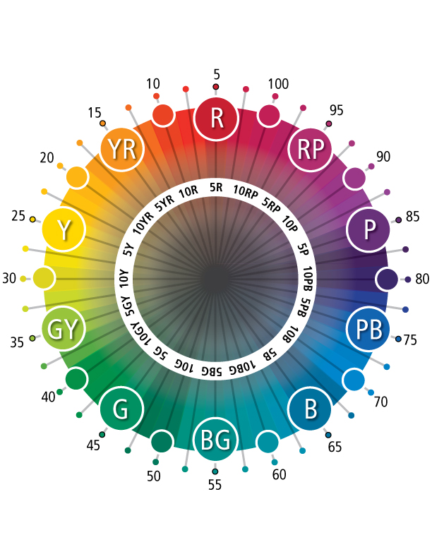 Munsell’s color system stemmed from three qualities: hue, value, and chroma. There are five principal hues: Red (R), Yellow (Y), Green (G), Blue (B) and Purple (P) and are equally spaced in clockwise order around a color wheel.
He wanted to display and chart the variety of colors in between the principal colors so he created color value to determine the brightness or darkness. The chroma is the color intensity or saturation – brilliance/strength or dull/gentle.
Colors are set up on a wheel where you can chart out every hue, value, and chroma.
“It may sound strange to say that color has three dimensions, but it is easily proved by the fact that each of them can be measured.”
A Color Notation 1905
You can learn more about Munsell’s color theory in his book called, “The Color Notation“. It’s a fascinating read. Next week, the Munsell Centennial Color Symposium will be honoring and commemorating his work on bridging the art and science of color.
There are so many colors to choose from! How do you know which ones to choose for branding and marketing? Glad you asked!
Colors Combinations Made Easy
Now that you know the basics of color, you can understand how to pick and choose for branding and marketing. The science of color can be complex but we’ll stick with simple to use elements.
The color wheel is to guide you on which colors are harmonious. The easiest way to choose colors is by picking a color from the direct opposite side of the color wheel, that’s known as a complementary color.
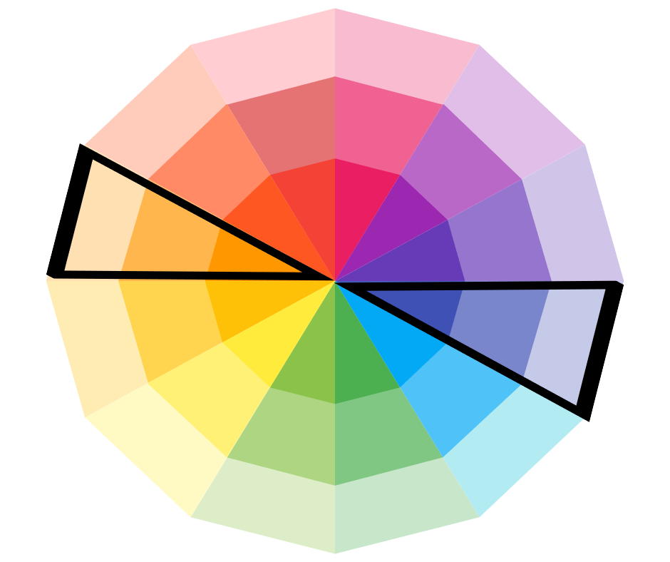
When you choose a color, you can choose different values (shades) of the hue. This is called monochromatic.
Researchers found that to achieve a harmonious combination of an image and a color element by increasing the hue similarity between them. However, this worked best with non-living objects and not effective with human skin or food.
Here’s an example of using monochromatic colors in an image.

The text color is a shade or value of orange (the sky and balloon are all values of orange). Since the photo has a dark background, the contrast of a lighter shade of orange can be easily seen.
That’s what makes colors harmonious, when there is a balance of dark and light.
How Does This Effect Branding?
Branding is the overall emotion of an organization or business. It’s not just colors or fonts. You may have complementary colors that go well together but what makes it great branding is how the customers feel when they encounter your overall look and personality. Think of the large brands like McDonalds, Target, FedEx – we already have a perception and feeling about these brands just by hearing or seeing their names or logos.
This concept is called associative learning. It’s our perception as growing into adulthood, that we associate things with colors. When we’re children, we associate dark sky with black and sunlight with yellow. Some people think of blue as sad but it depends on the shade of blue and the culture.
With logos and brands, we connect them quite easily too. McDonalds is red and yellow and people easily think about tasty fries when seeing the colors. Many major brands have invested large amounts of money to investigate how their branding impacts their consumers. Colors are so powerful that Cadbury tried to register the color purple as their own.
For entrepreneurs and small business owners, budgets are small and can’t invest in such research. As you develop brand assets, survey your customers to see how they feel when you provide them logo variations or brand looks. Your overall goal is to connect with customers and develop relationships.
Consider Colors in your Marketing Efforts
Depending on the type of marketing, colors can play a significant role as shown in the study on red and blue, where it all depends how your brand is perceived. If you use a color that’s “off-brand”, the customer will get confused. It’s like Harley Davidson all of sudden using pink on all their CTAs. You won’t know what to use until you know your customer’s beliefs and perceptions.
There is a study on black and blue, as those colors are considered universal in perception, black being unclean and blue being clean but both known as trustworthy colors. The study determines that yet people have associations with certain colors it all depends on the context of what the color is representing.
Help your marketing efforts by studying your customer avatar. Are your customers all over the world or local? Your target audience is the main focus of your marketing so get to know them so you can market effectively. In this study in regards to Instagram images, green was negatively shown on engagement. Black did well for footwear category, however, pink, white, and purple were the most engaged colors for other categories such as: active wear, teen looks, casual wear, and accessories.
Try to do your own study on past image posts and check your analytics to see which posts have higher engagement.
Color Combinations for Powerful Marketing and Branding
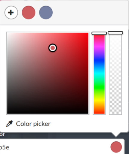
Use tools that can help you find complementary colors as you create social media images. In Stencil, we have a color picker that can help you choose the precise colors needed for an image. You can save these colors for your branding style as you continue to create more images.
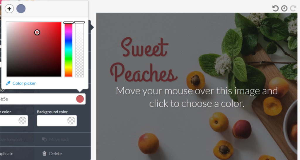
As mentioned before, you’ll want to use similar hues for non-living objects in images. If you have an image with people or food, try not to use skin color or the food color as the font. Use black or white font (depending on the background) with photos with people.
Stick with 3-4 colors at the most, which is called a small palette principle. People generally like to combine colors that are relatively close or exactly match, with the exception of highlighting an element of contrast. Many people would like to see visual cohesiveness rather than a blast of color.
In this example, I use the color of the outside of the peach for the font. This brings the image together and allowing the inside of the peach to be the element of contrast.

Use the power of color to enhance your products or services in your images.
If you’re unsure of what color to use and combine, then check the Munsell color chart to help guide you. Use color to your advantage!
Let us know in the comments how you create color combinations in marketing.



Leave a Reply