
Have you ever seen a design and wonder – how did they do that? Creating graphic designs can be a wonderful feat however it can be a bit stressful. Sometimes making decisions on colors, fonts, filters, etc. can be overwhelming for a non-designer. When there’s confusion on how an image should look, it can be a huge time-waster! Today we want to bring you simple graphic design tips for the non-designer that will save hours of frustration and time. Let’s get to the tips!
Simple Graphic Design Tips for the Non-Designer
Background
First, let’s talk background. Now you’ve found an amazing photo and you really want to use it. The question is how? Sometimes a photo looks amazing but when you start working on the design it kind of doesn’t work out. No matter how you place the text or change the filter it still doesn’t look the way you want it.

When you look at the amazing photo, have an open mind. Know that the photo you’re looking at straight on will most likely change. Never go in thinking the photo is going to remain exactly the same and placing text on it will work perfectly. It rarely does.
Second, ask yourself if the photo is relatable and proper for your audience. Let’s face it. Sometimes we pick photos because they’re so gorgeous but don’t think of how followers or clients will relate to it. This tulip image is a perfect spring image. Perhaps you’re having a spring sale for your business, then this image may work. Let’s continue on and go through a couple of ways to work it out.
Transparency
Using the transparency feature in Stencil is just a click and slide away (as shown below).
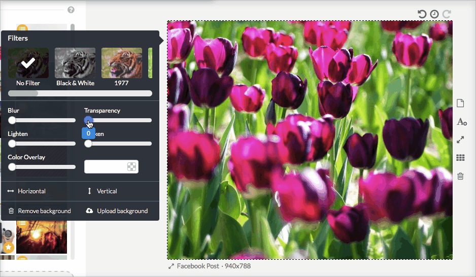
When you have a busy image with no white space then transparency is your best bet in making the text stand out. You still see the tulips in the background and you’re now preparing the image for the message.
Let’s talk about the font for your message.
Fonts
Before you place your message onto the background, you have to choose your fonts. Only choose one to two fonts. When choosing fonts, make sure it’s appropriate to the design. Meaning, if it’s an image about a professional business, then using fonts like: Butterfly Kids, Chewy, Comic Sans MS, CODYSTAR, etc. are not appropriate.
Since the tulip image we’re using is for a spring sale, we’ll want to use a professional type so stay away from fancy script fonts and frilly fonts.
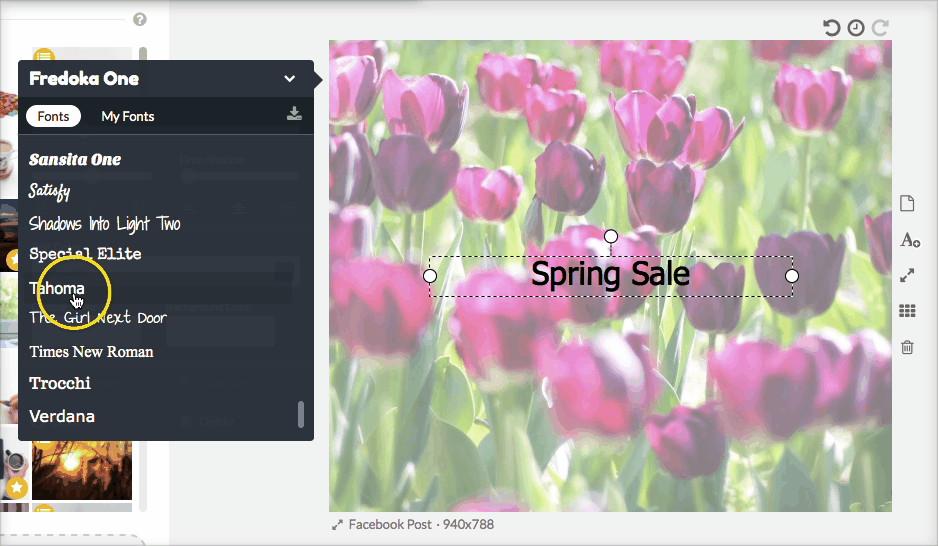
Stencil has an excellent font list however you can use Google Web Fonts directly through Stencil for more variety or upload your own font.
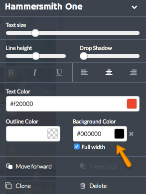
Good professional looking fonts will be clear and concise. You don’t have to stick with Arial, Times New Roman or Verdana. There are some excellent professional fonts such as: Hammersmith One, Helvetica, Montserrat, Open Sans, Oxygen, Quando, Quattrocento Sans, and Raleway. The key is to stick with one as your header or title and a second as your body font.
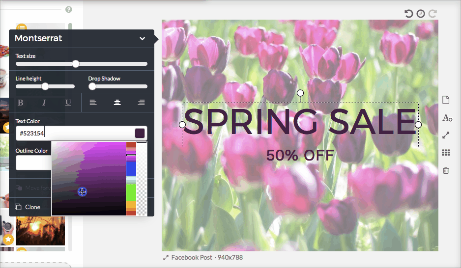
Combine fonts that are similar with the header preferably with more weight than the body font.
Here’s an example:

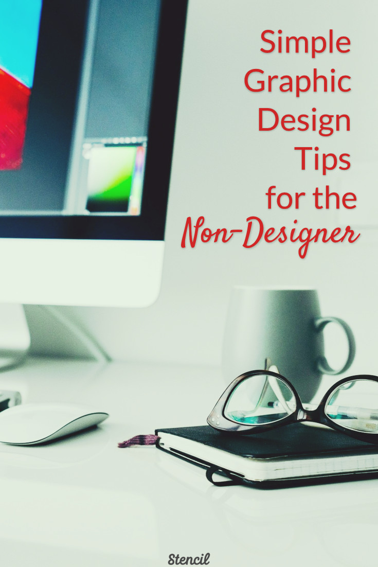
As you can see the spring sale text has a bit more weight or thicker than the body text. You can also use bold or an italic version of the same font to change the weight of the lettering.
It’s clear and concise in what the image wants to represent and has to offer.
Font Alignment
A good design always has proper alignment and the text should not be scattered throughout the image. Making the message legible and easy to read is the goal of the image. Stencil makes it easy to align the text with gridlines.
Note the colors of the text, let’s chat about that.
Font Color
I used a dark magenta color using the color spectrum in Stencil to match the darker tulips in the background. Simply move the dot within the box to get the color variant you’d like. Keep the colors similar. If I chose red for my header and green for the body then it wouldn’t look very professional.
Rather than use the color spectrum, you can find some great color palettes with HEX codes that can be entered into Stencil from these sites:
Text
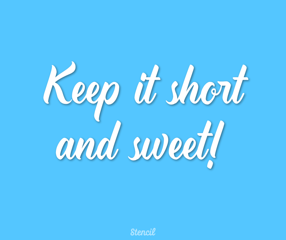
Less text is best. Try to convey your message with minimal text. Your image should get people to stop and look rather than scroll through the social media stream. If the image has too much text it will not be read and will be passed on. Another way to use less text is to use icons.
White Space or Pattern Background

Talk about white space! This is an ideal photo that gives you a lot of space to work with for text. Any image that gives you open space with no objects in a section of the photo is white space. You can do a lot with this image.

As you can see I was able to use the white space quite easily.
People tend to be afraid of pattern backgrounds however they are very easy to work with. Most of the time you just need to adjust the font color or add the background color of the text.
Here are a couple of examples of different ways to use a pattern background:


Keep it simple with a contrasting color for text or a color background behind the text.
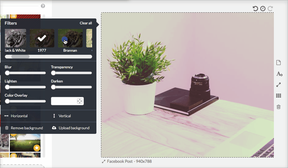
Color Overlays and Filters
Color overlays can be fun and can match your branding. Louise Myers does an excellent job in keeping within her brand with a purple overlay.

It’s a look that’s easy to maintain especially for blog post and social media images.
Filters can be great to provide a bit of texture or dimension to a photo.
What if you make a mistake?
Ok so we’ve gone through different ways of creating images but what if you make an error? Stencil has recently launched the Undo/Redo feature! It will create a history list of all your design moves. Pretty awesome, right?!
No need to worry about changing an image and wondering how to go back. You can create an image freely and know that it’s ok to make mistakes.
Let’s recap the design tips for the non-designer!
- Keep an open mind when designing. You never know where the design will go.
- Don’t be afraid to use busy backgrounds with the transparency feature.
- Choose 1-2 fonts that are relatable to the image.
- Combine fonts that are similar by using font variants.
- Keep your fonts in order! Align them easily with Stencil’s gridlines.
- Use font colors that correlate with the background image or provide a contrast of the background.
- Keep text short and sweet.
- Use icons rather than text when appropriate.
- Take advantage of white space and patterns.
- Color overlays and filters should be used with branding.
- Mistakes… what mistakes? The Undo/Redo feature is now available.
Which design tips for the non-designer listed have helped you with your image creation?
I love stencils
Great tips, thanks, Lillian!
My pleasure, Sister Mary! 🙂
Just what I needed today..Thanks
Wonderful to hear, Karen! Have a wonderful weekend. 🙂
Thanks so much, this really helps the artistically challenged.
Our pleasure, Anthony! 🙂
Stencil is super-easy to navigate & it didn’t take long for me to start producing beautiful images!
i read out this really amazing blog.thanks for sharing .
Simply ideas that make sense, thank you