The successful use of fonts can turn good content into great content. One way to ensure a successful image is to choose a font that reflects the tone of your content. Your font can inspire emotional connections, increase market value, and even boost sales. We’re going to chat about why you should be thoughtful of your font usage, where fonts can be found, different types of font, and what popular fonts in Stencil you should use. Let’s get to it!
Fonts Stimulate Emotion
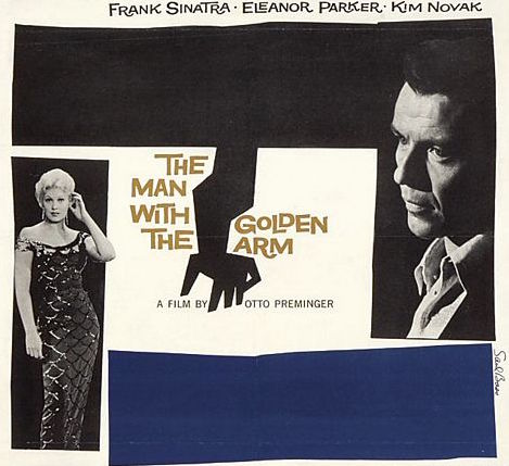
A great example of emotion and readability can be found in the work of Saul Bass. Bass, the man who created the fonts used in movies like The Man With The Golden Arm was famous not only for his iconic action movie lettering, but for countless other logos, images, and text. The success of these projects are a testament to the power that great fonts can have. Movie poster lettering always seem to capture the emotion of the movie perfectly. Be inspired by different images that inspire you to get your creativity flow going to create your own design.
Where Fonts Can Be Found
Font is the term we primarily use today, which is actually the specific typeface of weight and size being used (i.e. Helvetica Bold 12 point). Font has become a common term with designers and non-designers as it became popular with desktop publishing and word processing software.
Many people will use the words typeface and font interchangeably, however, original typeface designers would not appreciate it and like to use the term typeface for the family of lettering (i.e. Helvetica). Since we’re not typeface designers, we’ll stick with the term fonts!
You may need to know this when you’re searching for fonts to upload for your designs. You may see the term typeface listed but understand that it’s the family of fonts with different weights like bold, italics, and light variations.
Here are some places you can find new fonts:
Remember you can always use the set font list in Stencil for your designs or use the Google fonts selection directly integrated in Stencil.
Categories of Fonts
Before you use fonts for designing social media posts, you should know the types of fonts that are available to you. Seriously, there’s a lot to choose from so here are the basic categories that you need to know.
Serif
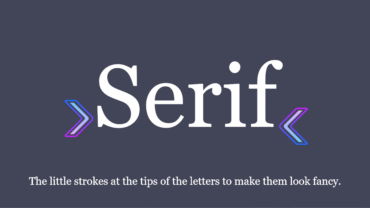
A serif typeface is a classic look with little strokes or lines at the end of the tips of the letters.
Sans-Serif
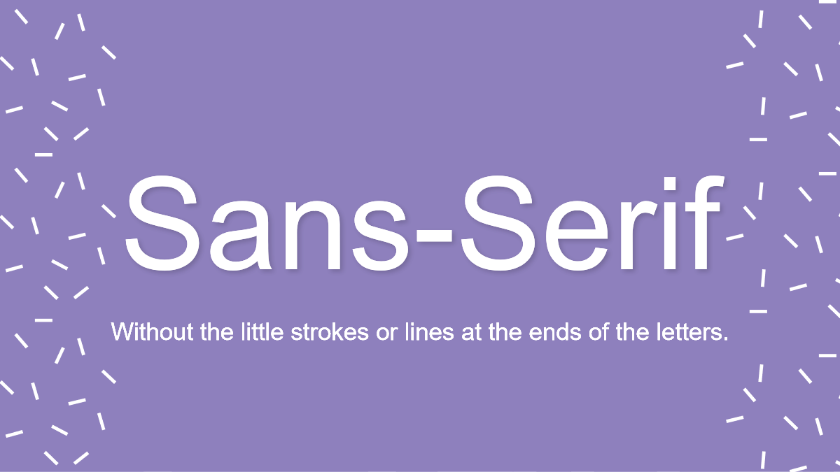
A sans-serif typeface has lettering that simply does not have the little lines at the end of the letters. Hence the word sans meaning without.
Script
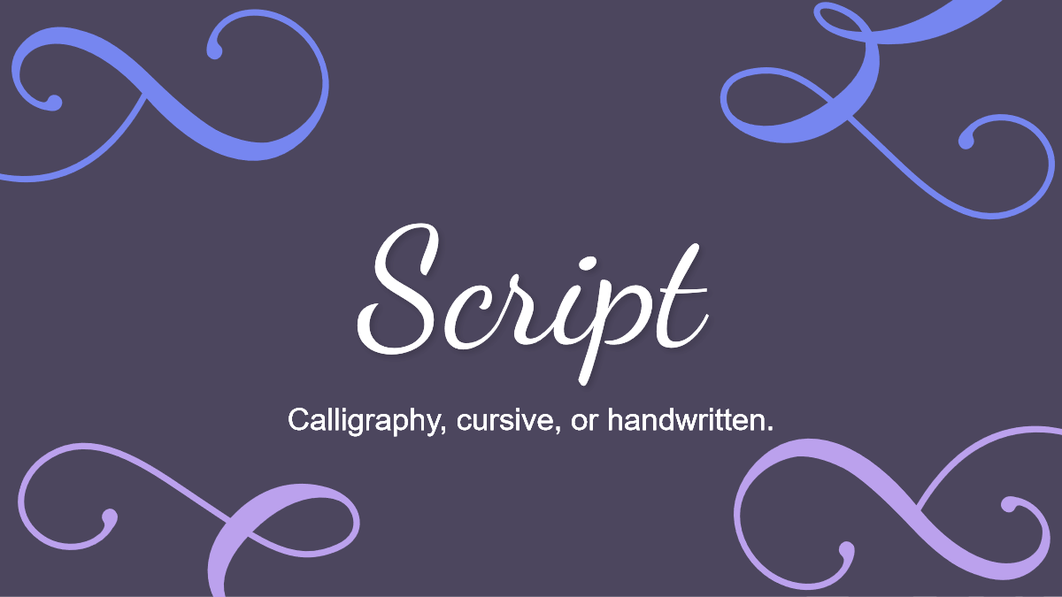
Script is the pretty cursive, calligraphy, or handwritten typeface.
Decorative
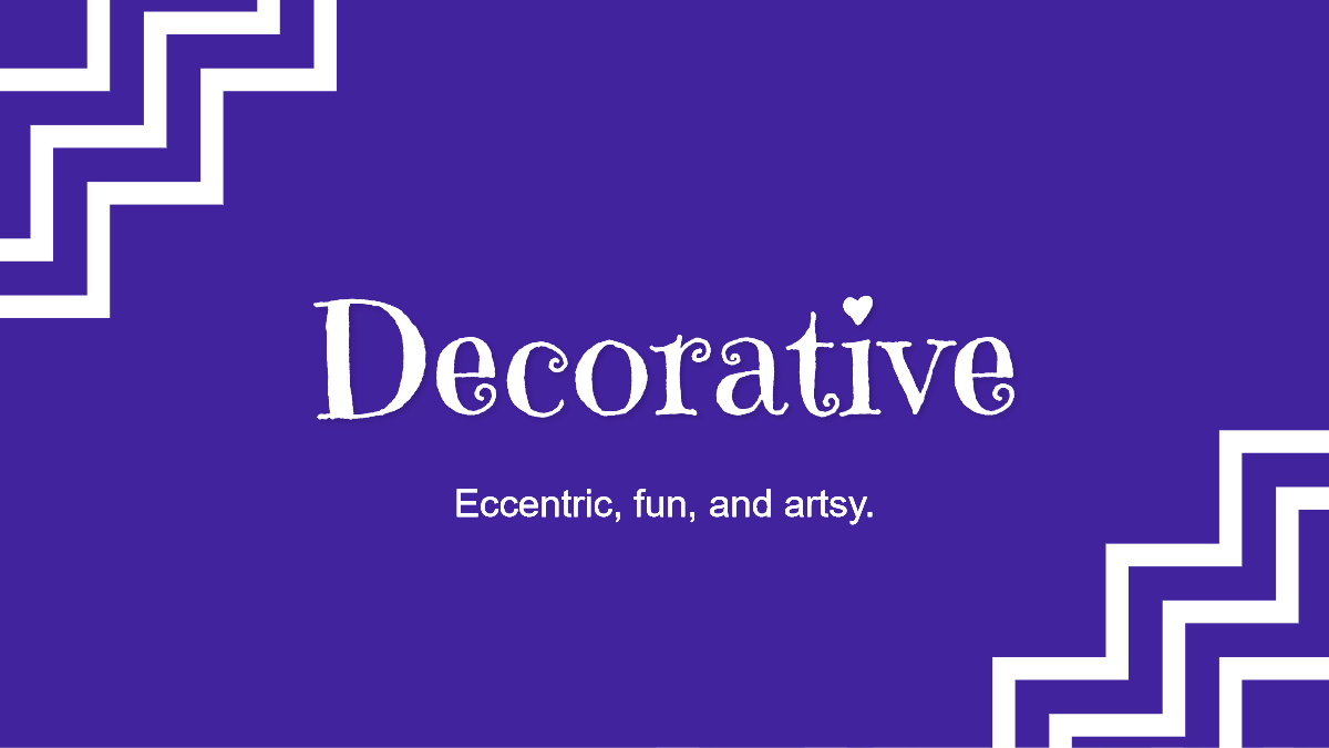
A decorative typeface is eccentric, fun, and artsy. This typeface should be used sparingly as most are hard to read.
Finally, let’s talk about which fonts are great for content marketing!
Fonts for Successful Content Marketing
Top five fonts that you should be using in order to create successful content:
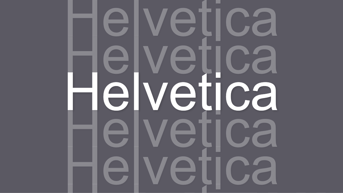
1. Helvetica. Perhaps the most celebrated typeface for more than 6 decades, this tried and true favorite was designed by Max Miedinger, influenced by the classically punctual demeanor of 1950s Switzerland.
It has claimed popularity by many in computer software programs to be a default font. You can find Helvetica in heavy commercial usage by companies such as Target and also by the US Government. It’s a neutral sans-serif typeface that many people love for its clarity.
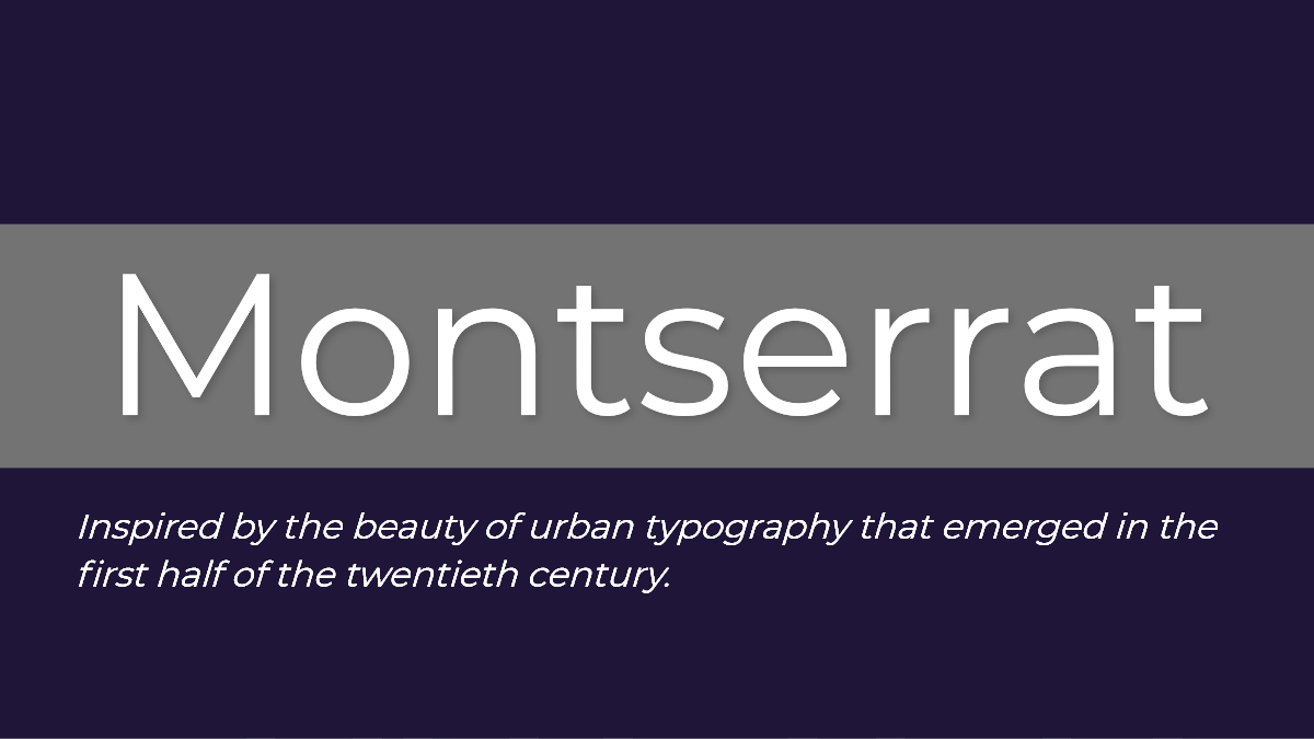
2. Montserrat. A sleek and mature sans-serif font designed by Julieta Ulanosvky, inspired by the designer’s Buenos Aires neighborhood of the same name. Montserrat is widely used online and a go-to for content creators around the world.
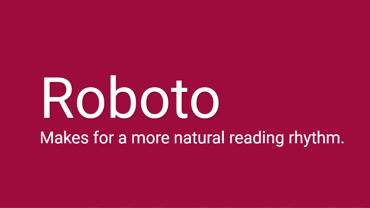
 3. Roboto. Another font widely used in social content and mobile apps such as Instagram and Gmail’s Inbox app, Roboto was originally designed for Google’s Android phone and has been since adopted by a wide range of marketers. It is also a sans-serif font.
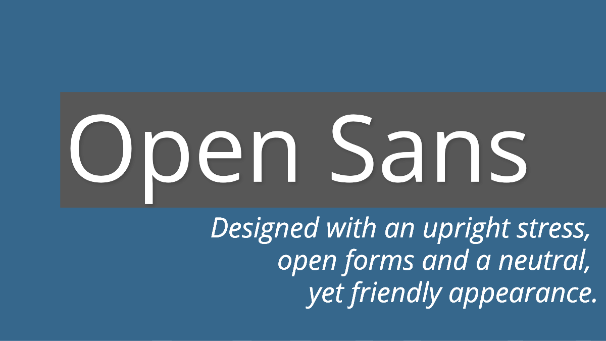
4. Open Sans. In 1992, Microsoft commissioned Ascender Corp’s lead typeface designer Steve Matteson to work on the hugely popular Arial and Times New Roman fonts. Open Sans is Matteson’s spacious reboot of Droid Sans, a font made for hand held use on smart phones and tablets. A sans-serif font that’s easily paired with other fonts.
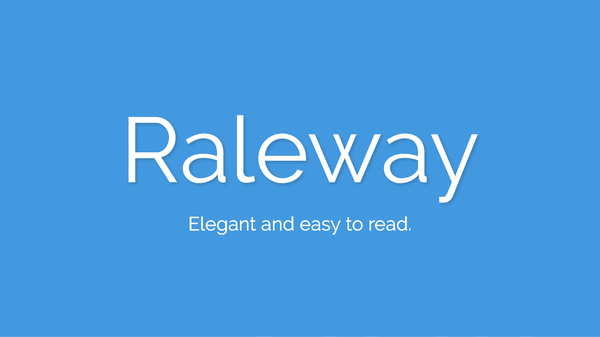
5. Raleway. Designed by Matt McInerney and then expanded upon by Rodrigo Fuenzalida in 2012, Raleway has an elegant look and is intended for headings and other large font usage. Its distinguished characteristics of the criss-crossed W and tail on the l is a unique quality.
Serif, script, and decorative fonts can be paired with any of the fonts listed above, as long as it’s clear in your message. By doing this you’ll capture the emotion and action needed from your audience.
Fonts can make an incredible impact on the way your message is perceived. Choose those fonts wisely!
What Fonts Will you Use
Try swapping these fonts out when working on your content to see how using different fonts can change the feel of your message. Again, make sure to use your font to help strengthen the message you’re trying to get across in your content marketing.
Lastly, make sure you pick a font that is easy to read. The quicker your audience understands what you’re trying to say the quicker you can direct them to your desired outcome.
Let us know which fonts are your favorite in the comments!


Terrific article, Lillian. I love fonts and this was very helpful.
Hey there Deb! So glad you liked this post. I LOVE fonts too! I have a bit of a script obsession. 🙂