Did you know: 65% of the world’s population are visual learners? With that in mind, it should come as no surprise that a great image can make a banner that will not only catch the viewer’s eye, but hold focus and generate interest in your Facebook page or website.
Some of the following information might be old hat for you, but we want to make sure you’ve got all the tools you need to create images that will make your site glow. Below is a list of the most common mistakes made when making images. This list can apply to all your different social media platforms.
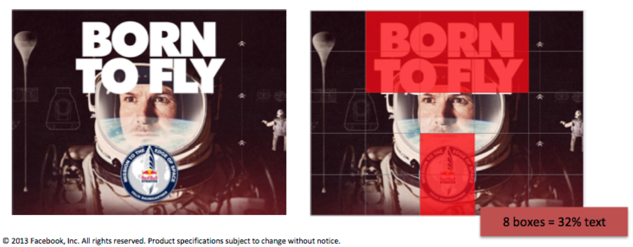
1. Forgetting Facebook’s 20% Rule
Make sure the text in your images does not exceed 20% of the image. This will ensure that you can use your image to run any social spend within Facebook.
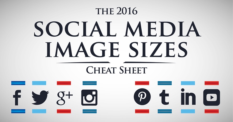
2. Not sizing properly for each social channel
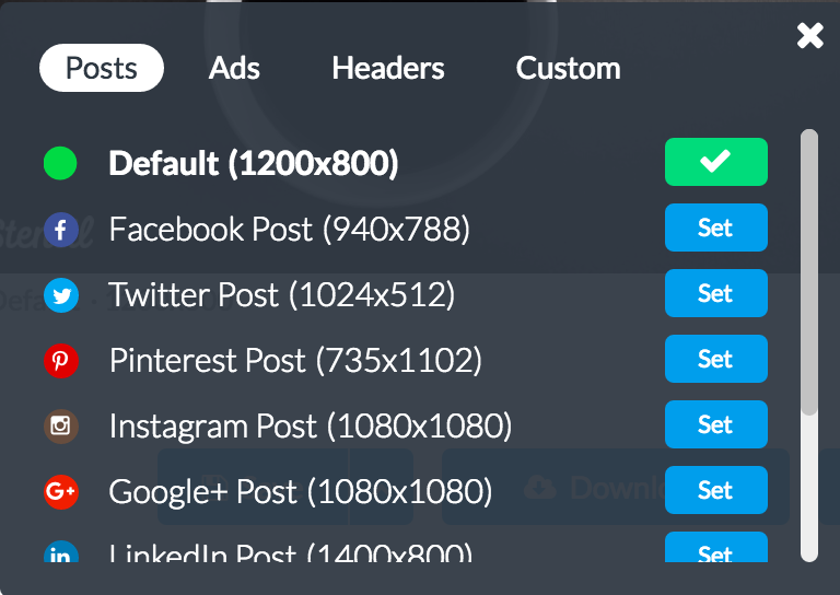
In keeping with consistent content across social channels, its important to make sure you size your images properly. For a helpful cheat sheet: Make A Website Hub has the hook up! And as always you can use Stencil’s built in image templates to make sure you’re all set.
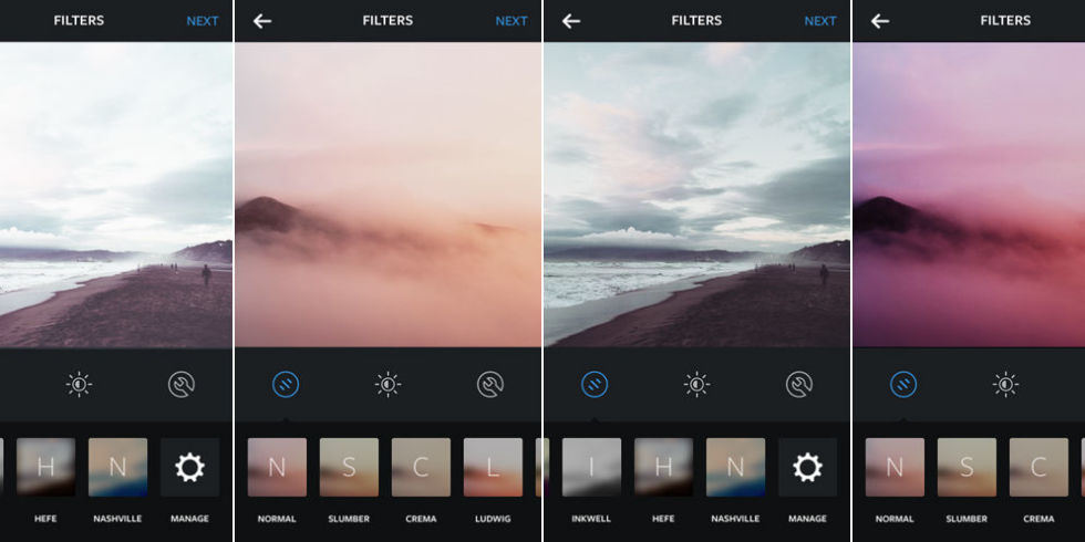
3. Using a filter (sometimes it’s good to just have a beautiful image)
Sometimes, less is more. ‘Nuff said.
4. Over designing (sometimes it’s good to keep things raw or natural)
Remember the age old philosophy “If it ain’t broke, don’t fix it?” A simple, clean image can often be the best approach.
5. Too much text
Similar to Facebook’s 20% rule, don’t clutter your image with too much text. Banners and visuals should be concise and easy to read.
6. Taking too long and losing track of the moment
Don’t make mountains out of molehills. If something isn’t working, move on to a new idea rather than getting tunnel vision. Need to save time? Try using Stencil’s Templates.
7. Relying on what worked months ago (keep things fresh and keep your content on top of the latest trends)
Its true, successful content can be recycled. But try keeping things fresh as well. Readers will engage with new and relevant content.
8. Using images that are overshared (stay unique)
Be creative! (That’s what we’re here for). For a quick example of what to avoid, check out Marketing Profs’ hilarious slideshow of overused stock images.
9. Pushing the same content across all channels
Switch things up! If your audience follows you on multiple channels, they’ll be less likely to return after viewing the same content over and over. Keep them hooked!
10. Forgetting about other content types
Instagram, Twitter, LinkedIn, G+, the list goes on and on. Don’t get too locked in to just one platform.







Awesome article . Thank yo for the tips. Keep it up.