Images don’t just beautify your post and break up text, they increase shares and thereby blog traffic too. After analyzing over a 100 million articles, Buzzsumo found that adding at least one image to your blog posts can increase shares on social networks like Facebook and Twitter. When you add images to your blog posts, they will also result in more Pinterest pins as people can only pin blog posts that have at least one image on them.
To get the highest amount of shares that will also increase clicks and traffic, you need to add the right types of images at the right places. Hence, to ensure you get the best results, I am going to show you how to visually optimize your blog posts for more shares in this post…
#1 Add lots of images:
Buzzsumo conducted another study on 1 million articles and found that blog posts with an image to word ratio between 1:75 and 1:100 (where there is one image for every 75 to 100 words) got more shares than blog posts with higher and lower image to word ratios.
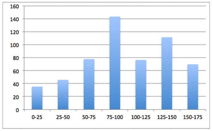
Post with this image to word ratio also got more shares on Facebook as displayed in the below graph.
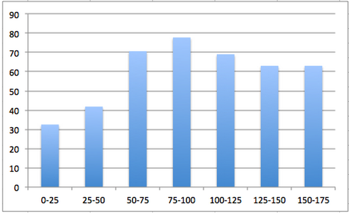
They also got tweeted more on Twitter…
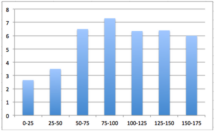
These graphs show that you need to add plenty of images to your blog posts to get more social media shares, especially if you rely on sites like Facebook and Twitter for traffic.
You don’t have to follow this exact ratio each and every time as the first graph also shows that posts with image to word ratios between 1:125 and 1:150 also get plenty of shares.
The images you use can be a combination of stock photos, graphs, screenshots, infographics, etc.
Neil Patel understands the importance of adding visuals to his blog posts.
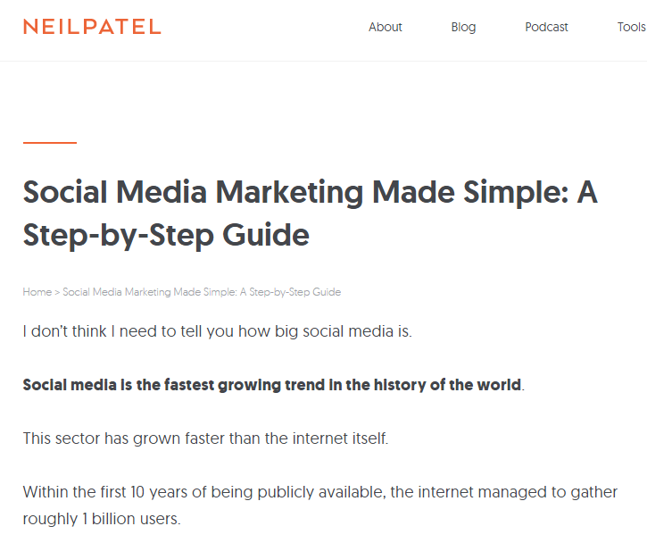
Take a look at his post Social Media Marketing Made Simple for example. It has more than 25 images. They are a combination of different types of images. He even included a small infographic.
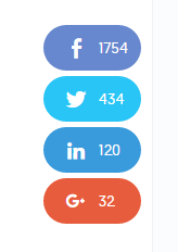
Using several images is definitely helping him attract more shares as the post got 1,754 Facebook shares and 434 tweets at the time of writing this post. Therefore, while writing your blog post you should try and add several relevant images that compliment it.
#2 Add images optimized for specific social networks:
Different types of images perform well on different social networks, Hence, if you want to attract shares and traffic from a specific social network, you should make sure you include images that perform well on that social network to the blog post.
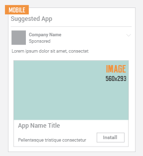
For example, if you want to drive more traffic from Facebook, you will need to add an image that is at least 560 X 292 pixels, to your blog post.
You will also need to make sure that this image is picked by default when someone shares that post. You can easily do that on a WordPress blog by making the image the featured image of the blog post or by using a plugin like Yoast SEO. Yoast has a feature that lets you pick the default image for Facebook. You can also add a Facebook title and description if you don’t want the meta title and description to appear.
When you do this only the chosen image will be shared on Facebook and it will appear as a big thumbnail, instead of the small one. As the thumbnail occupies more space it will attract more attention and traffic.

You can see this in action on this post on Facebook live broadcasts on Iag.me. As you can see in the above screenshot the image is specially optimized for Facebook. When I share it the big thumbnail appears and it also contains the title of the blog post which persuades people to visit the website. Another benefit of including this image is that it can be shared on other popular networks like Twitter, Linkedin and Google+ where it will perform well.
But this landscape image will not perform well on Pinterest.

To optimize your post for Pinterest you need to create a portrait shaped image. You can see a lot of food blogs take advantage of this like in the above screenshot from Pinterest. These types of tall images get pinned and repinned a lot on Pinterest and this drives back a lot of traffic to the website. Again, set your pin it button to pin that specific image to ensure only that image gets shared on Pinterest.
If you want to go a step further you can create an infographic for your blog post too as infographics get a lot of shares on Pinterest. I do this on a regular basis, like in this post on getting more followers on Pinterest. I summarized the entire post in an infographic. It got me a good amount of repins.
#3 Add image share buttons:
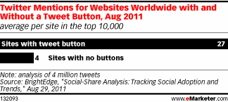
Regular share buttons can increase shares by nearly 7 times as found by this study, but as you are looking to get more shares through your images, just adding regular share buttons won’t be sufficient. Along with them you should be adding image share buttons. These are the share buttons that appear when someone scrolls over your image. They remind the person that the image can be shared and this leads to more shares.
Hence, go ahead and add some image share buttons to your blog posts.
Summary:
To sum up this post you get started with visually optimizing your blog posts for more shares by simply adding more images. You can then add images that are specifically optimized for your most important social networks. To get further more shares don’t forget to add image share buttons to remind and encourage people to share your post.
How do you visually optimize your blog posts for more social media shares? Which techniques have worked best for you? Please leave your comments below.



Great post Mitt! Shared. I love images and use lots BUT I’m curious. I’ve heard that stat often: 1 image per 75-100 words. 75 words is like 3 sentences. That’s too many images IMO. Wondering if you counted or estimated the number of words in Neil’s post. (I counted one of his sentences, it was 25. Pretty sure he doesn’t have an image every 3-4 sentences. And he does have a LOT).
This was an awesome post from Mitt! Loved it too. I always wondered about that stat as well. You know I love using images but I think that may be taking it overboard. LOL
@lil@lilliandejesus:disqus Thank you Lillian!
@LouiseMcom:disqus Thank you Louise! I think as long as you have an image every 150 to 200 words it should suffice. In the above graphs you can see that posts with an image every 175 words did well too.
It’s best to experiment with different ratios and see what works best for you.
Thank you for your comment!
Mitt: I saw your site and the offer of the background images. But I don’t understand where the backgrounds are or what they look like. I see that portrait formated triangle thing but….what is it and what do we do with it? I wouldn’t want to use it as a background, would I?
@arthurtwilliamsiv:disqus Hi Arthur! You need to sign up to get the background images. The file will be emailed to you. It’s a zipped file with 100 images. They are of different dimensions so that you can use them on different social networks.
http://www.astrologerdhaneshwarswami.com
Really great learning here for me Mitt. Thank you. Can you give some examples of share buttons? I have them at the end of my posts. Should I put more in?
@j@jfb57:disqus Thank you! You’re welcome! You could try adding some at the top of your posts or you could use floating buttons that appear on the left side all the time. I like using them on my blog as I write a lot of long blog posts http://socialmarketingwriting.com/complete-guide-successful-social-media-manager/
You can see them on the left side when you scroll down. Image share buttons also do well!
Thanks to share with us. I am reading this post very nice information to share in this article..