When there’s a new skill to learn you go to the best of the best to educate yourself and learn all that you can. It’s no different when you want to learn about the latest social media trends and visual marketing tips online.
When you want to design social media graphics and post on social media you want to be sure you’re doing what the experts would do. We’ve handpicked the best of the best visual marketing experts that gave us their top three tips to help you with your social media marketing. Let’s get started!
Top 3 Tips from the Best Visual Marketing Experts
Peg Fitzpatrick –
Co-Author of the Art of Social Media: Power Tips for Power Users, Speaker, Visual Marketer, and Social Media Marketing Pro.
Peg shares tips on her blog regarding Pinterest, Instagram, and blogging. She has a personable approach, almost makes you feel like she’s your next door neighbor ready to offer you some sugar cookies and Pinterest tips all on a pretty pink platter.
Here are Peg’s Top 3 Tips:
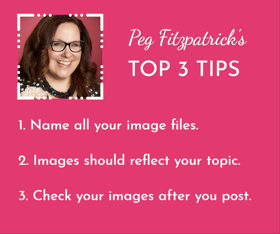
1. Make sure to name all your image files for the best search possibilities. Use keywords in your file names to help your images float to the top of the search.
2. Keep in mind that Pinterest uses visual discovery. Your images should reflect your topic so when it pulls up in a Pinterest search people are happy with what they see. Pinners are looking for ideas and inspiration so make sure you deliver interesting and informative content.
3. Check your images after you post them to make sure that text or important content isn’t cut off from your post. Facebook, LinkedIn, and Twitter change sizes and how things are displayed. You want to make sure that your work looks as professional as possible.
Yes! Keywords in image files are so important, we discussed the details about it in our Enhance Blog Images post.
Always remember to check those images. Visit Peg on her Instagram profile and see how she delights with a balance of friendliness, business tips, and soft pink hues.
Donna Moritz –
Speaker, 3X Winner Top 10 Social Media Blog, Content Strategist, and Visual Marketing Consultant.
Donna shares the latest visual marketing tools and social media marketing ideas that are engaging and keeps you on your toes with what works on various social platforms. You can trust her to know what’s working in the industry and if you have a question she’ll answer you straight away on her blog. Super friendly and always there to help.
Here are Donna’s Top 3 Tips:
1. Use Social Video –
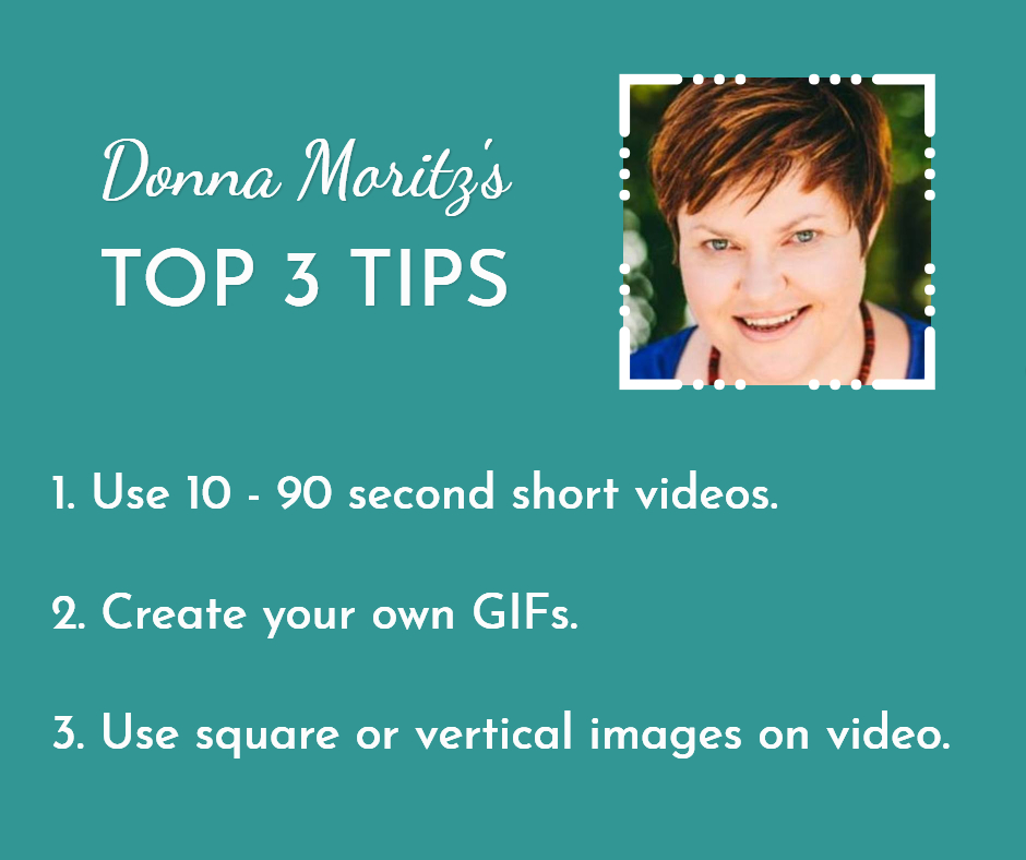
With so many types of video to choose from, short 10-90 second social videos are still a great way to get more reach and engagement across many social media platforms including Facebook, Twitter, Instagram… even LinkedIn. Facebook, in particular, promotes short video on the newsfeed and for many businesses, this is a good first step into creating video if they are not yet ready to go live. Creating social video can be as simple as using Facebook’s Slideshow feature or you can use a tool like Wave or Animoto, which make it super simple to create an engaging social video with easy-to-use templates.
2. Create Your Own GIFs –
Just like any visual content, original visuals stand out. We use GIFs everywhere to say what words just can’t – in emails, on websites, messenger apps, on social media, in our comments and replies. Creating your own original GIFs will help you to stand out. Use tools like Giphy.com or Easil’s GIF Maker to create a GIF that you can share across social media and your website. You can also create a channel on Giphy to allow your audience to use and share your branded (or unbranded GIFs). You are only limited by your imagination. Hot tip: You can also convert your GIFs into short videos and share them on Facebook so that they loop on autoplay.
3. Use Square or Vertical Images on Video –
On any newsfeed, the more “real estate” your content takes up the better. This means that you should consider the size of your images for the platform you are on, and how to maximise the amount of space they take up. This gives you more chance of catching attention! For instance, square images are better than landscape on Instagram and Facebook and Pinterest tall images are better than square on Pinterest. When it comes to video, don’t just stick to square – consider vertical video too! Vertical video shows at full screen on mobile for Facebook, and you can upload it into Instagram stories too. We hold our phones vertically so it makes sense to think about how we will naturally view video on some of the social platforms. It’s not always in landscape mode!
So many actionable tips right here from Donna! If you haven’t gotten into video now is the time and like she said short video is winning. We love Giphy! We use GIFs on our Slack channel all the time while chatting and on our social. Be sure to visit her blog and chat with Donna!
Louise Myers –
Visual Marketer, Graphic Design Expert, and Blogger.
Louise is always in search of the most up to date social media post sizes and trends. She has a handy cheat sheet she keeps updated without fail! Louise provides graphics and tips for small businesses and entrepreneurs for visual marketing.
Here are Louise’s Top 3 Tips:
1. Go Tall –
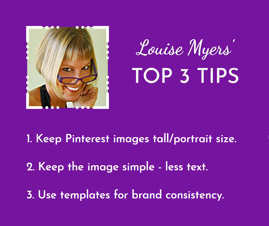
Contrary to most social platforms which prefer horizontal images, the best shape for Pinterest is tall, or portrait. Pinterest tells us that the optimal aspect ratio is 2:3, which means 1 1/2 times as tall as it is wide. This is exactly what Stencil offers in their Pinterest templates – so give one a try!
2. Keep it simple –
80% of Pinterest use is on mobile devices. That means most Pinners are seeing images in the feed at about one inch wide! Whether your Pin is a plain photo or an image with text on it, make sure it communicates what it’s about at a small size.
3. Be consistent –
The best thing you can do for your business – and your sanity – is to develop a ” brand look.” This means that all your visual content has a similar look, with the same colors, fonts, and feel. If you’re baffled on how to develop a “brand” – just pick a Pinterest template and get started. Save your first Pin creation as a template in Stencil, and use it for your next Pin – changing the words and/or photo, but keeping the same colors, fonts, and filter. It may morph over time as you see what works – and that’s fine. Just get started! Stencil makes it easy for you.
You gotta love Louise! She’s an awesome supporter of Stencil and with Pinterest. Be sure to check her out and get her latest cheat sheet and planner.
Rebekah Radice –
Author of Social Media Mastery, Digital Marketer, Visual Marketing Consultant, and Speaker.
Rebekah is like Gandalf from Lord of the Rings, she’s like Bruce Lee to martial arts… can you tell I’m totally fangirling over here?! She is all things visual marketing. Rebekah is the Visual Marketing Master. She recently started a podcast called Brand Authority to further teach entrepreneurs and small businesses with social media marketing along with her blog. Her blog is full of digital marketing and actionable tips for entrepreneurs.
Here are Rebekah’s Top 3 Tips:
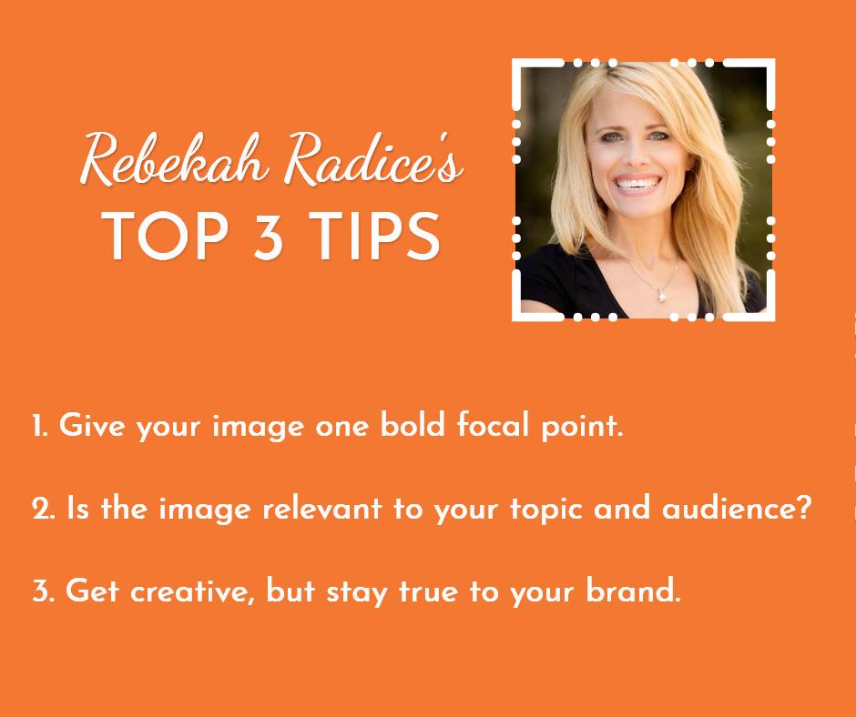
1. Give your image one bold focal point. A confused mind won’t click. Keep it simple with one clear takeaway.
2. Always ask, is this image relative to my topic and relevant to my audience? If you want to capture attention fast, relevance and consistency are key.
3. Get creative, but stay true to your brand. Use contrast, color, hue, and tone to allow your images to stand out in the feed.
Love these clear and precise tips! Be sure to check out Rebekah’s blog and podcast out.
Sue B. Zimmerman –
Instagram Expert
Sue is an incredible teacher and visual marketing expert. Her enthusiasm is infectious and her passion to help business owners win on Instagram shows every day. I see it first hand being part of her Ready Set Gram program. If you find any course or speaking engagement of hers you should jump on it because you will learn so much.
Here are Sue’s Top 3 Tips:
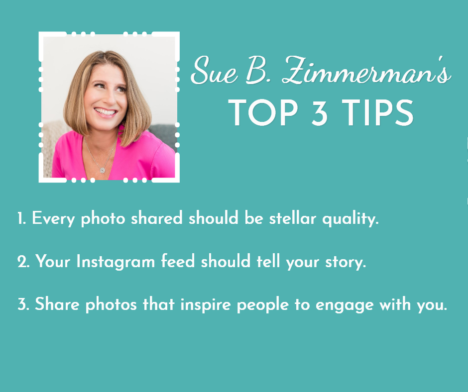
1. Every photo you share should make people want to stop in their scroll. Plan out your feed so every photo is stellar quality – and forget sharing photos that are grainy, blurry, or dark.
2. Your Instagram feed is your opportunity to tell a great story. But you only get 2,200 characters, so sometimes you have to get creative in how to tell your story. Try using emojis, line breaks, or unique symbols in your descriptions. You can even use ALL CAPS to grab peoples’ attention.
3. Always try to evoke engagement. Share photos that inspire people to like, comment, and repost. When people feel emotionally connected to your content, they’ll also feel they’re part of your Instagram community.
Sue knows all about building a community! She has more than 55K followers on Instagram. Be sure to stop by her profile to say hi and be inspired!
Ready to take action on these visual marketing tips?
These visual marketing tips are all actionable and any entrepreneur or small business owner can do them. These are the leaders and experts in their field and the one thing that I’ve found that they all have in common is that they want people to succeed in their business. They offer their knowledge and experience because they’ve seen what works and what doesn’t work. When you’re ready to design your social media posts and strategize a social media plan you can use these tips to guide you.
The best part is you can always follow and learn more from these experts as visual marketing trends change. You’ll be the first to know when and how to implement changes to your marketing plan.
So hey! Did we introduce you to anyone new? Did you find any of these tips helpful?
Let us know in the comments!


What a great roundup! I love the variety of tips – many quite appropriate to the expert. I love that Sue reminds us to use images to inspire engagement. She’s the best at that!
Thanks Lillian 🙂
Thank you Louise for sharing your tips! Love all of these ladies, including YOU. I agree, Sue, is especially good at inspiring engagement. She’s #WickedSmaht like that. LOL
A bit disappointed. When the title say “amazing tips” but it starts with basic tips like use keywords and check your images, you can’t help but feel duped by a clickbait headline.
Sorry to disappoint. There are some basic tips that are extremely important that you can’t skip out on. If you read further into the post, you’ll find these visual marketing experts put a lot of thought and detail into their answers. This is why I used the word “amazing”. This is not clickbait.
There are five different points of view and you just stick to the first one. What were you expecting?
Hi Lillian… great post with lots of great tips. So many things to keep in mind and this is one cheat sheet to be reviewed often. Thanks so much.
Thanks BG! Glad you like it. I love that all the experts had so many details to provide.
Amazing tips from top experts! Love Donna’s tip about how we should maximise the amount of space the images take up. It’s so simple – and yet to easy to forget.
Bookmarked the post!
So glad you like these tips too, Olga! Some of these tips seem so simple but if we forget to implement them we’re missing out. You’re exactly right. Thanks for bookmarking! 🙂