Visual marketing is the combination of images and words put together to capture leads, create brand recognition, and develop relationships. It’s critical for any business, online or offline. It’s no secret that visual marketing is making a difference in business, especially when creating ads. We’re going to walk you through 3 visual marketing hacks for ads with Stencil that will bring you visual marketing success.
Photos and images can make or break an ad, with overly cheesy stock photos or images that attract the wrong type of audience, it can be very easy to create a failed ad. A call-to-action button in an ad is actually quite important in directing the audience of the next step to take. Facebook ads in general are the epitome to what visual marketing is all about, and we have a hack that’s especially awesome to show you. Let’s get into the details!
Visual Marketing Hacks with Photos and Images
Stencil provides more than 680,000 (and growing each week) royalty free high-resolution photos from amazingly creative photo sites. Plus the photo sites do not take cheesy stock photos of office workers smiling and jumping at the same time. Seriously… why do they do that?
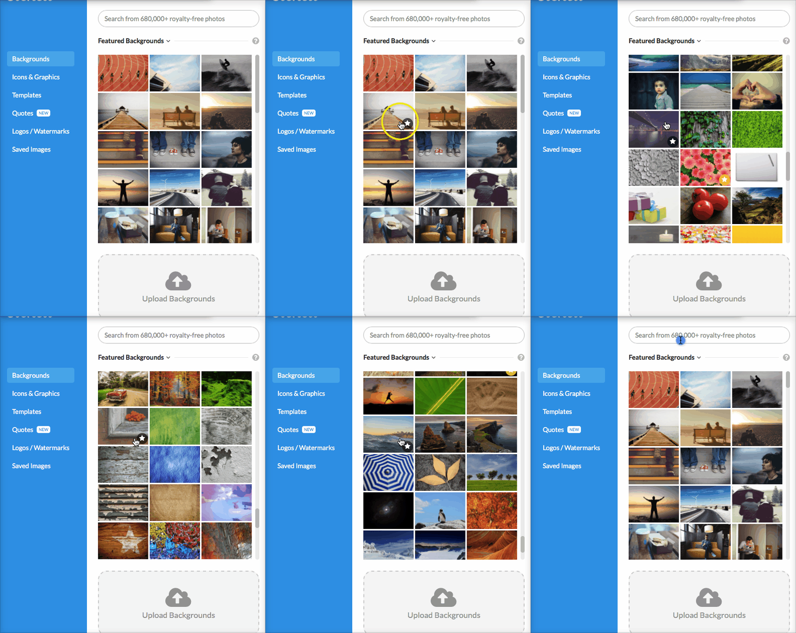
As you can see below, Stencil has featured background photos that are swoon-worthy and will make a good impression to your audience.
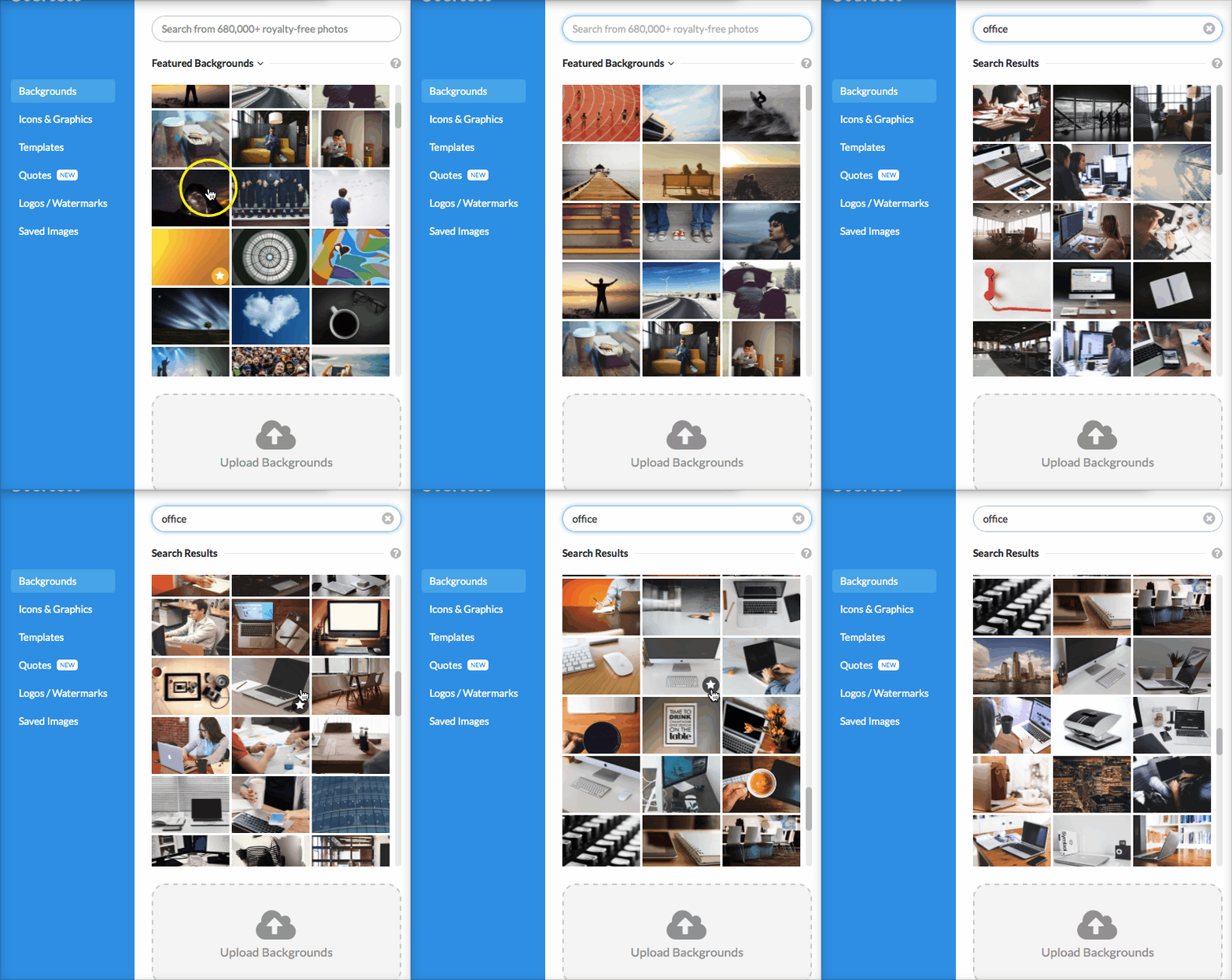
If you can’t find one that suits you, then simply search for a topic in the search bar. I’ve searched for ‘office’ and as you can see there are lots of great photos with that search.
If you’re not sure what to search for, think about your branding and who you serve. For example, if you’re a yoga teacher then you could search for calming or meditation photos. These are images that would be in line with your target audience and they would be more inclined to see what you have to offer.

Would the target audience of yoga students be interested in the concert image? No. They would be expecting a yoga-type image.

It’s all about context and how it will affect your audience emotionally. Content with relevant images get 94% more views than content without relevant images.
Skip the cheesy fake smiles and go with naturally beautiful photos that resonate with your target audience.
Visual Marketing Hacks with a Call-to-Action
Believe it or not, a call-to-action is a major part of marketing but don’t just say, “Buy Now!” or “Get it here!”. Using a visual, as simple as a button, with the call-to-action makes all the difference.
Now there has been some controversy and plenty of case studies in regards to the color of the button, you can read about the battle of the green and red buttons here. However, in essence, you really won’t know what button color converts best until you do your own testing with your own audience. The fact of the matter is, you should have a button with the call-to-action on your ad. Stencil already has some templates that you can use with call-to-action buttons. Take a look at where you can find the templates below:
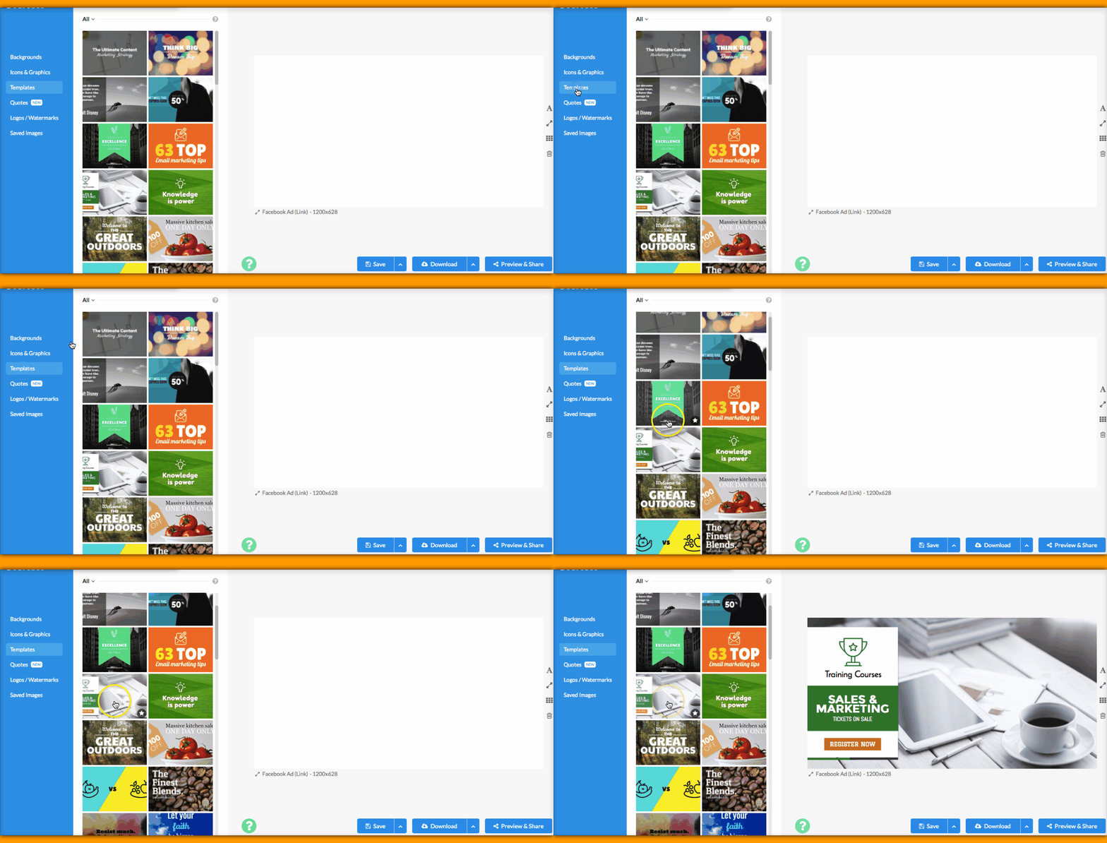
It’s best to have 2 of the same images but change the call-to-action button’s color to do your own A/B testing to see which button converts best.
Let us know which color works best for you!
Visual Marketing Hacks with Facebook Ads
Facebook has become the ultimate ad machine. If you have a Facebook page, then you’ll quickly realize that most of the posts are not being seen in the newsfeed for others to see. Which can be quite a predicament if you’d like to gain leads and essentially sales for your business. Now it has become the “rule” to use Facebook for marketing with ads. This is best way to get more eyes on your posts, yes, you must pay to play. Many businesses have found great profit with Facebook ads since you can pinpoint the target audience. You can find more tips here.
In creating Facebook ads, one must note a particular rule that Facebook has, the 20% text rule, you can check out the guidelines here. Basically the less text you use on an ad the better. There is a tool that Facebook has to test the image prior to submitting the ad for approval. However Stencil has made ad images easier by providing a grid tool right in Stencil’s design area.
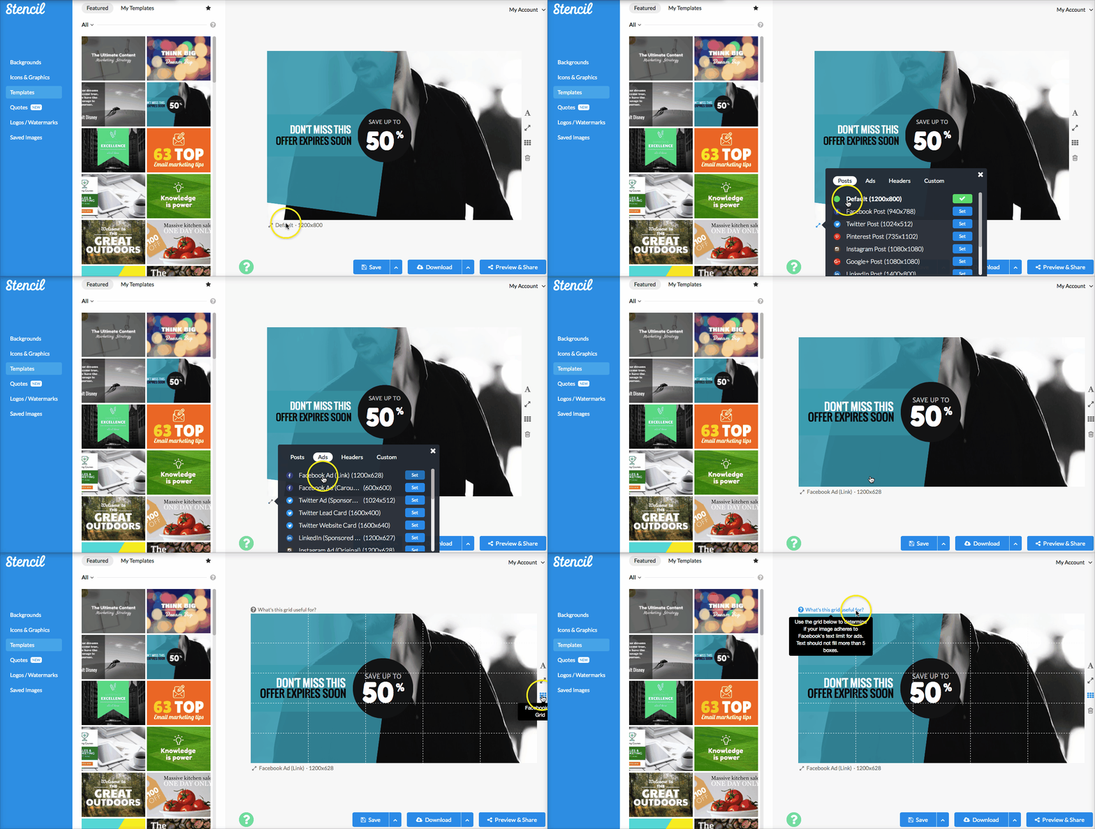
When you first create an image in Stencil, the design area is at a default size of 1200X800, you can instantly resize the design area to ad image dimensions by clicking on the Ads tab. There are many different types of ads you can create but Stencil has the Facebook ad sizes conveniently at the very top of the list. Click on the Facebook Ad Link to change the dimension to 1200X628. Finish designing your ad with the amazing photo and very little text.
Click on the 3rd button on the right side of the design to add the Facebook ad grid. This tool will help you create your ad. If your text fills more than 5 of the boxes on the grid, Facebook will most likely reject your ad.
Avoiding this Facebook error is such a time saver and we’re excited to bring this tool directly to you with your designs.
Visual Marketing Hacks with Stencil Recap
Some people need a bit of help now and then with marketing with ads. Who are we kidding?! We all need help. Visual marketing is a must with ads and Stencil wants to make it easier for everyone who is running a business.
Let’s recap the visual marketing hacks:
- Photos/Images – Use fantastic images that work with your target audience. It will really work best when you know your audience’s likes and dislikes. Make sure the image resonates with your audience to really get their attention.
- Call-to-Action – Be sure to use words directing your audience on what to do next, such as: Sign up now, Buy now, Get started, etc. Using a button works best and the color of the button is all in the testing.
- Facebook Ads – The dreaded 20% text rule on ads can be the least of your worries in creating ads with Stencil’s handy Facebook grid tool.
We hope these hacks can help you on your visual marketing and ad journey!
What other hacks have you found that help you in creating ads? Let us know in the comments.


Thanks for sharing! I have been using Canva for all my FB ads only because of the size set up. I use Keynote on my mac for all my blog post images with text overlays because it is super fast and I all about making tasks go faster so you can move on to the next task. But canva is so clunky and buggy. You also can not resize without starting over again unless you pay for the pro-version. So that means it takes too long to work in the app. That is why I love Stencil so much, so much faster than any other app out on the market for such a reasonable fee. I love how you can now just click on the tab and get the FB ad size! Huge time saver!!!
I hear ya Katerina! Stencil has made creating ad images so much faster. So glad to know you’re using Stencil and enjoying it. 🙂
da BOMB!
Why, it’s Lillian! I should have known 🙂 Nice post! While FB no longer rejects ads over 20% text, they give them less reach, so we do need to minimize text.
Aww! You found me, Louise. So happy to see you here. 🙂
Yes! With their new policy – “With our new system, ads with higher amounts of text will receive less or no delivery at all.” Minimizing the text would be the best way to go!
You’re right on the button Louise!
We’ll be updating Stencil shortly to give feedback that if text goes beyond 20%, the ad’s reach will be limited.
Thanks Tommy Pakk to have help me hack my Husband email i knew he had a skeleton in his cupboard just skeptical about it, but with your help now am sure he does, its my time to show him payback is a bitch. if you need a reliable hacker you can contact him via tommypakhacker@gmail.com