Social Media Marketing can get feel like an uphill struggle.
Maybe you’re just in a creative slump. Perhaps you’re lost, and bored of trying to figure out what you should be doing. Or, you could just be feeling a little stale after a few months of doing the same old same old.
Don’t fret.
In this article you’re going to learn 10 data driven ways to improve your social media strategy strategy, right now, and get more from every update.
#1: Get Responsive
A lot of people only use their mobile phones to access social media.
In fact, active mobile accounts are up 23% (or 313 million people) in the last year. And 66% of tweets that mention brands come from mobile phones.
Which means that now is the time to get on board with the mobile revolution. Especially when iPhone users alone are spending upwards of 21 hours a week online on their mobiles.
That means it’s time to get a responsive theme for your site – whether that’s a blog, landing page, coaching page or anything in-between – that looks lovely across mobile phones.
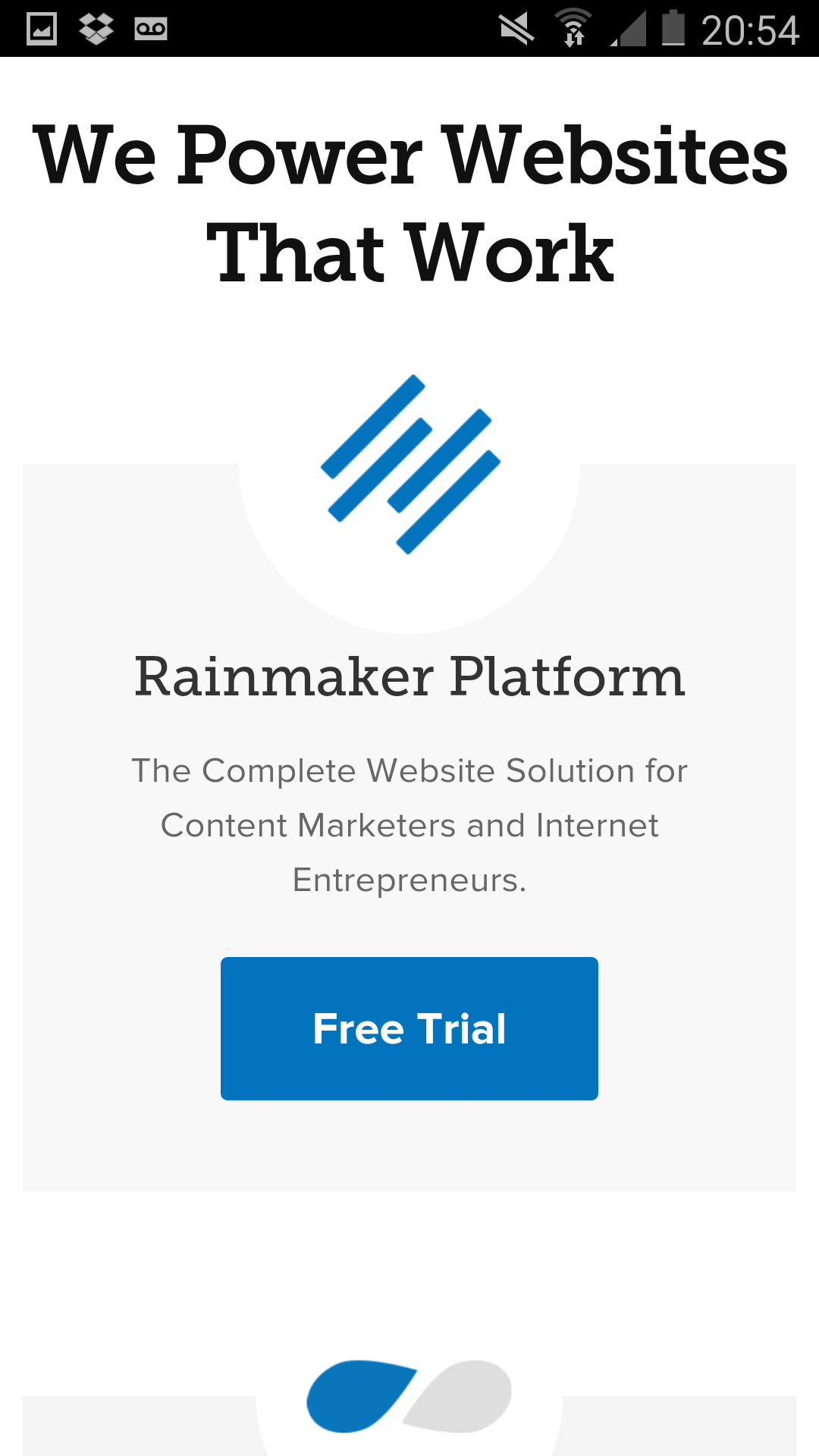
Like how Copyblogger’s homepage goes from this:
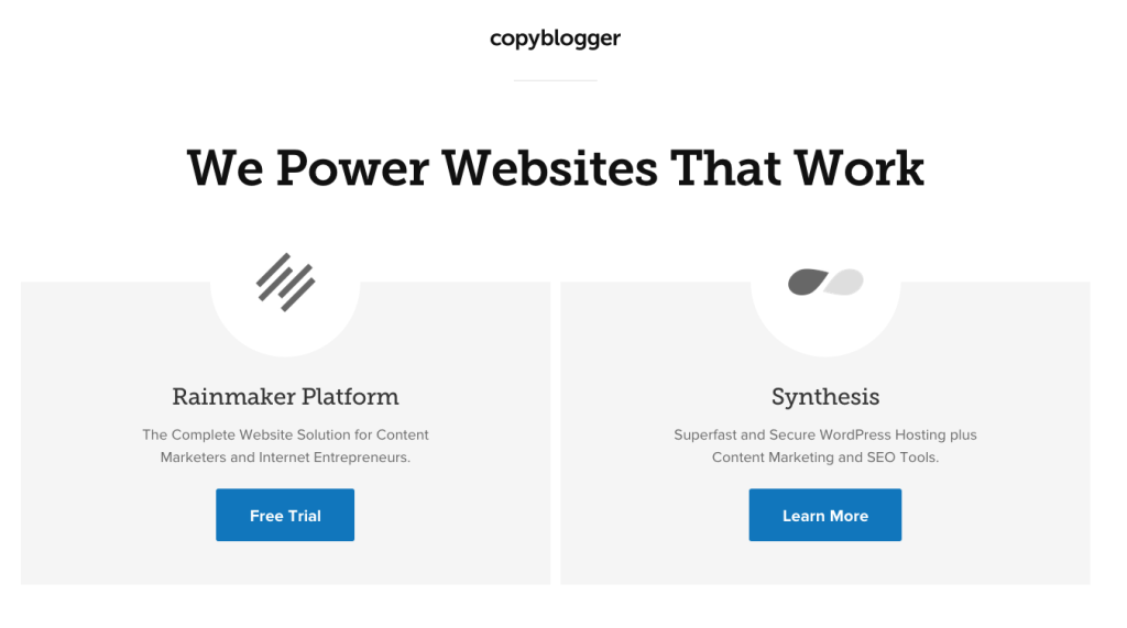
To this:
Now making your sites responsive is a little beyond the scope of this article. And I’m a writer, not a developer.
So I’m going to hand you over to this lovely article from Social Media Examiner that shows you simple ways to do that.
#2: Understand Why Your Users Share
I’ve written a lot about the importance of getting to know your audience, and why they do what they do (link).
And there is one truth about all audiences that every marketer should accept:
People share to boost their social image.
They want to look funny, or smart, or helpful to everyone who follows them.
That means that people are sharing the content you share because it adds some sort of value to them, and their audience. And it’s the exact same reason you share content too.
So it pays to take the time to find out what image your audience is looking to share.
For example, Red Bull has built an entire social media image around extreme sports, and not their product.
Why?
Because they know their users would rather share a picture of a guy setting himself on fire and going surfing, than anything to do with their energy drink:

And that’s a big part of why they’re so successful, and so many people drink their drink. They understand what their audience wants to read about – and share – then they give it to them in a big way.
#3: Cash In On Hot Topics
From time to time, no matter how dirty it might feel, it’s good to jump on the bandwagon and ride the viral wave for a little while.
It gives you a short-term boost that can put you in front of lots of new people in almost no time at all.
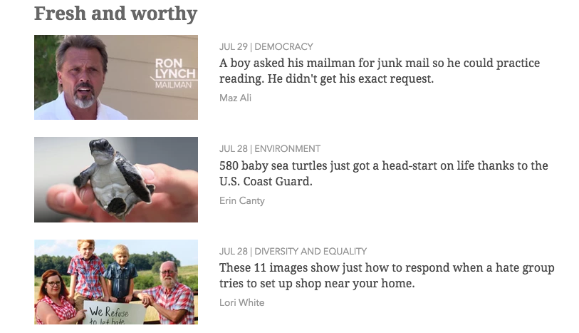
It’s something UpWorthy used to get off the ground, by sharing lots of viral, emotional content from all over the Internet. Which was rarely created by them.
You could:
- Share a viral video
- Post an opinion piece on a topic
- Reply to a guru’s latest viral post
- Create a blog post around an Infographic someone made
Whichever it is, make sure it’s something that’s truly relevant to your audience, so it doesn’t look like you’re cashing in at first glance.
#4: Use Infographics
Businesses who use Infographics in their social media marketing get 12% more site traffic than those who don’t.
That means if you’re not using them right now, it’s time to start.
And, the best news about Infographics?
You don’t even have to create them if you don’t want. You can easily use an Infographic that someone else has created, share it with your audience, and then tell the people who did make the Infographic that you’ve done it.
Not only can you improve your social shares, but you can build relationships with other people in your niche, too.
You could – as I mentioned earlier – create a blog post around an Infographic.
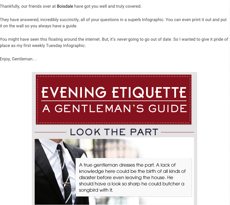
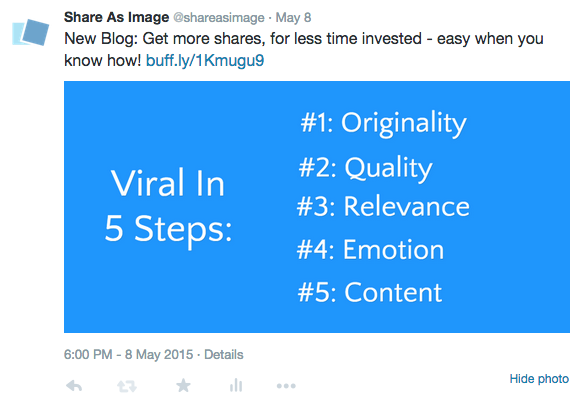
Or, you could create (or use) small, tweet-sized Infographics for your general updates, like this:
#5: Focus On List Posts
QuickSprout did some great research into what gets shared most on Twitter. And they tested a lot of different types of content.
And what they found is that, on average, list posts get three times more Retweets than any other type of content.
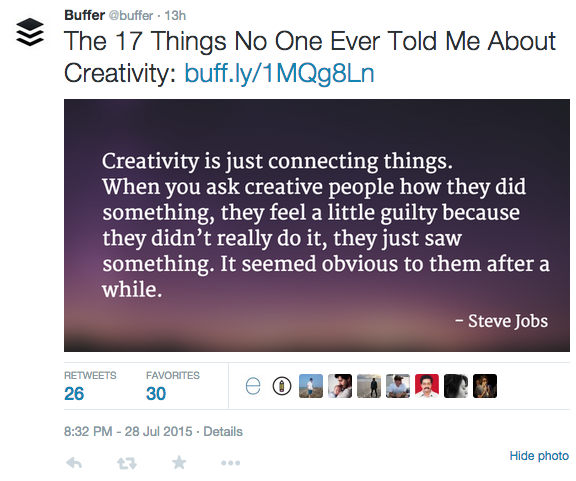
While this isn’t startling news – copywriters have been using lists for decades to generate hype – it does go to show that, if you’re in a growth stage, list headlines are the best way to get your content seen.
But, what do you do if your content isn’t in a list post format?
Well that takes a little bit of creativity, but it’s not too hard.
For example, if you’re sharing a piece of content about, “How To Improve Your Diet This Summer”, you could add up all the foods you recommend in the article and turn it in to, “36 Foods To Eat For A Better Diet This Summer”.
There are numbers to be found in every post, you just need to look for them.
#6: Reduce Your Social Media Buttons
You might have noticed that those scrolling social media bars at the side of posts are getting ridiculous in length:
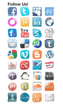
Because it’s all about giving yourself the most opportunities to get shared, right?
Well there’s research to suggest otherwise. Neil Patel played around with the sharing buttons on his site, and found out some interesting data.
When he reduced his sharing buttons to just three options his share rates went up 11%.

That’s because people only tend to share on one site.
Like, for my own personal work, I use Facebook more than anything else. I can go weeks without logging in to Twitter.
So if you have a relatively low rate of shares, identify which sites your audience spend most time on, and focus solely on those three. And, when you start getting up to over six-figure traffic, think of adding an extra button
#7: Use Large Twitter Cards For 300% More Engagement
Did you know there is more than just one type of card you can share with on Twitter?
No?
It’s okay, neither did I until recently.
But it turns out that when you start to use these different cards, you can increase the engagement on your feed massively. Because they stand out in a boring news feed.
Research from BuzzSumo found that large Twitter cards could give you up to 300% more engagement than using any other type.
That’s a card that looks like this:
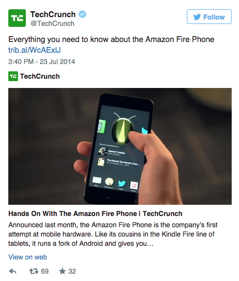
Now you can’t just do this through an option on Twitter, it has to be done on your site, with a little coding. But if I can do it, I’m pretty sure anyone in the world can do it.
You can find out how to create these cards, simply, from Twitter themselves right here.
#8: Add Images To Every Update
The benefits of visual content are endless. In fact, it’s fast becoming the most important content you can use across social media.
For example, take a quick scroll down your Facebook or Twitter feed. I’d wager a bet – for any amount of money – that it’s at least 60% videos and images.
There’s a reason some of Twitter’s most subscribed content feeds now look like this:
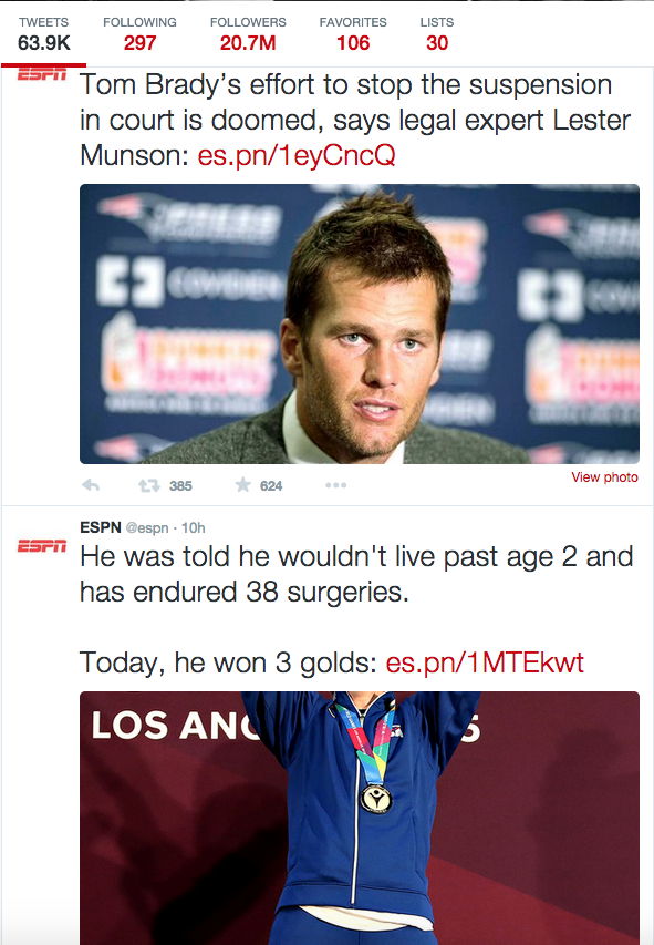
Just visual after visual after visual.
And it’s with good reason. Facebook posts with images get 2.3x more engagement, and Tweets are 150% more likely to be retweeted.
So, if you’re not doing this, where do you start?
Well there’s two options for this:
Firstly, you could read this article I wrote for Buffer on what makes a great social media image.
Or, you could sign up to Weekly Snaps, which will send you 20 high quality, royalty free images every single week. For free. That way you always have fresh images you can use for your updates, with no time or effort.
#9: Ask People To Share
Sometimes, when sharing is the goal, you go so far out of your way to create content that gets shared. Be that questions, quotes, article, images – you name it.
But often, we forget to do one fundamental thing:
Asking for the shares.
By simply asking for a Retweet (and spelling it as retweet) you’re 23x more likely to get retweeted than if you don’t. Even if you just spell it RT, you’re still 10x more likely.
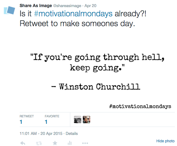
So, when you have a tweet the really needs to be seen, instead of passively trying to get it shared, take it by the scruff of the neck and just ask people to do it.
You’d be surprised at the results.
#10: Test Out Multiple Headlines
Okay, so you just read about how powerful list headlines are on Twitter. But, what about the rest of social media? What works well across those other important platforms?
The honest truth is, it depends.
On who your audience are. The niche you’re in. The topic you’re writing about. And a couple of hundred other variables that you could dwell on.
Which is why it’s important to test lots of different types of headlines, to see what works.
Take a look at this post from Canva:
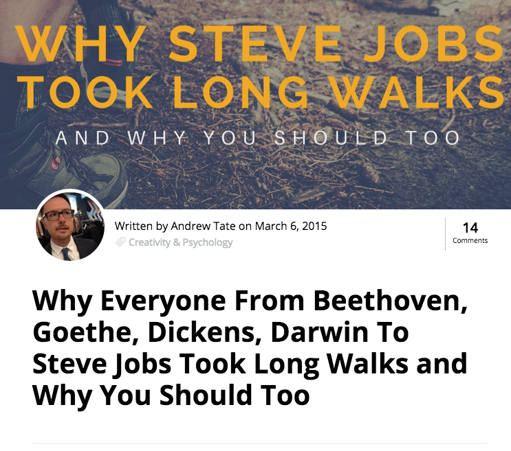
It went super, mega, insanely viral for a design blog. It has 81,000+ shares (and counting).
But the first time they posted it, it was a flop. Here’s what they had to say about it over on Boost Blog Traffic:
“The original headline, as reflected in the banner, was simply, “Why Steve Jobs Took Long Walks and Why You Should Too”. But for some reason, that didn’t perform very well.”
So they revoked it, renamed it, and came back to it with a fresh social media headline, based on what had worked well for their audience in the past.
The result?
70,000 shares.
They turned another flop into a viral success by changing the title.
So the lesson here is to test your headlines. If something isn’t working, don’t take it as your post just isn’t good, or that it’s run its course. Change, adjust and adapt – by using data from previous updates – and retry.


Good primer on ways to shake up the status quo and make more interesting posts. As long as one is careful not to push the use of these over the need for varied, meaningful content, they can help any of us.
It’s all about shaking things up, Warren! If you’re not pushing the fold, what are you doing?
Mixing metaphors? I’ll play.
If you are pushing without quality, you’re just making a mess.
Nothing wrong with challenging people. My advice was to remind folks not to push before the baby is ready to launch.
All great suggestions. I did not know about Weekly Snaps, will have to check that out. I also like the sharing of infographics because they are not always easy to create. Good list!
Thanks again, Laurie! Weekly Snaps is great, we’re proud to have it as part of the Share As Image family now 🙂
Yeah, infographic sharing is great, that snapshot is of a blog I ran a while back, and it got some great results.
Another great post and and interesting read. Some great tips here James. Thank you.
Thanks for the kind words, Mark! Any tips that you’ll be using?
Hi James.
Some of your tips we have already put into practice, so it is great to know we are aligned with your great advice.
I have to agree on your reference to Red Bull concentrating on adrenaline sports (rather than their product) – this is such a great point. So many successful companies see beyond pushing just their product to focus on the bigger picture or cause. This makes a lot of sense.
Some of the great tips we have started to use (after reading your blog) are Twitter card images firstly. These definitely brighten up a rather dull feed.
We also complement all of our blog posts and social media posts with images. Shareasimage is a great way of doing this. We have always experienced far more engagement. To be honest I cannot imagine writing a blog post without a featured image!
Thanks again for the great advice. I’ll look forward to reading your next post 😉