If you don’t mind I’m going to do a quick mind-read on your favourite type of image to share. Ready?
Quote images.
I’m right, aren’t I?
Well I’ll let you in on a little secret; I didn’t just read your mind (yes, really!). All I had to do was look at the hundreds of interactions we get each day on Twitter:
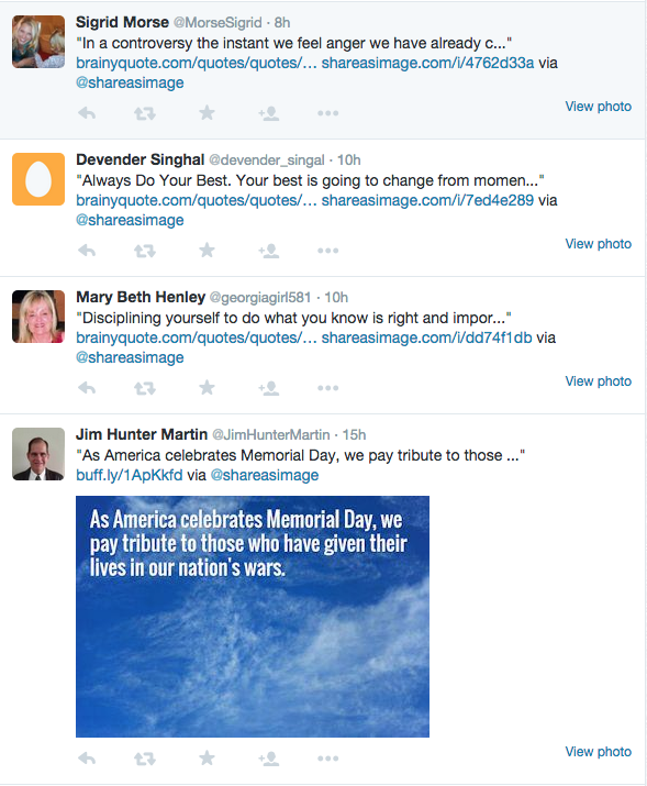
The majority of images we get mentioned in are quote images. In fact, I’d say they make up about 85-90% of our unique interactions. And with good reason:
Quote images are powerful.
As the guys over at Quick Sprout found, they get 847% more Retweets than questions do.
Because they’re easy to share and they make you feel something when you look at them. And, if your reader likes the person you’ve quoted, they’ve found another reason to like you too.
That’s what we in content marketing call a win/win/win.
So, in this article I’m going to show you how to make the perfect quote image that will:
- Boost your followers
- Get more shares
- Spread your message
Get ready to bookmark this one, because you’re going to be using it for a while.
What Makes A Good Quote Image?
To make sure your quote image is perfect, you need to ask yourself five questions:
- Is this quote relevant?
- Is the quote emotional?
- Does the font match the message?
- Is the focus on the quote?
- Does it fit your brand?
You need to be able to answer a resounding yes to all of these questions before you hit send. Let’s look a bit more in-depth and see how you can get to that yes.
Is This Quote Relevant?
Quotes are a little like spaghetti sauce; there is no universally good one. Everybody has their own favourite depending on their tastes.
So when it comes to choosing a relevant quote, you’re never going to be exactly on the money.
What you should focus on instead is choosing a quote that fits your niche. Not just one you like, or that sounds cool, but one that fits the topics you talk about.
For example, if I’m writing a tweet for Share As Image, it has to fit one of these topics:
- Design
- Productivity
- Social Media
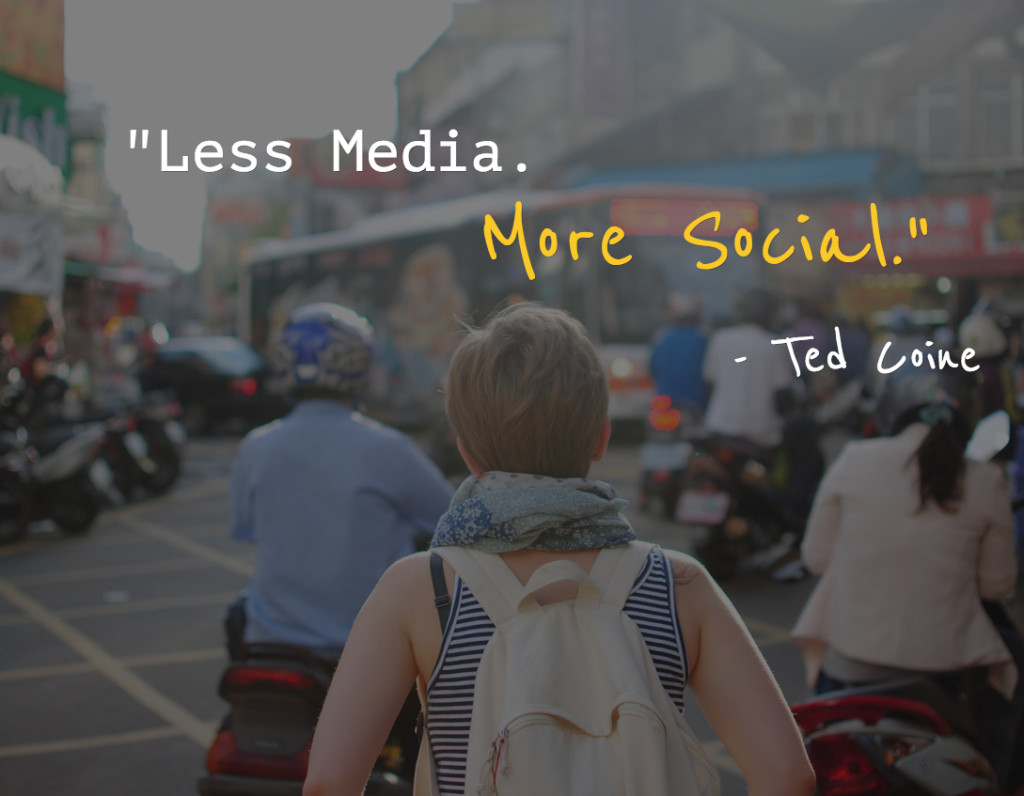
If not, well, you probably wouldn’t care about it – and it wouldn’t fit our brand – so it’s a waste of an image. That’s why this quote about social media would work:
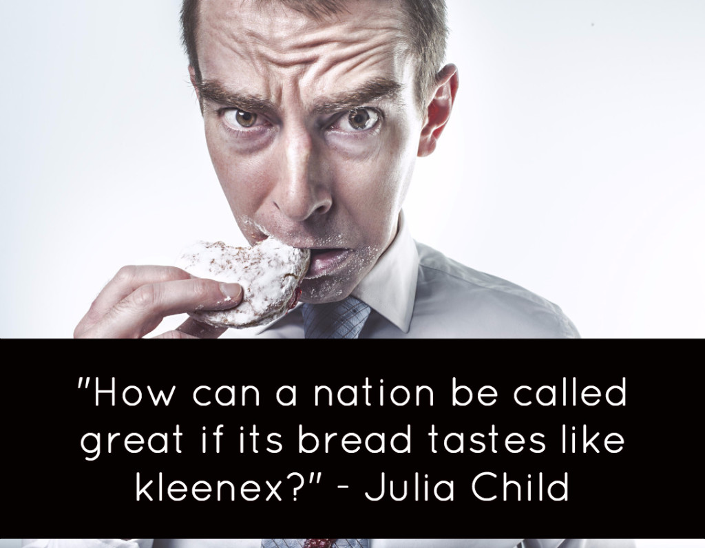
But this quote about bread – although funny – wouldn’t fit:
The important rule to remember is this – the quote should enhance what you think about your niche. If it doesn’t do that, then it isn’t relevant.
Is The Quote Emotional?
I’m sure you already know that emotion and sharing go hand in hand. By adding a strong emotion like awe or disgust, you can really maximise your chances of getting shared.
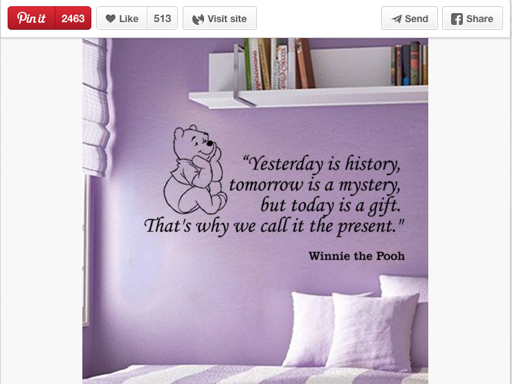
So it’s important to pay attention to whether your quote evokes an emotion in the person that reads it. Like this Winnie The Pooh quote from Etsy that managed over 2463 re-pins on Pinterest:
A great way to source emotional quotes like this is to ask your audience what their favourite quotes are. The ones they share with you are more than likely going to have an emotional reasoning behind them.
Does The Font Match The Message?
It’s common to use a font because it looks good. And, there’s nothing wrong with that. But here’s the thing:
The font is the body language of your quote.
If the typography you’ve used, and the message you’re putting across don’t match up, then you’re sending mixed signals to the reader.
To put that into everyday terms, think of it this way:
Have you ever seen somebody’s face and then heard them speak and felt that their face doesn’t match their voice? You almost always forget what they’re saying because you’re so focused on why it doesn’t make sense.
The same happens when you use the wrong font. Whether the audience likes how it looks or what’s being said doesn’t matter, because all the dots don’t connect.
Take a look at these two variations on the same quote. In it, I’m trying to convey anger; so which one looks the angriest?
This one in calligraphy style fonts?
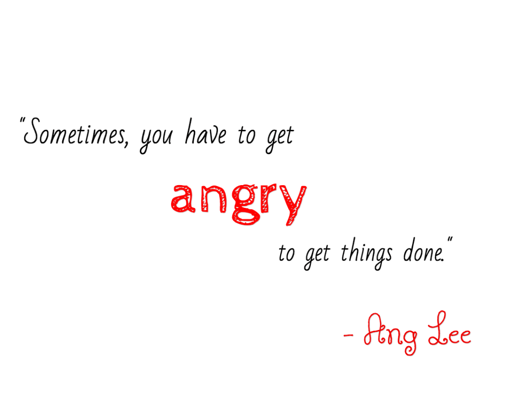
Or this one in bold and strong fonts?
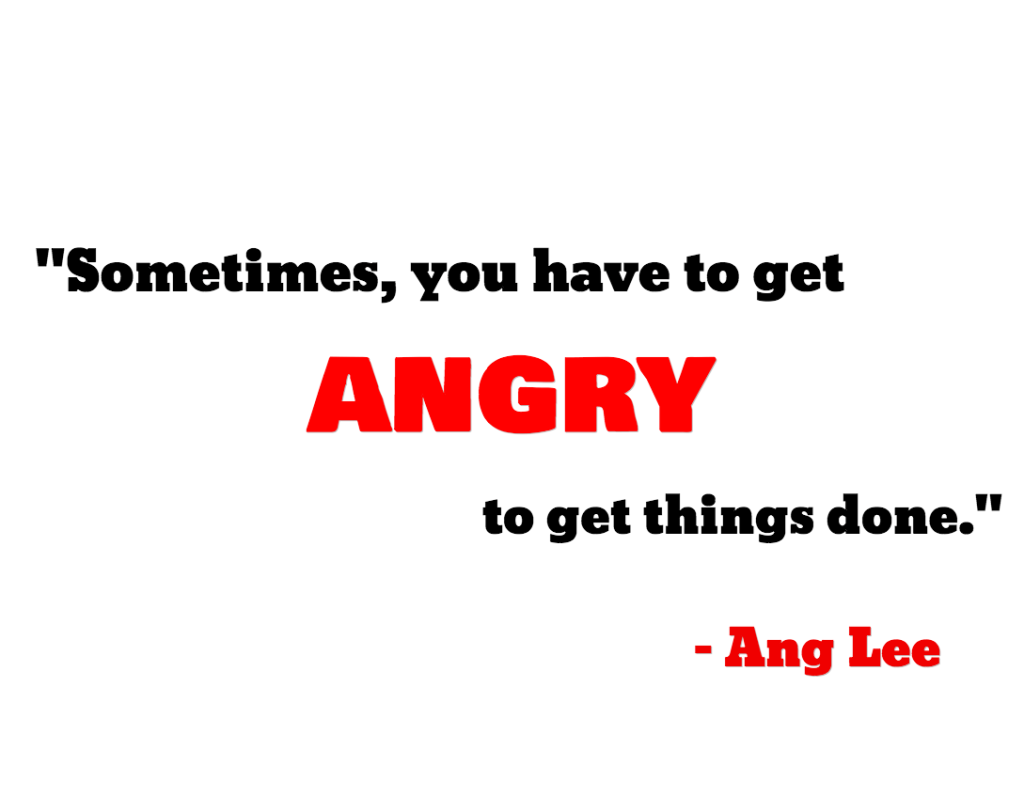
The second one packs way more of a punch than any of the others. Because the font matches the message.
If you want to know more about what types of font work best, I’d recommend reading the guest post I wrote over at Buffer. But if you’re ever in doubt, choose a clear, easy-to-read font and let the reader make up their own mind.
Is The Focus On The Quote?
Simple designs are by far the most effective – and emotional – designs. They also help you keep the focus on the quote, and not what’s going on in the background.
You see it’s a bad habit a lot of designers get into, both amateur and professional, where they try and fill up all the space that they’ve got.
But, you don’t have to, especially for quotes.
That doesn’t mean you can’t use background images, or designs, that have a lot going on. It just means you want to the focus to be on the words you’ve written. That way they carry more weight and are more likely to be shared.
For example, this quote about impatience has a lot to look at in the background, but the focus is on the quote:
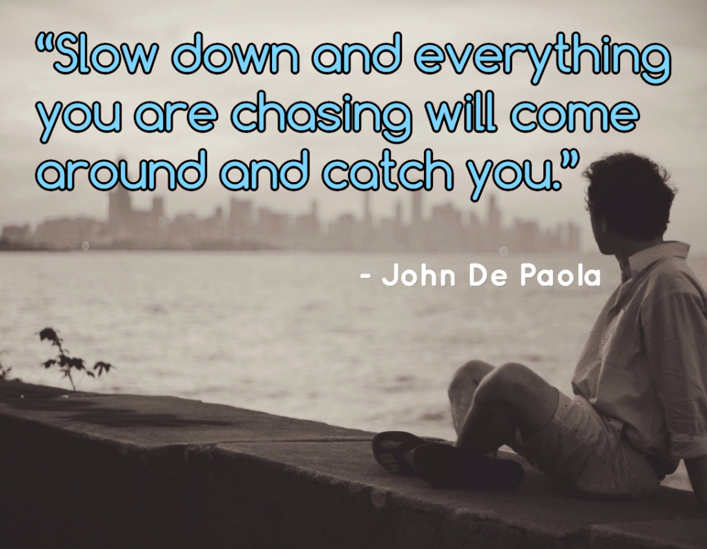
To be safe though, try and use one of these style of backgrounds so your message doesn’t ever get lost in the background:
- Plain: Choose a colour that fits your site, niche or brand and use it as a plain background. So that there is zero chance of any focus being lost.
- Nature: Nice scenery works well with a lot of quotes. Using the Share As Image PRO filters you can add a little life and soul to them, too.
- People: People respond well to pictures of other people. Though be sure to choose pictures with fewer people so they don’t look cluttered.
And remember that clear, empty space doesn’t draw away from you quote, but gives it a lot more power.
Does It Fit Your Brand?
Whether you know it or not, you’re a brand.
If it’s just you sharing, you’re a personal brand. If you’re sharing for a business, company or site then you’re a more traditional type of brand.
Either way, your brand needs to have something really important:
Consistency.
All of the images you product should have similar – if not identical – qualities that mean a reader can tell your image from any other. And that’s a powerful weapon if you’re in the content marketing game.
Let’s take a look at some images from the Buffer twitter feed. For all their images they use the same:
- Group of fonts
- Filters
- Image styles
- Watermarks
To make sure their images are consistent, so you always know that it’s theirs:
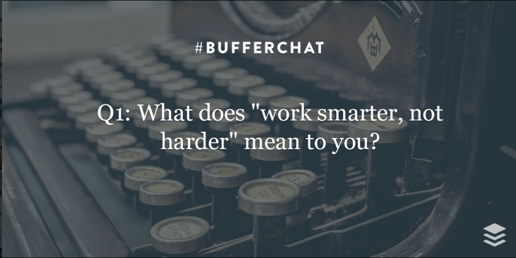
The biggest benefit to this is that those images are so recognisable that readers will stop mid-scroll because they know it’s a Buffer image.
When it comes to your own quote images – or images in general, for that matter – take the same approach.
Choose:
- Consistent Fonts: Choose three or four fonts that fit your brand, and work them into your images. This leaves room for you to use an emotional font for the focus words on your quotes, too.
- Two Filters: Filter’s can make your images look completely different, so stick to just two filters that are recognisable. Your third filter is, well, no filter.
- Similar Images: Try and get your images from the same sources, or ones that have a similar look about them. Over time, these become more recognisable.
- Watermarks: Add your logo as and when you can – unless it really distracts from the design – so that when something does get shared, it’s undoubtedly yours.
And with all of that in place, you now have a solid system to help you choose the right image every single time.
Tying It All Together…
By now you should have a solid idea of what makes a truly great quote image. But let’s recap everything you need to have in place:
- Relevancy: It should fit your niche and your audience.
- Emotional words: The quote should trigger something emotional in the audience; if in doubt, ask them about their favourite quotes.
- Matching font and message: The font you choose and the message you’re portraying should match up nicely.
- Focus: The focus should be on the quote, nothing else. Remember that space gives your words power.
- Branding: Consistent fonts, filters and images between all of your images.
If you can nail all of these five elements, you have a quote image that’s got so much viral potential your feeds wont even know how to handle it.
All that’s left do now is start creating your image! Oh, and don’t forget to let me know your favourite quote (or quote images) in the comments…


Great article – thanks. My favourite quote – maybe a little over-used but epic and so true: “You can have everything in life you want if you just help enough other people get what they want” The Late and Great Zig Ziglar
My favorite quote and my goal to share with all the world
That’s a great goal, Warren! How do you plan to do it? 🙂
I share through posts, speaking, my books and podcasts.. and of course people I meet, anywhere.
Thanks for the kind words! Great quote – think you could turn it into an image? 😉
Hmm – Reckon so… Watch this space..
Great tips. I love creating quotes over images and these pointers gave me some additional ideas!
Awesome, Laurie! Anything you’re going to start using right away? 🙂
Firstly, I like the Winnie the Pooh quote that you used as an example. It surely is packed with emotion even with a simple background image in it. Second, your tips are a lot easier to understand compared to others. The simpleness and straight forward approach topped with the appropriate examples makes everything simple and easy to digest. I can say that I am not an expert with quote images but after reading with this post, I am confident that I can create one that will surely be worthy to be praise. Thank your for this James.
Farrell, this comment was an absolute pleasure to read on my return from vacation! I’m so glad you enjoyed the post.
Is there anything you’d like to see in the future, too?
Terrific article, thanks! Along the lines of creating amazing, expressive, shareable images with SAI, I would love to see a few more bold, italicized fonts that suggest action/movement/motion added to the font library.