Don’t click delete.
Most email marketing campaigns are screaming this. Marketers spend a lot of time carefully formulating catchy headlines, working enticing offers into their copy, and A/B testing different phrases for their CTAs. The overall look and design though is often an afterthought.
Rarely do marketers bring in graphic designers to help them with their email campaigns. Instead, they rely on their own judgment to decide what looks good and what doesn’t. But as web designer James Chartrand has written, “Design isn’t just about Photoshop. It’s about psychology.” Great design does much more than simply make your emails look nice—it’s the catalyst in your brand’s messaging.
What Can Be Screwed Up in Five Seconds
Humans process visuals 60,000 times faster than text, and they remember visuals much longer than they remember text. So in the five seconds a lead reads your email, you have the opportunity to make much more of an impression with design than with copy.
There are six principles of design that designers consider when building websites. In a more limited medium such as email, three of them are most applicable:
- Email Design Principle #1: Dominance/Emphasis is the principle that defines where a user’s attention goes to first. You can use highlighting, color, and size to guide the user to start looking at the most relevant information first. In email design, this principle is most important for nailing the first impression. It’s the critical first second that determines whether they keep reading and scroll down.
- Email Design Principle #2: Hierarchy is what determines the order in which information is presented to you. Usually the hierarchy takes the shape of an inverted pyramid, with all the most important information at the top and the least important information at the bottom. We can borrow this shape in email design, since this principle determines how a user experiences your email top to bottom.
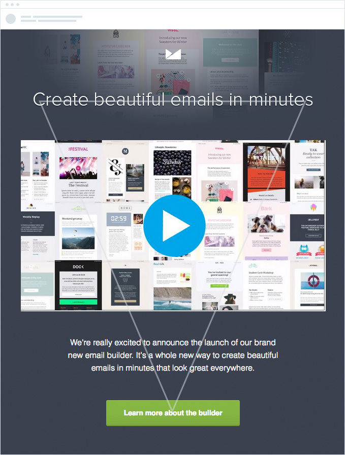
[source]
- Email Design Principle #3: Unity/Harmony is the repetition and continuation of various design themes. It requires consistency in branding, with special attention to details such as colors, fonts, and imagery style. In your email campaigns, this means the design has to be an extension of your brand. Users will judge this after they click through to your landing page and decide whether it’s what they expected, based on your email.
Thus the three most important elements of email design can be mapped out onto the critical stages of the email recipient’s experience. You have to nail the first impression, provide an excellent in-email experience, and, finally, deliver on their expectations when they click through.
The importance of email marketing to drive sales can’t be overstated. As online course creation platform Podia puts it, “Your email list is your number one most valuable sales asset.” Get the design right, and you’ll build and grow an email list that can nurture and convert leads. Most email marketing doesn’t pass the sniff test, which boils down to the visual design of the email that readers make a snap judgment on as soon as they open.
Here are the most common mistakes marketers make in each stage.
No Emphasis Across All Email Clients
Most people have an instinct for dominance and emphasis—which colors make text seem most important or what font is the most legible. They put together their campaigns, look at a preview, and maybe even send it around to get feedback. That’s enough to make a great first impression for only a portion of your email list.
The tricky thing about email is that it’s a flexible protocol. Different desktop and mobile email clients will render your email design differently, sabotaging the carefully selected image or the contrasting header that you put up at the top. Common mistakes that end up ruining your first impression are:
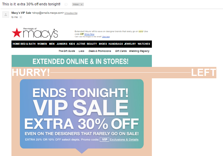
- Getting carried away with CSS. A lot can be done with CSS when you’re working on web design, but each email client supports a different subset of CSS. Check out Campaign Monitor’s Ultimate Guide to CSS Support to see which email client supports which style elements. Otherwise, you’ll end up sending emails that look like this for half your email list:
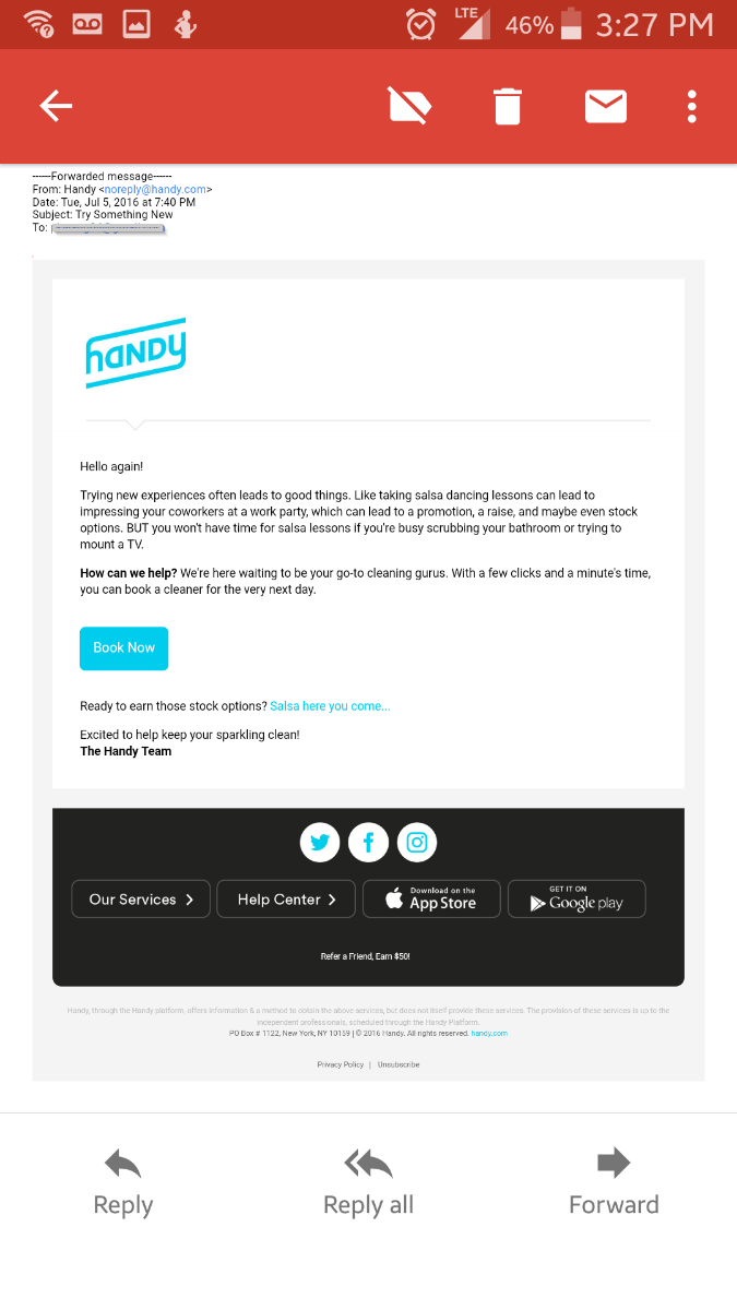
- Not using a mobile-first design. More than half of global email activity happens on mobile, so it’s not enough for emails to dynamically adjust to fit a user’s mobile screen. Tiny buttons and illegible font ruin any kind of visual emphasis you were going for— so stick to single columns with minimal text and large CTAs for your mobile templates. Handy’s email below, for example, is barely legible on a mobile screen.
- Not including ALT tags. 43% of all Gmail users keep their images turned off when reading their emails, and some email services, such as Outlook for Mac, block images entirely. An ALT tag (<img src=”image.gif” alt=”Description Goes Here”>) is basically your backup plan—it lets you add a bit of context to where the images should be. Yoga to the People sent around the email below that includes the most important information—their offer of 30% off for six months of yoga—in an image that isn’t visible to 43% of their list.
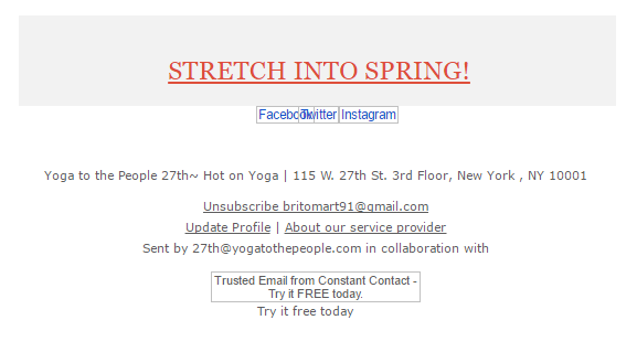
You might pour hours into crafting a beautiful, mobile-friendly design, but a single unsupported style element or missing ALT tag can hemorrhage your ROI on that email campaign.
Test Your First Impression on Different Email Clients
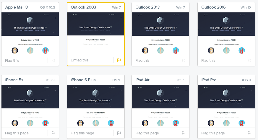
In addition to these popular mistakes, there are dozens of little things you can mess up that will break a link, an image, or the formatting of your emails. To prevent leaving a damaging first impression, test all your emails across as many devices as possible. Send them to your team and see what they look like on their different devices and email clients.
Alternatively, use a tool like Litmus to preview your design on 40 different email clients, and spot the places where images aren’t properly displaying.
No Hierarchy In Your Email Body
Once the user forms their first impression and decides to look through the email, it needs to have a visual hierarchy that presents information in order of relevancy.
Here are the design mistakes that ruin the email experience:
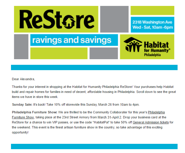
- Adding big blocks of text. If all the information you’re presenting the user is in one block of text, there’s no hierarchy whatsoever. Users who spend a lot of time online have adopted a non-linear approach to reading. They scan the headers and quickly look through pictures to see if the content is worth their attention. In the Habitat for Humanity email below, few readers were likely to read the store-wide sale that’s happening that upcoming Monday. If you’re going to keep your email basic, keep it short like Keysheet, an expert review site for cryptocurrencies, does.
-
- Sending unfocused messaging. What’s an easier decision: “Do you want lemonade delivered to your door?” or “do you want lemonade, iced tea, juice, or coffee delivered to your door?” Sending an unfocused message that offers too many options will slow down your email recipient and cause them to second guess whether they should click through.Check out this email with eight different options and nine call-to-actions:

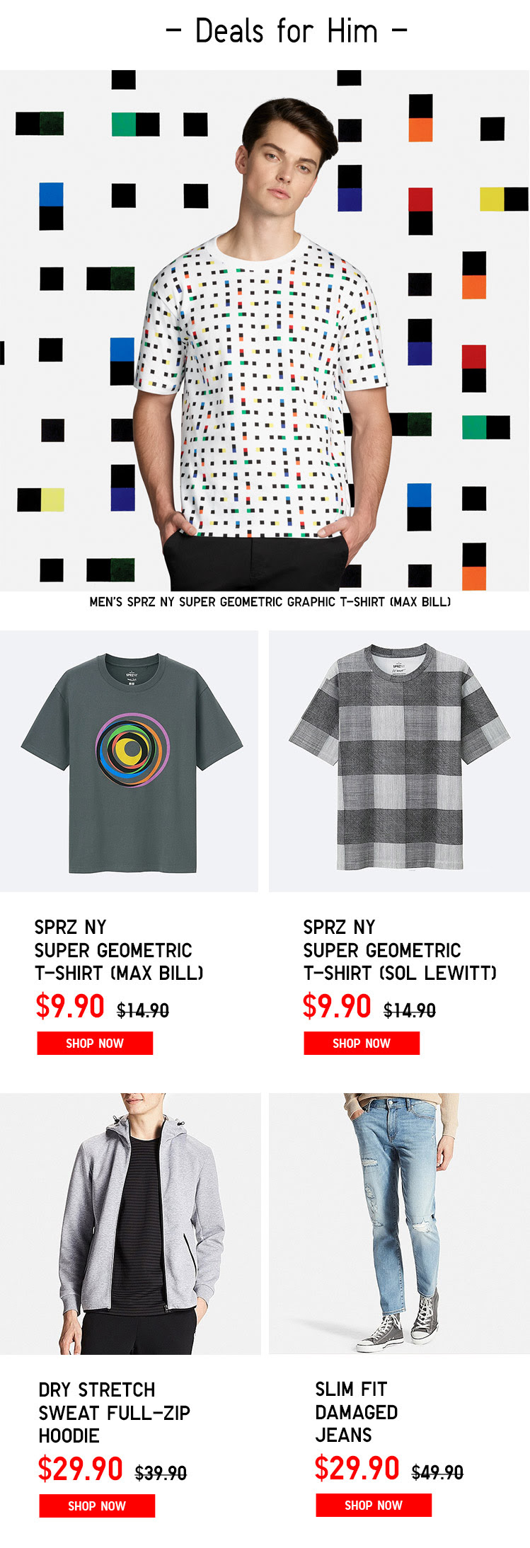
Great design should make clicking that CTA button a no-brainer. Poor design, however, makes the user pause and deliberate their options.
- Sticking to one basic layout. Sticking to a visual hierarchy doesn’t mean that your emails should look like every other. In fact, it’s a rule of thumb that leaves a lot of flexibility with what you can do in the body of your emails. You can include more dynamic content such as gifs, videos, and even embedded Twitter feeds. Look for ways to use your design as a way to differentiate your emails. Keep the informational hierarchy the same, but experiment with different layouts and eye-catching visuals that go beyond just showing off your product.

Huge companies like Apple can stay on top of email design trends, and even pioneer some of their own. But when you don’t have the design resources, it’s tempting to just guess at what looks best. As a result, your email design can turn out either too bland or too overwhelming.
A/B Test the Visual Hierarchy
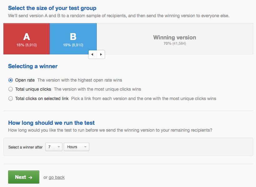
Instead of trusting your gut, perform A/B tests on all your marketing campaigns to see which design is most effective. Try a tool like Campaign Monitor that lets you test your most creative ideas for your email design, and then optimize based on the A/B test results.
You can start with their drag-and-drop feature to quickly create and iterate several versions of your email campaigns, and then use their A/B testing feature to compare their designs. You can select the size of your test group, pick the criteria for the winning design, and then determine the length of the experiment. If the test yields statistically significant data, it’ll update that campaign with the winning design.
No Harmony Across Marketing Platforms
Your emails have to properly represent your product and your brand, so that when users finally get to your website, they aren’t disappointed.
Here are common mistakes in email design that are losing you conversions:
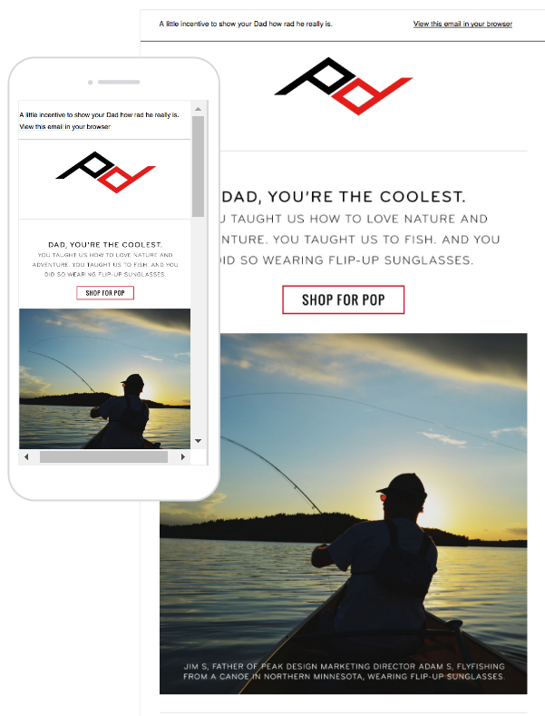
- Unrelated imagery. The average adult has an 8-second attention span. Chances are, they’re not reading detailed descriptions of what your product actually does—instead, a good chunk of their estimation is based on the images you include in your emails. If your images aren’t clearly defining what you’re marketing, you’re inadvertently soliciting some disinterested clickthroughs.In the example below, the image doesn’t represent the product. Peak Design sells clothing and bags, but this ad could be attracting someone looking for fishing tools.
 [source]
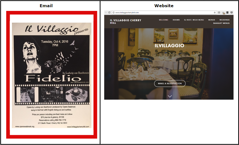
- Inconsistency in branding. Your email campaigns should be an extension of the branding found on your website. This applies to more than your logo—even small details, such as color schemes, font, and imagery style need to be similar to what would be found on your website. The ultimate goal is to constantly include design elements that are unique to your brand in your emails, so that users on your email list will recognize you before reading your name.Il Villaggio, a small Italian restaurant, sends out emails marketing events, but the font and old-fashioned style of email design clashes with the modern design of their website.
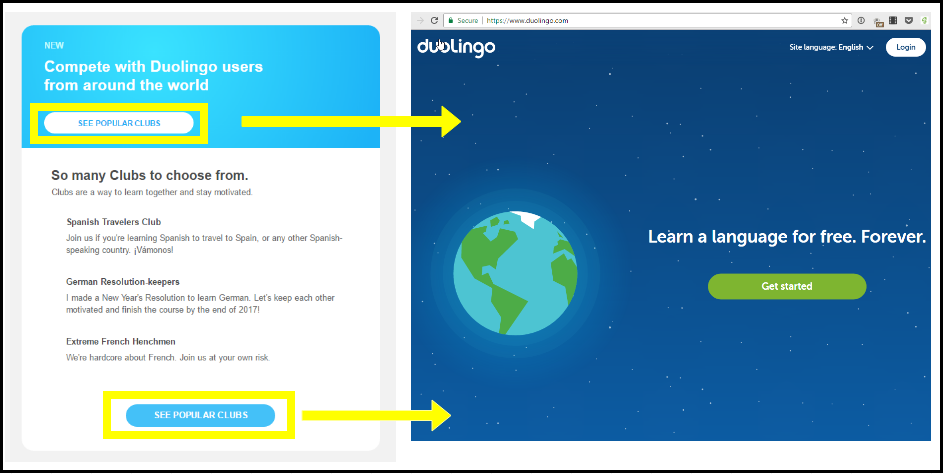
- CTA points to the wrong landing page. According to an experiment conducted by Yale social psychologist Howard Leventhal, specificity in instructions is one of the driving factors for action. If your CTA says “sign up now” and doesn’t take you to a sign-up form, your users won’t take any action.Duolingo, for instance, sent an email with a CTA button that said “see popular classes,” which takes you to the home page.
When you’re focused on getting results from marketing campaigns, it’s hard to keep things in perspective. You don’t think about how your email campaigns are a potential starting point for a long relationship with a future customer, or how to ensure a seamless experience from first to last.
Test Messaging and Consistency
Your emails are crafted with a marketing persona in mind, but you have no idea whether your design is serving its purpose unless you ask. Set up exit surveys on your landing page, so that when your users go to hit “back” in the browser, they’re hit with a survey. A simple multiple choice survey that asks users what they expected should do the trick:
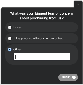 Tools like Qualaroo let you set up exit surveys as a way to make sure that users are coming to your page for the right reasons.
Emails Offer A Small Glimpse Into Your Brand
Email is a unique opportunity to reach leads you wouldn’t have otherwise. You should think of your marketing campaigns as smaller versions of your website that you send out to tens of thousands of people. Just like with your website, design is an integral part of how your present your brand and your overall message.
That’s why you should take the same kind of scrupulous and iterative approach to email marketing as you do website design. Don’t save a template in your email marketing tool and then send the same marketing campaigns time and time again. Test, iterate, and gather feedback to see what’s working and then adjust.


Leave a Reply