What makes an image go viral?
Well, that’s a question we spend a lot of time thinking about here. Because, as you know, we see images as more than just padding on a news feed:
We see them as a powerful way to connect.
And one of the best ways to connect with new people? Social shares.
But knowing how to create a shareable image, one that can go viral, for your niche is a lot easier said than done. Or, at least it was. Until now.
In this article I’m going to show you the five parts that make up shareable images, and how you can apply them to your own images today.
The 5 Parts Of A Highly Shareable Image
Shareable images can be broken down into five simple components:
- Originality
- Quality
- Relevance
- Emotion
- Content
All of which are needed to create an image that is powerful enough to not just convince your fans to share, but to convince the people your fans know to share it too.
Here’s each one of them broken down, and how you can use them:
#1: Originality
The Internet is home to the serial skimmer:
People who don’t really read what’s in front of them. They just skim and wait for something to catch their eye. Like, how you approach your TV Guide on a Sunday morning.
And – like that TV guide – if you’ve seen something before, you just gloss over it and pay no attention. Because it isn’t original, and it isn’t eye catching.
Which means:
The more original your images are, the more likely they are to be seen.
Meme’s are a great example. The first time you saw your favourite Meme (mine below) you stopped, looked at it and probably even saved the image to your phone.

But, when you saw it for the 100th time, you probably didn’t even chuckle. You just skimmed over it.
Don’t let your images suffer the same fate:
Stop following design trends, and start experimenting with original ideas. It’s a risk, but so is trying to go viral, and it’s going to pay off in the long run.
#2: Quality
The quality of your images matters. Why?
Because nobody likes to look bad. They don’t want to share a poor quality, grainy image that isn’t nice to look at. They have high standards for their own feed, after all.
So you need to make sure that your images are of the highest quality you can.

Now, these don’t have to be super-high-resolution photo’s. But, they need to look like they weren’t taken with a clip-on camera for an old cell phone.
Another factor in image quality is simplicity:
Simplicity in design is really powerful. And the less clutter there is in your photo, the better quality the image looks.
There’s a lot of background colour and noise here, which makes the focus of the image hard to make out – making the quality poorer:

But, remove the background noise and keep it simple, and you have a cleaner looking image that pops:

#3: Relevance
Relevance falls under two categories
- Niche: Does the image fit your niche?
- Timing: Does the image fit with what’s happening right now?
And, if you want to increase your shares, you can play on either of them depending on where you are in the year, and what’s going on in your niche.
But, you niche should always come first. Why?
Because if the images doesn’t fit your niche, then you’re not serving your audience. If you run a comic book store, and you’re tweeting images of expensive watches – you’re not providing relevant content.
Unless, that is, it’s tied well to something that’s happening in your niche. Using the above example; if Rolex started making Marvel watches – that would suddenly fit the niche and serve part of your audience.
Public holidays are a great way to stay relevant, too:
- Christmas
- Thanksgiving
- Business anniversaries
- “This day in…”
And, if you can put an original spin on these, you can create epic shareable content – that’s relevant and gets noticed.
#4: Emotion
When your readers feel it, they’ll share it. (Click here to tweet that!)
Emotion is one of the biggest reasons any content get shared. In fact, if you only take one lesson from Jonah Berger’s book Contagious it should be that.
So, if you can add emotion to your images, the chances of you getting shared go through the roof. But how do you do it?
Try these types of images:
- Quotes (the highest performing on twitter)
- Questions
- Funny pictures
- Shocking
- Tutorial
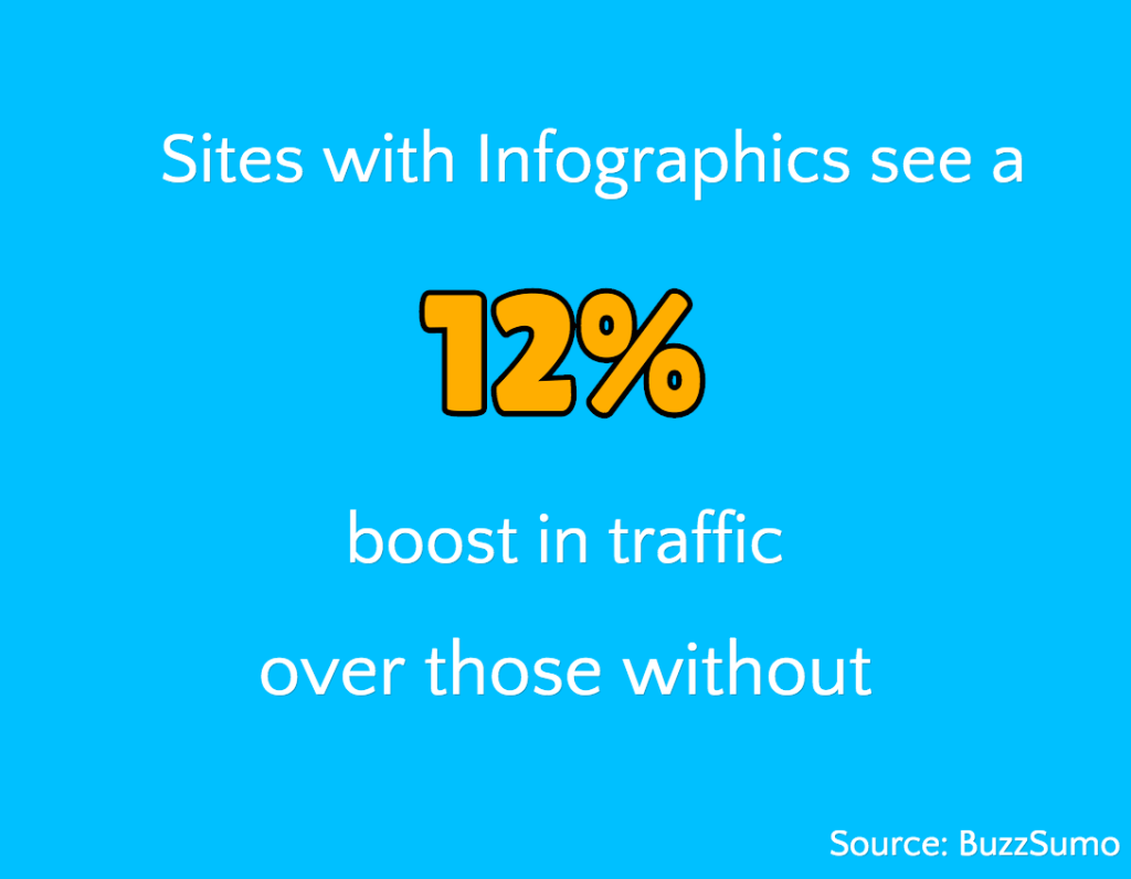
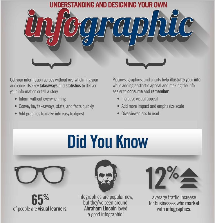
- Infographics
Although they may not all seem like they’re emotional, they can create the two types of emotion that matter:
- Shock
- Awe
If you can make your readers shocked at something: statistics, data or just by throwing a downright curveball, you can create some serious social shares.

And, if you can create awe – the feeling of inspiration, fear and wonderment – with a tutorial style image, you can also push the fold with you social shares.

#5: Content
Here’s the thing about content:
It’s absolutely everything you do online. And, it’s the coming together of the four points we’ve just spoken about before.
But, content itself focuses on what is on your image. For example: if it’s a tutorial like we spoke about above, a simple quote or anything in between.
Too much content can kill your image. Whilst too little can stop you from getting noticed at all.
Here’s three questions you can ask to make sure your content is perfect for your image:
- Do your readers want it?: Your content needs to fill this criteria. Because, if it doesn’t, then it’s not worth your time. Dropping images for the sake of dropping images doesn’t cut it – they need to serve a purpose.
- Is it bite sized?: Make your point, or ask your question, in as few words as possible. It should be tweetable, and digestible.
- Does it add value?: Not only do you readers have to want it, it needs to give them something valuable they can use once they’ve seen it – to make them want to share it.
If you can check all three of these boxes, you’re on the road to create content your readers can’t help but share.
Which one of these steps were you missing? Let me know in the comments…


[…] this article I’m going to point out you the five parts that make up shareable images, and how one can apply them to your personal pictures at the […]