The use of visual information has increased on the internet by 9,900% since 2007. We all know that images and infographics increase traffic on the web, whether it’s on social media, blogs, or our company site, but what we are still unpacking is the why.
As content marketers, we often plug and chug the strategies we know that work when it comes to writing a successful blog, but because visuals are such a crucial component of this formula, the topic is worth delving into a bit more.
Brace yourselves. We are about to enter the world of neuroscience and cognitive studies. Don’t worry, you won’t be quizzed on it, and we won’t get too deep, we will just explore some recent findings.
We first start processing visual information – such as color, shape, orientation, and size – once an image passes through our retina, located at the back of the eye. The retina is the place where light is converted into neural signals. After that, parts of your brain will continue to process that information for longer. And it’s within the brain that things get interesting.
Here are 4 reasons why we psychologically respond more to images
1. Sight is our main sensory skill
Our brain is working very hard to make sure we can process what we see quickly and efficiently. 20% of our brain alone is reserved for processing vision, and when our eyes are open, about ⅔ of electrical impulses running rampant in our brain are strictly dedicated to sight – our brain was built for vision.
Think about it this way: we are born being able to see immediately. Before we even know words, let alone way before we can read, we can see.
Because we have so much experience, we are very good at seeing and extracting information from images around us.
A recent study at MIT suggests that the brain can process an image in 13 milliseconds – or to put that in perspective: faster than the blink of an eye. Researchers asked subjects to look for a particular type of image, such as “picnic” or “smiling couple,” as they viewed a series of six or 12 images at a very rapid rate. They found that each subject was able to process the images at rates between 13 and 80 milliseconds.
It takes much longer to process text, and on average, the people seeing your content will only read 28% of the words on the web page they visit when there isn’t a compelling image giving them a reason to stay.
“Seeing is believing,” and you want to get the viewer to believe you so they will want to convert.
2. Visuals reduce a lot of information to a simple idea
We see an image and we automatically associate it with a vast plain of knowledge, information, metaphors and other associations we have with that visual.
Studies show that people will only remember about 10% of information they received through text, but when you add images this shoots up to 65%. This is because that image contextualizes the simple idea buried in the body of text.
This is extremely relevant to branding and marketing. We see the Nike symbol and immediately recall “Just Do It.” Simultaneously, we are reminded of a commercial or ad featuring our favorite athlete. We are also reminded of our own ability to be the best athlete we can be.
Another example is the Coca Cola label, which most recently invokes their campaign of sharing a coke with a friend. We remember that a coke is synonymous with refreshment. Maybe, just maybe, we are even reminded of Pepsi, the polar opposite and arch nemesis, and a brand that doesn’t evoke these ideas of sharing and refreshing.
We can extract a lot of information in this way. If you are strategic, you can choose a visual to supplement your content that will elicit a slew of information for your reader or customer.
3. Humans are naturally drawn to emotion
Images have the powerful ability to trigger an emotional response, and we humans love emotion.
One professor at Rider University has his undergraduates sift through 200 pictures at a pretty quick rate of about 5 seconds a piece. He asks them to count how many images create a some kind of response, and then once the slide show is over, he asks them to pick out one and write about it. What he has found in his years of doing this is that the images that students recall almost always have some kind of emotional attachment for them.
Psychology also shows us that other human faces have the ability to trigger the most emotion. As people we are constantly assessing other people’s expressions and microexpressions, trying to make sense of who they are and what their intentions are.
So next time, even if your macho friend, Bill, says he’s not an emotional person, just know that, like the rest of us, he is a big softie waiting for the right image to bring out his feelings.
4. We attach meaning to colors
Colors have come to subconsciously signify a lot of things for us over the course of evolution. Certain colors make us feel safer, while others might jar or accost us.
Research shows that hues of blues and blue-greens denote safety, cleanliness, and friendliness, whereas yellows and browns do the opposite. Reds are bold colors only to be reckoned with when you know what you’re doing.
In a 2011 study by Thomas Sanocki and Noah Sulman, they revealed that people remember content better when the color palette is harmonious. They also showed that content is most effective to the viewer when its color is greatly contrasted with the background.
Establishing the right color scheme to an image, infographic, or visual template can be hard, but it affects the way readers view your content, and it can ultimately effect whether or not they choose to read or engage in it.
By keeping these tips in mind you can increase your conversion rate by 300%.
By simply keeping some of these tips in mind about how our brain processes images, you can make the right decisions that will drive up traffic and conversion rates on your site.
When you enter a website for the first time, it can be overwhelming to be bombarded with text and a multitude of dropdown menus before you even know what you’re getting into. Visual graphics help clear out this clutter and direct the visitor to taking the next step on your site.
Let’s look at SumoMe’s new Welcome Mat as a case study because of its immediate success and simplicity. Welcome Mat is a visual, full screen call to action that you can put on any page of your site by dropping in a Javascript snippet. This page is big, simple, and most importantly, it’s the first thing that visitors see when entering your site.
SumoMe tried it on AppSumo and it has proven to increase their conversion rate by 300%. SumoMe is so confident in Welcome Mat, that they are referring to it as “their most powerful tool yet.”
The power of the Welcome Mat lies in the design – the visual that supports your call to action.
Let’s look at some specific examples of different companies who have simple, visual landing pages, and draw on what we just learned from the psychology of images to analyze why it’s so effective.
1. AppSumo and SumoMe
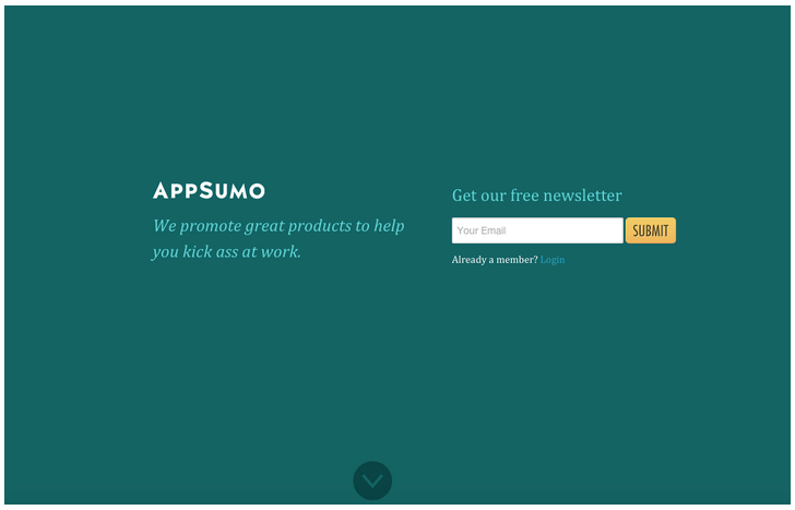
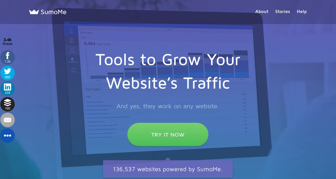
If we were to analyze these two examples, the first thing that jumps out is the color palette. Both use hues of blue, green and purple, which, as we just learned, are color tones that create warmth and clarity.
They are also careful to use color and font size to separate their content, which is also kept to a minimum, from the background.
SumoMe’s landing page includes a faded image of a computer screen because they are a program that helps manage the content of your website. Having this image immediately accessible makes their content so clear that you don’t even have to think about what it means.
2. Airbnb
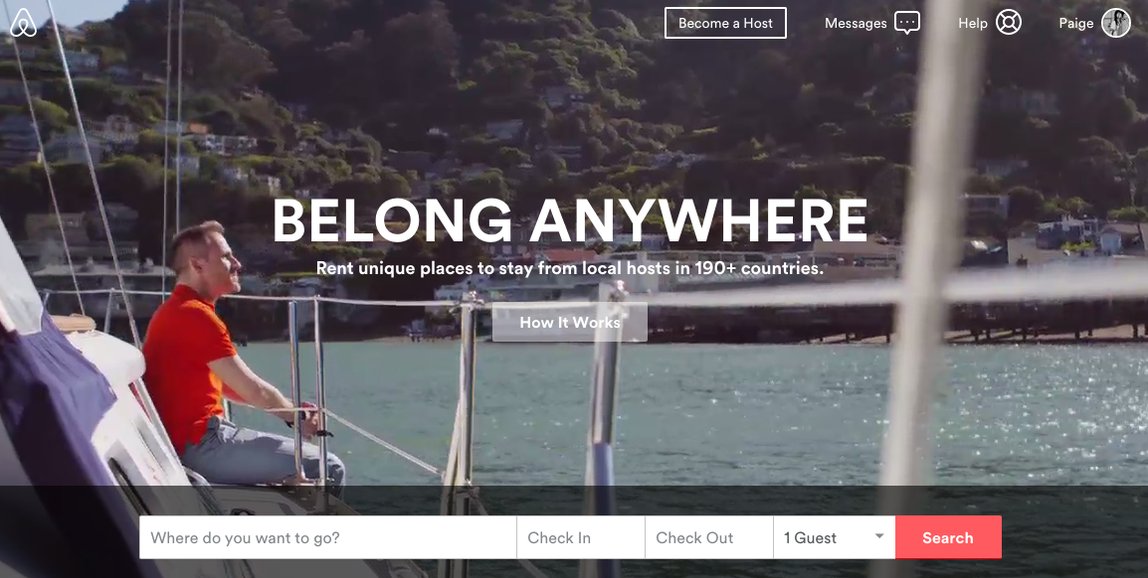
Airbnb’s landing page rotates between videos of places and people travelling all over the world.
As stated above, visuals containing humans are some of the most powerful because as the viewer, you are looking for something to identify with and people’s faces tend to provoke the most emotional response.
Here, a viewer might see the curiosity or pensive nature on this man’s face and recall a time where they were able to travel and reflect on their life – which as we all know, is vital to our own sanity.
Moreover, aside from the color of the man’s shirt, this image also relies on hues of blue to create a scene of serenity.
3. Huckberry
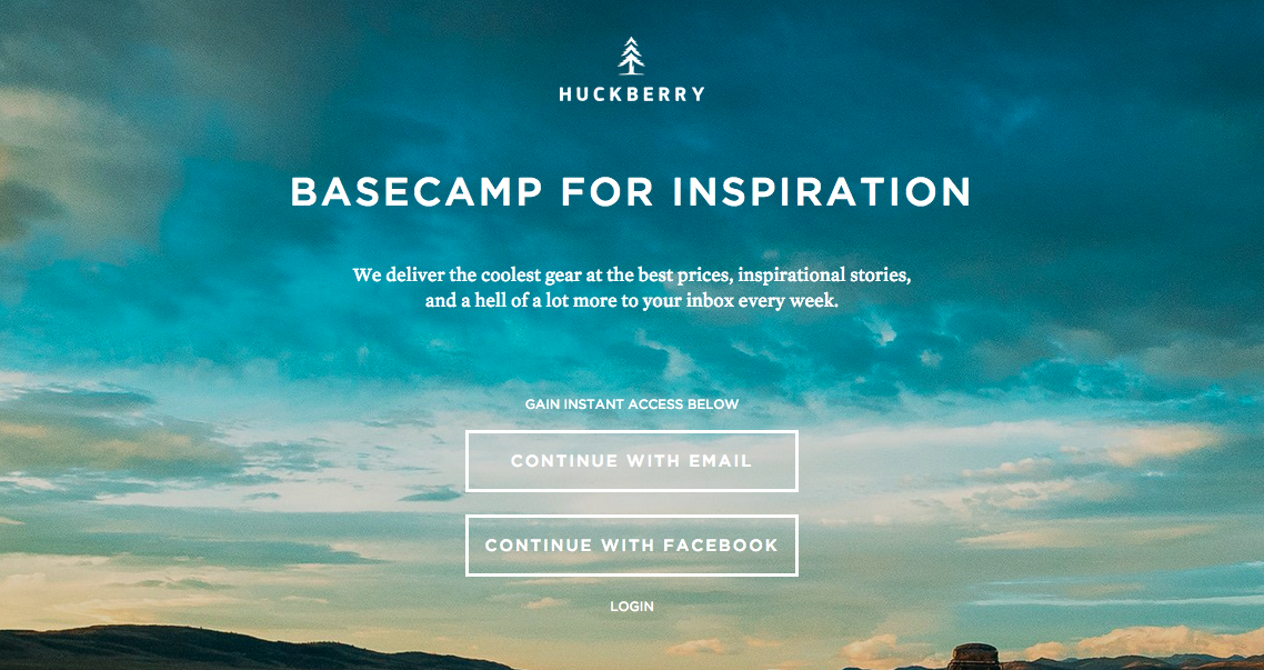
This image relies on primarily blues (see the trend?). People are also generally attracted to landscapes, I suppose because they bring us back to nature and there is something that is not at all threatening about them.
Huckberry wants this image to remind you of the beauty of nature. For nature buffs, the invitation to continue is very compelling.
As in the above cases, the image compliments the call to action, and simplifies the content of the site. All the information associated with hiking or camping and planning your trip is condensed into the one image. It’s a reminder of why you value nature.
4. Brothers Leather Supply Co.
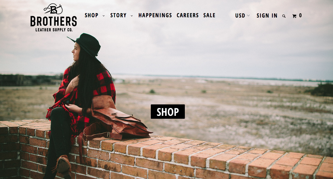
Okay, I had to exhibit at least one example that wasn’t all about the blues (literally, not figuratively).
This image clearly focuses on the woman sitting down in deep thought. Is she thinking about her next adventure? Maybe she’s just thinking about what she wants for dinner, but the bottom line is that once again, we are presented with a human that we can at least identify with.
The background is blurred, but nonetheless depicts a serene landscape in which we are invited to explore.
And then of course the call to action “Shop” is boldly centered in the middle of the graphic.
Cater to your audience
We are often so focused on using images on our blogs and social media profiles, but actually there is a lot of potential to use images to drive conversion rates on our websites through the roof.
To recap, here are some important things to remember when designing content for your website:
- Choose colors that align with your intended tone.
- Contrast your content with the background.
- Nature creates feelings of serenity.
- Depict people when you want your viewer to identify with a certain emotional pull.
- Use your graphic to get the simple idea across so that they will natural ingest the content.
Of course, these are general pieces of advice. The most important thing is that you must use your skills as a marketer and cater to your audience. By ingraining the basic psychological pulls above, you will be able to design visual content that will capture the interest of the people visiting your site, and increase your conversion rate at least three-fold.

