Designing an amazing cover/header for your social media brand (or personal) page can be a bit more involved than it appears. Typically, you’d need to start by researching the correct size and confirming that it’s correct. That usually involves reading a bunch of long articles before even starting to design. It turns out there’s also a lot misinformation when it comes to the correct social media image sizes.
Once you do figure out the proper size, you might realize that your audience can be viewing the cover/header on any wide range of devices such as a desktop computer, a mobile device, a tablet or even a TV. … Yikes … This usually leads to hunting for a template that has all the guides built-in. These are typically only available for software like Photoshop and can be very clunky to use. They include complicated layer groups and don’t even always ensure your image is visible on all devices.

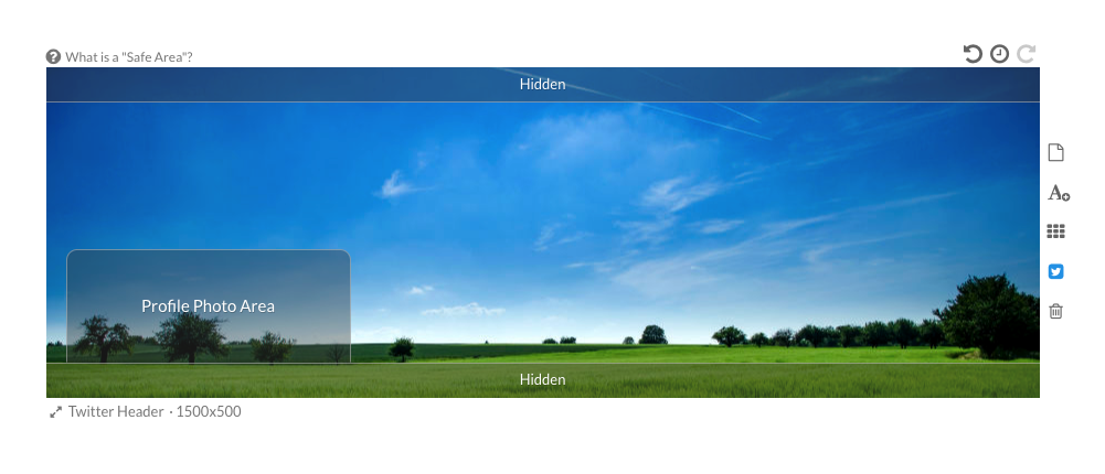
That all changes today with new “Safe Areas” in Stencil! Now you can turn on/off overlays on the canvas that show you exactly where it’s safe to put graphics in your header/cover images, ensuring they won’t be cut off by profile photos or other changes between desktop/mobile/tablet/etc. This is now available for all Stencil plans (even free accounts, yay!) and is automatically enabled for the following cover/header images:
- Facebook Cover
- Twitter Header
- LinkedIn Company Cover
- LinkedIn Personal Cover
- YouTube Channel Art
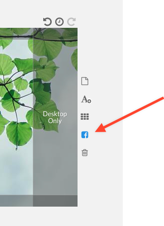
Just select one of those from the canvas resizer and the “Safe Area” guides will appear. If the overlays ever get in your way, you can always turn the “Safe Area” on or off, using the social media icon to the right of the canvas:

We hope you find this new feature extremely useful and this will make creating header/cover photos a total breeze. Here’s a quick video showing the creation of a Facebook Cover image from start to finish, in less than a couple of minutes:
Let us know in the comments if this was helpful and saved you a ton of time!


Leave a Reply