Do you want to sell more products from your ecommerce site? Would you like to learn how to use visuals to drive more traffic and sales on your ecommerce site?
In 2019, retail e-commerce sales worldwide amounted to $3.53 trillion. But the competition is immense as there are over 12 million ecommerce sites and only 650,000 of them make more than $1000 a year. Hence, if you want to beat these sites and make more, you need to implement a powerful strategy.
This strategy should include the application of visuals as they can increase conversions on landing pages. They can also drive traffic.
You might already be adding visuals, but are they optimized to drive more traffic and sales?
To find the answer, read all the tips I have shared.
I have covered my top tips on how to use visuals to drive more traffic and sales on your ecommerce site…
#1 Add social media optimized images:
Driving both organic and paid social media traffic is vital to driving sales on your ecommerce site. But before you drive any of this traffic, you need visually optimize your site for the social networks you plan to drive traffic from because it will encourage visitors to share your pages as well.
The social networks you optimize your site for should be the social networks your target audience frequents. One social network you must definitely optimize for is Facebook as it has the most users and also ads are cheap here.
To optimize your post for Facebook, the basic rule you need to follow is the 1.91:1 aspect ratio rule i.e. the width of the image should be 1.91 times the height. This will ensure that when the image is shared on Facebook, the large thumbnail will appear which will drive more clicks and traffic. You can use this image in your ads too.
Facebook recommends the size 1200 X 627 pixels. But a size of 560 X 292 pixels should do. I use an image with these dimensions every time I optimize a page or a blog post for Facebook sharing. It ensures that the large thumbnail appears whether the page is shared on a desktop or mobile device. Once you add the image you need, adjust page settings to make sure this image is selected every time someone shares.
To get best results from this image make sure the product is clearly represented and there is a message that persuades people to click on the image and visit your site.

A perfect example is the above screenshot of the image Facebook pulls when I share from the Retrosupply website, a website where designers can purchase digital design assets like templates, background images, fonts, etc. As you can see the above image contains text that describes the product and is placed on an image made created using the product. You can easily make sure that Facebook pulls the right image if you build your ecommerce store with a builder such as Shopify (https://www.shopify.com/
Pinterest is another site you should optimize your ecommerce site for as it is a powerful source of traffic and 72% of its users use it to make buying decisions. They also spend an average of $140 to $180 per order.
To enhance your site for Pinterest, the main rule you need to follow is to add a portrait shaped image. Pinterest recommends you use an image that is 600 X 900 pixels. If you get this right you will be rewarded with a lot of traffic when someone shares this image on Pinterest.
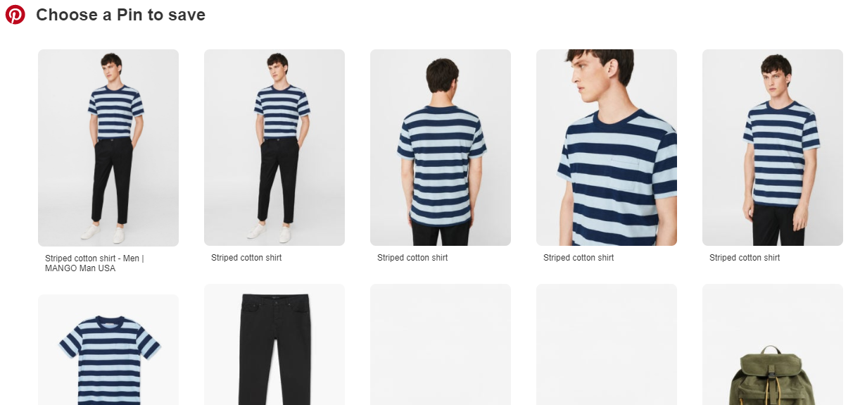
Most fashion sites like Mango.com place tall images of their products that can be pinned as you can see in the above screenshot.
Optimizing your ecommerce site and all the products for these two sites will be worthwhile as they drive ample traffic. But if you want to get better results, you should create extra images for other visual centric sites like Instagram and Tumblr especially if they are already driving traffic to your site.
#2 Use a lot of pics:
Adding the above images will optimize your posts for social media and get your site some traffic, but they won’t automatically drive sales. For that you need pictures that sell your product.
You can do this by adding several images on your product pages that show the product in various angles and in action. For example, if it is a dress, you should show pictures of it in various angles and pictures of people wearing it. If it is a cooking appliance you can show people using it to prepare a meal along with plain images of the product.
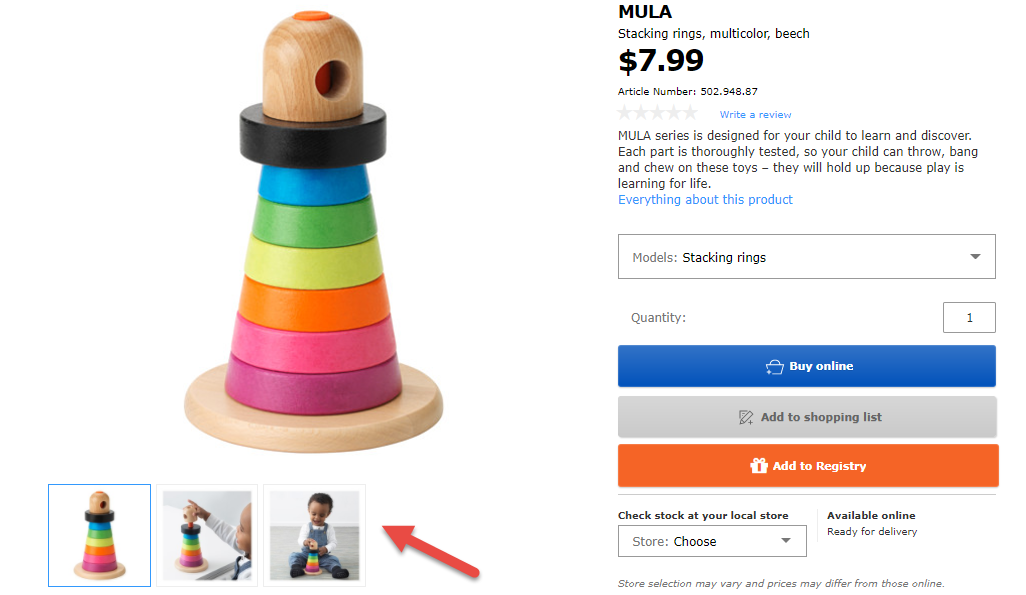
An example is this kid’s toy on Ikea, where along with the picture of the toy you have a couple of pictures of a kid playing with it.
#3 Display user generated content:
People share 1.8 billion images on social media daily. Some of these are photos of themselves along with their new purchases. When their friends glance at these pictures it instantly boosts your products’ social proof and more people will want to purchase it.
These pictures can be more effective than your marketing campaigns where you use models as these images appear more natural and generate a lot of word of mouth both online and offline. If you want these images to help you drive sales through your site too and not just on social media, you can collect and display them on your website or you can directly ask customers to submit them.
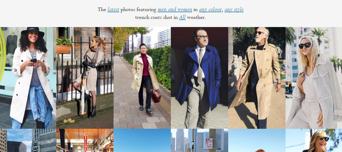
A company that does this is Burberry with the Art of the Trench campaign. Here, they display latest pictures of their customers in trench coats. This can drive up social proof and provide customers with ideas on how to dress up better. Anyone can submit their photos on the Burberry website itself.
#4 Share images through conversational commerce:
One of the hottest forms of marketing right now is conversational commerce. This where you use closed social media/messengers like Facebook messenger, WhatsApp, Snapchat, etc. to market your products.
As Corey Bloom perfectly summed up in his helpful guide on conversational commerce, ‘one in every seven people in the world interact with either Facebook Messenger or WhatsApp.’ As there are over 1 billion users on each.
Through conversational commerce apps your website visitors can have a quick chat with your sales team if any lingering questions are thwarting them from making a purchase. This process can also be automated with bots.
When people ask certain questions about a type of product, your bots can automatically set to suggest relevant items.
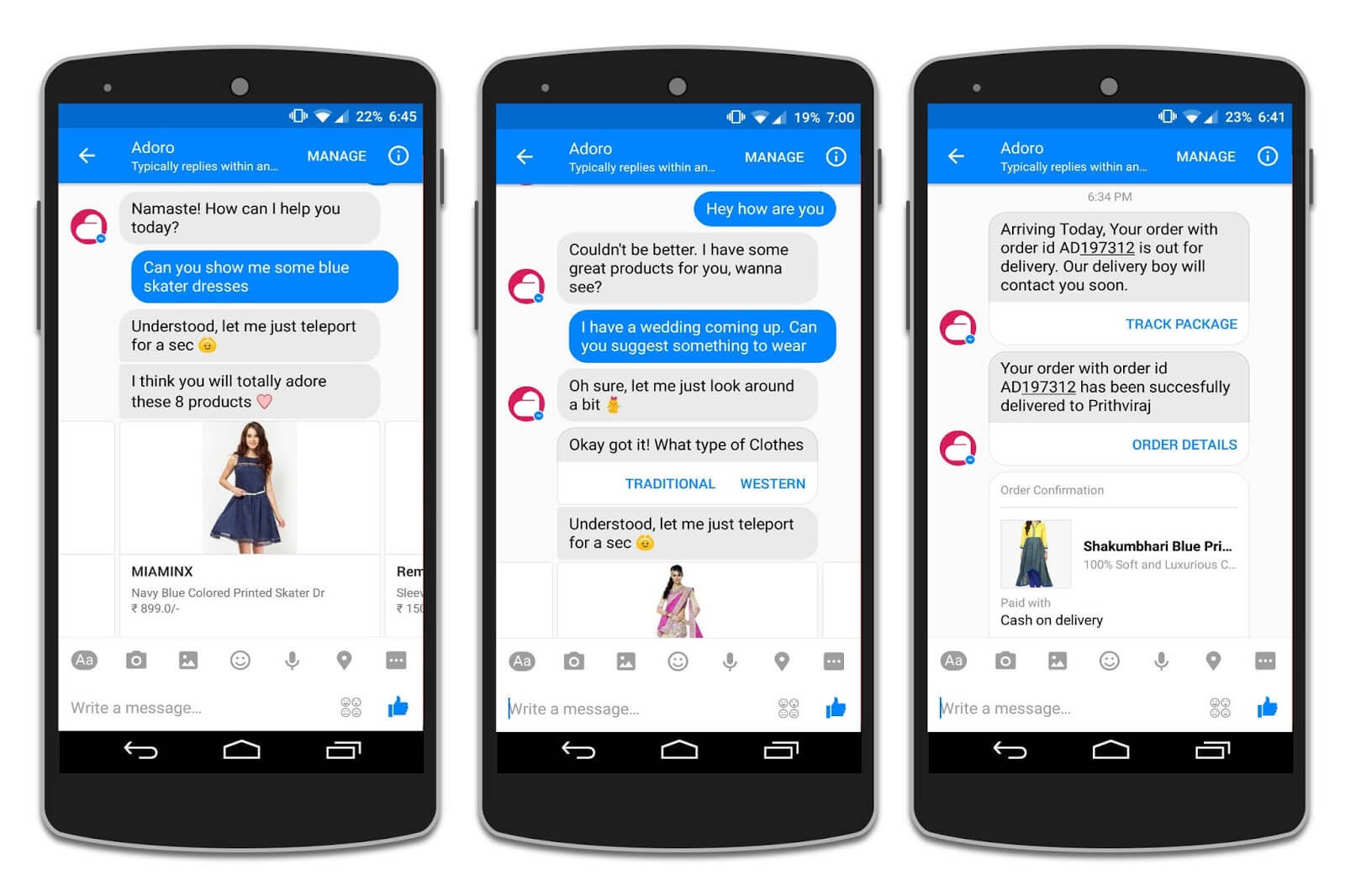
Image Credit: Yotpo Conversational Commerce
An example is the Adoro chatbot which automatically displays products one can purchase based on the messages sent as you can see in the above image.
As images help increase conversions you should take complete advantage of these situations and share many product images. You can use the aforementioned technique and show the product being used and at different angels.
You can even allow in app purchases so that people can view pictures and directly buy them without leaving.
When running an ecommerce site, visuals will always play a vital role as visitors will want to picture themselves using your products before purchasing. But sharing any image won’t do. To gain maximum traffic and sales you need to have a strong ecommerce visual marketing strategy in place. Therefore, follow the above tips and only choose the right images that meet all the requirements.
How do you use visuals to drive more traffic and sales on your ecommerce site? Please leave your comments below.



Leave a Reply