How effective is your blog?
Chances are if you’ve got one somewhere, whether it’s a Medium page you write on once a month, a corporate blog, or the main way you drive new customers to your business.
But no matter what type of blog you’ve got, there are always methods you could use to make it even better. There are always more shares to be had, more readers to reach and better content to create.
One of the best ways to improve your blog overnight?
Adding blog images.
In this post you’re going to learn which images you should use to:
- Boost social shares
- Make your posts more memorable
- Get more comments
- Keep people reading longer
So let’s get started, shall we?
How Many Blog Images Should You Have?
The answer to this question used to be, “It depends”.
But now, thanks to research from the guys at BuzzSumo and Canva we’ve got a definitive answer.
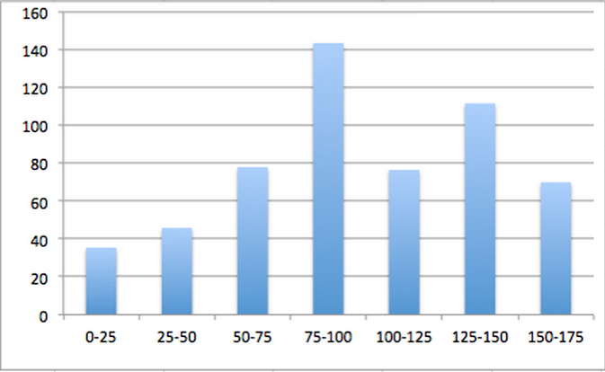
For maximum engagement you’re going to want to include one image every 75 to 100 words:
The best engagement seems to come closer to the 75-word mark, but if you aim to have 10 images every 1000 words you’re going to be in the right zone to take advantage of this data.
You can try and find your own audience sweet spot too. Start with the above ratio and try to fine-tune it until you find what your tribe are looking for too.
But that doesn’t mean you should just throw images into your posts because you now know that they should be there. Instead you should carefully choose the visual content you’re going to include.
Which brings us full circle to what you’re going to learn in this article….
All of the images here go beyond just filling a hole in your post. They’re going to help you add value and depth to the points your making, and make your post more memorable than ever before.
Screenshots
Screenshots should be your go-to image as a blogger. They’re probably the most valuable image you can use and they help you fulfil the old writing adage of, “Show, don’t tell”.
But, what makes them so valuable?
Well, for starters, visual content is much easier to process than written content. In fact, it’s processed 60,000x faster than writing:

Which means that your point becomes a lot more powerful when it’s backed up by an image, because it can be seen in action. That makes these blog images really useful for walkthroughs and tutorials.
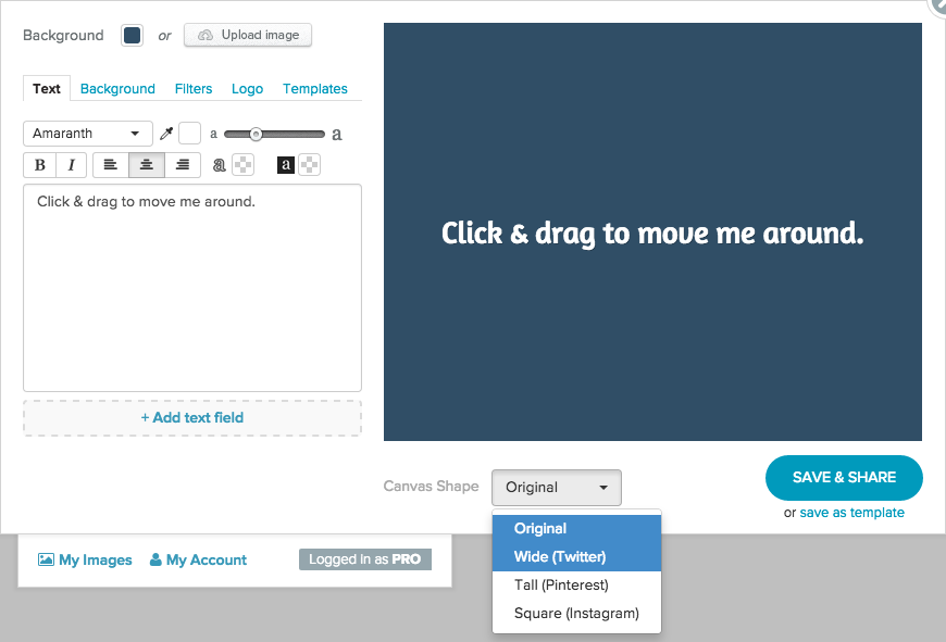
For example, if I wanted to tell you how to size your image for Twitter in Share As Image, I could say:
“To size your image for Twitter, simply select the Canvas Shape dropdown menu underneath your image, and select the ‘Wide’ option”
And show you a screenshot of where that is…
Now it’s not open to interpretation and everybody knows exactly what I mean. And the more complex the task, the more impact screenshots have.
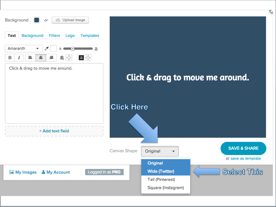
You can even take this to a much deeper level if you have presentation software, like Microsoft PowerPoint, to highlight the parts of the image that need focus:
Not only does this add power to the argument you’ve made, but you can count on these images getting their own social shares too, because people in your niche are going to want to share this actionable information with their own audience.
Quotes
I love quote images. And, judging by the response to our simple guide to creating quote images, so do you.
And that’s because they are powerful image no matter where you use them – social media, blog posts or on the wall of your office – because they create an emotional response with your reader.
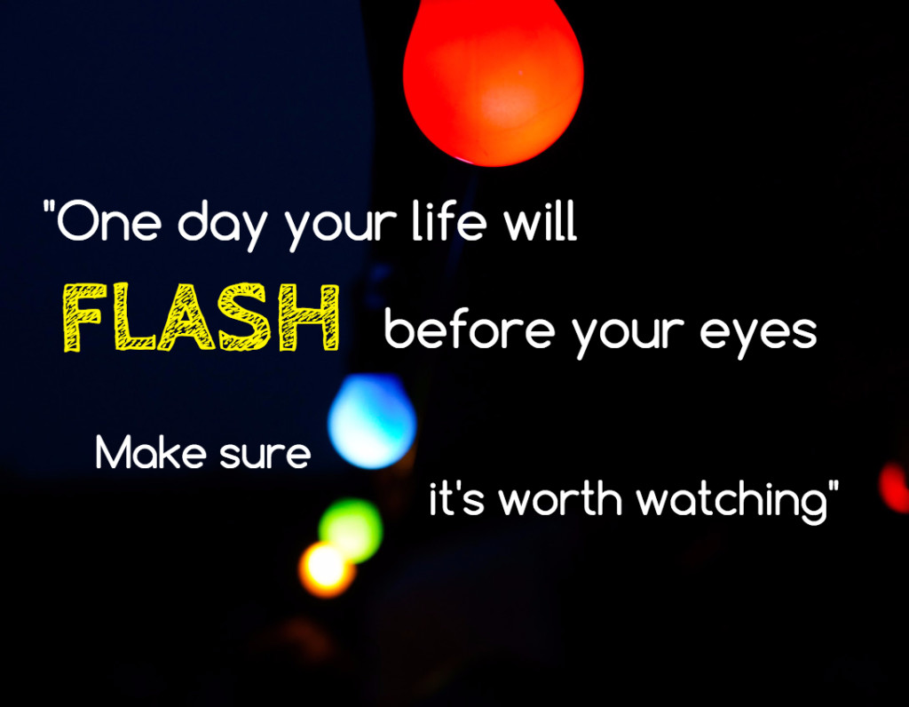
Plus they help your reader create a connection between what you’ve written and the quote, so your blog post instantly becomes a lot more memorable.
Now, there are a lot of people who use quotes in the Click To Tweet style, like this:
Which has been known to help people get shares, especially when they’re said by an authority. But this type misses out on two big benefits:
- The share after the share: Text based quotes are not as likely to be re-shared by an audience as quotes in images.
- Pinterest traffic: By creating an image, you open up a whole new stream of traffic you might not have ever thought about.
Not to mention the branding impact of people seeing images in your style over and over again.
These are great images to use around your post to make up your image count, while still adding a ton of value with relevant quotes to back up everything you’ve said.
Social Media Updates
These are images you’ll see dotted around blogs from time to time. And while they might look a little like ‘padding’ to a post, they can actually be used to great effect to:
- Boost social shares
- Make stronger points
- Provide social proof to your readers
If I’m honest, we were a little late on the pick-up of this. It was until recently I noticed that a lot of our Pinterest shares for posts were coming from these images.
One of our highest performing posts, How To Increase Your Twitter Followers In 3 Simple Steps, got 100 Pinterest shares:
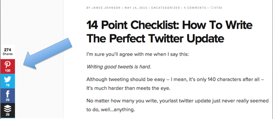
And a lot of those shares came from the social media updates:

So there’s a lot of potential here that could be used, if you choose the right updates to fit your post.
Here’s some questions to ask to help you choose the right social media update for your blog post:
- Is it from a relevant authority in your niche?
- Does it back up a point that you’ve made?
- Does it add depth (or entertainment) to the post?
If you can say yes to all of the above, take a screenshot and add it to your post!
Headline Images
You might be thinking, “Isn’t that just another name for a featured image?”. But it’s not, this is something in a class of it’s own.
Where a featured image serves as an attention grabber for your post, a headline post goes after the introduction to your article and get’s formatted to fit Twitter.
Take a look at this example from the Buffer blog:
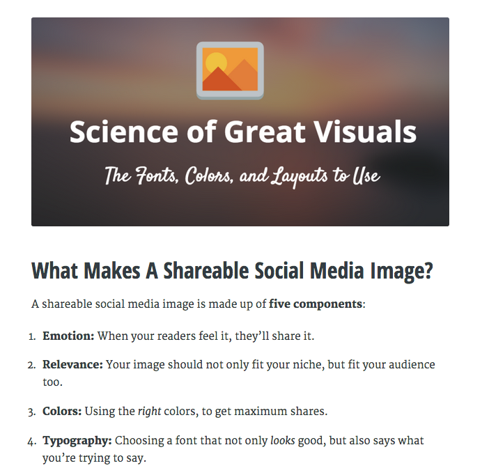
These images – a little like quotes – might look like they serve just to fill a space on your blog post. And, in part, you would be right. But there’s a good reason for that:
Introductions are usually really long.
Like, it can be up to 250-300 words before you get to the content. Then, you usually have to go through another 100 or so words before you get to the first image.
That means you’ve got a lot of text, which can put a lot of readers off. So adding in a headline image can break it up and keep more users on your page.
But, why is it formatted for Twitter? Well, that’s simple. It’s small enough to not look out of place on any blog – and you can use it as an image to boost engagement on social media too:
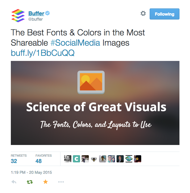
So not only will more people stay on your page for longer, your chances of reaching more people through social media go up too.
And if you’re any good at writing headlines, you’ll see a nice little spike in traffic too.
Let’s Get Visual, Visual…
Here’s a quick recap of what you’ve just learned:
- You should be using images every 75-100 words
- Aim for 10 images every 1000 words, and test your audience
- Screenshots add incredible value to How To and Tutorials
- Add annotations in PowerPoint for extra depth
- Use authority quotes to boost shares and Pinterest traffic
- Social Media updates add social proof to your posts
- They’re also highly likely to get shares
- Headline images keep people on page and can boost shares
Now, the only question that remains is – which style of image are you going to use first?



Hello James, the links to medium.com and to clicktotweet.com are broken.
Thanks, Jochen! I’ll get those fixed right away 🙂
I think I’m going to implement social media updates first! Very easy to implement
Great choice! They only take minutes to do, but pack a wild punch. I’d love to see your results 🙂
When I can make bar charts (like the one exampled in the blog post above) on Share As Image (or pie charts, etc.) then it will be worth it for me to pay for the upgrade, instead of being an occasional Share As Image user.
It’s a good article though!
Hey John,
We’re currently looking at different features and upgrades we can make to Share As Image, so we’ll be sure to take your comments on board and see what we can do 🙂
Images really do make a world of difference. It even applies to pop ups for collecting email addresses. When I do A/B tests on my pop-ups I find that I have a higher subscription rate for those which have images than for those that just have text. I really need to use more visuals in my content as well. I normally use a maximum of two but now that I know how powerful they can be, I definitely will be using more visuals. Thanks for sharing these excellent points!