Time on page is an important ranking metric and has been for a long time. There are other ways to think about time on page, time on site, or even “dwell time”.
The overall idea is that a user who is referred by a search engine begins reading your page and decides how long they will spend on that page before moving to another page or clicking the back button in their browser. As soon as one of those events occurs, the clock is stopped and the dwell time can be calculated.
My favorite way to understand Google’s algorithm is through common sense so let’s take a common sense approach to this issue. Google wants to provide relevant and useful search results for every query. If Google refers 100 visitors to your page and they stay on your site for an average of 20 seconds while Google refers 100 visitors to another page for the same query and they stay for 60 seconds, which is the “better” page for that query. Using common sense, the people who stayed for 60 seconds cared more about that page and chose to spend longer on that page.
Please don’t email me telling me there are more metrics that just time on page. I realize, this is just a simplified explanation of one single ranking factor!
How can we influence that specific ranking factor? Said in another way, how can we keep people on a page longer? I have 5 quick tips that I implement on all of the great content that we produce at DiamondLinks.net.
Add images
Images are an all around great strategy. I have subscriptions at multiple stock photo sites and we use them all. A great site is Pexels.com and it’s free. Pexels aggregates stock photos from other free sites. For some reason, they don’t have all of them from the sites so we often check Pixabay.com as well.
Make sure and check the Creative Common’s Licensing. I usually look for CC0 which states, “You can copy, modify, distribute and perform the work, even for commercial purposes, all without asking permission.”
Stock photos are great and help to break up big chunks of text, but even better than stock photos are…
Create Custom Images
This is where Stencil excels. I use Stencil to create images and graphics for my blog post but then adapt it to social media to promote the post on social media. Stencil makes that process extremely simple as they have the sizes for each platform already built in.
Here is my workflow when creating images with Stencil, you can see examples here and here, both of those examples were created with Stencil.
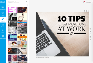
Step 1 – Find a template you like. I try to find something that matches the topic. I chose this template so you can see the before and after transformation.
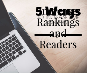
Step 2 – Customize text. I put the title into the text to make it fit, I always put in all of the text before making it fit.
At this point it looks bad, but that’s just temporary.
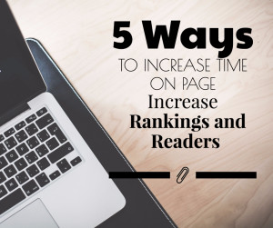
Step 3 – Position Text. Now I begin repositioning the text and other elements that need to be adjusted because of the text.
Step 4 – Add Flair. It could be used at this point but I don’t think it looks great, it’s very monotone and needs some flair. Please note that I’m not a great designer. I’m not even a good designer.
I don’t really care for the paperclip icon so I’ll look through and find something I like more.
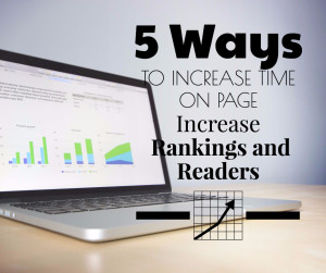
I added a chart icon by searching “chart” and then changed the background searching “chart” as well.
Step 5 – Increase Readability. I like everything except how hard the text is to read. Add this grey background was a little tricky. I tried to add a background to each text block but that didn’t work. I had to add a text box with just line breaks (hit the enter/return key) and then move it back and set a background.
I added a light drop shadow to text I wanted to highlight and consider that a finished product! Since this was the final I started to review my creation…
Step 6 – Proof Read. This should be “Step 0”. As I was reviewing I realized my grammar was off! I added the word “and” which should have been there in the beginning. I was never one to measure twice and cut once.
That was for Facebook, you’ll need to adjust the sizes of your elements to get each of the other image sizes you need.
Here is the modified final for a blog post.
Write Compelling Content
Great content elicits great feedback. That feedback comes in the form of shares, comments and an increase in time on page. If people love what you’re writing they’ll read the whole thing and then look through your site to see what else you’ve done. I can’t tell you how many times I’ve found a blogger I really like but didn’t know before. I read an article and was hooked.
Compelling content is equal parts art and science. There are a lot of great resources, if you’re new to content creation and content marketing, check out Brian Dean as I consider him to be at the very top of this field.
When I write content, I look at a 5 key factors including…
- Where will this content go?
- Who is the target reader?
- What is my goal with the content?
- What is the main takeaway?
- What should the reader do after reading?
Those questions should set the tone of the article. In my business we write a lot of content for clients. Much of the content is just filler content for a new website. After that is done we often look at ideas for an excellent piece of content that can rank well, drive traffic, and increase overall time on site (because of that one article having a high time on page).
Through this type of content marketing strategies we are able to consistently get ranking results for both SEO clients and reputation management clients. I have been in this field since 2004 and had a single Google algorithm update in the mid-2000’s that affected me negatively. Since then, every new algorithm update has had a neutral (no significant change) or positive (major ranking increases) increase in rankings. This indicates to me that great content written and placed on great sites is an effective strategy that is not going away anytime soon.
Eye Stops
Naturally our eyes begin to glaze over when we’re forced to read a long paragraph of text. Having some key highlights allows our eyes to rest on that sentence or phrase. This stops mindless scrolling through a page. Here are a few great ways to get the reader to read through each word you’ve written.
- Images
- Paragraph Breaks
- Bold
- Italics
- Numbered Lists
- Unnumbered Lists
- Questions
- Color Changes
- Links
- Charts
- Tables
- Glossary
- Header Tags (h1, h2, h3, etc.)
- Horizontal Ruler (HR tag)
- Screenshots
Each of those could be a full post on their own so you’ll need to do a little research to find some good examples and implementations for each of these ideas. You can also look through this post. I’ve implemented many of them!
Links to Related Content
This one is a little confusing, as “time on page” has nothing to do with reading other content. Let me give you a little secret, it absolutely does, and here’s why.
When I’m reading a post that I really like and find a link I want to read, I don’t open it in the same window because I’ll lose the article I’m reading. So instead I open that new post in a new tab.
The reason this helps with time on page is that I might go and read that new tab immediately and then close it to come back to my original article.
Giving readers embedded links in your content that is relevant is always a great idea as you’re filling a need for them and I believe linking out to other sites is a small but important ranking factor. If you search through just about any normal keyword, almost all of the top 10 results will link out to other sites. That tells me something and should tell you the same thing.
The more writing and content marketing that you do, the more things 5 tips will become natural. You won’t have to sit and think about them as they will just become part of your process.
What do you think? Are there other factors that influence time on page?
Brandon Hopkins owns DiamondLinks.net, a full service SEO and reputation management company. DiamondLinks has clients around the world and from it’s inception has been focused on results-based online marketing. For more information please visit DiamondLinks.net or call 559-871-1613.



I like the 5 key factors of writing compelling content, especially #5. Thank you!
I agree!
Excellent suggestions, which I found true for me.