The goal of every email campaign is to get readers to follow-through and complete some kind of action. You want them to buy something or sign up for a program, so you come up with a campaign using quirky designs and clever copy.
But despite your effort, conversions are low. Hardly anyone clicks through the email to your landing page. Instead of getting readers excited and eager to take the next step, the email falls flat. Readers click out, never to return.
The problem is that the point of the message is lost in the design and copy. Because the email isn’t clear, readers are confused about what to do.
Ideally, your email should have a logical flow that catches readers’ attention and helps them understand what you want them to do. The inverted pyramid method is a design technique meant to do exactly this—grab attention, excite readers, and then guide them to take action. It’s a framework that gives emails focus and flow to give you higher conversion rates.
Let’s take a closer look at the method and what you can do to get started.
Three layers to email marketing gold
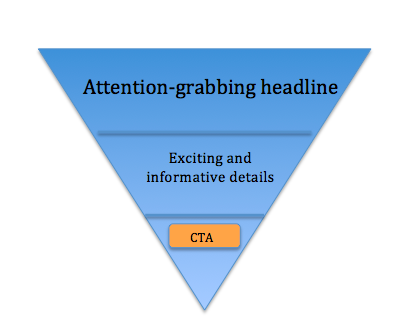
The inverted pyramid method—the framework for an email that drives high conversions—has just three parts. But each of these parts is designed to capture and hold readers’ attention, and encourage them to take the next step. Here’s what it looks like:
[Source]
It helps create a flow, kind of like a funnel, that grabs the reader’s attention and drives them to the bottom of the email and call-to-action (CTA).
It works like this:
- The attention grabbing headline offers up your value proposition or a promise. It’s meant to make people curious so they keep reading.
- The next layer builds anticipation and gives details to back up the value proposition or promise. This is your chance to get readers excited about what you have to offer and how you’ll deliver.
- The final layer is the call-to-action. This is where you “close the deal.” If the first two layers are on point, by the time readers get to the CTA they should be more than ready to click and convert.
Approach your email campaigns like you’re telling a story. They’re structured — with an intro, body and conclusion — to get readers from beginning to end. Plus there’s usually some kind of takeaway at the end.
With the inverted pyramid method, the headline is the intro. It’s like the first few sentences of a story. This is where you set up the plot and get the reader interested in reading on. The headline sets the tone and focus of what’s to come.
Once you’ve got the reader’s attention, the meat of the story is the body. With the framework, this is where you build curiosity and get a little deeper into the story. You offer details to hook readers and leave them wanting more.
That’s where the conclusion, or CTA, comes in. It ties the story together and gives the reader something to do. By the time they get to this point, the action they need to take is clear, and they’re willing to follow-through.
It’s like reading a book about why running is good for you. If the point is to make you a better runner, by the time you get to the end of the book, you’re ready to lace up your shoes and start running. This framework helps you create a structure that helps readers flow through.
So how exactly do you create email campaigns using the method?
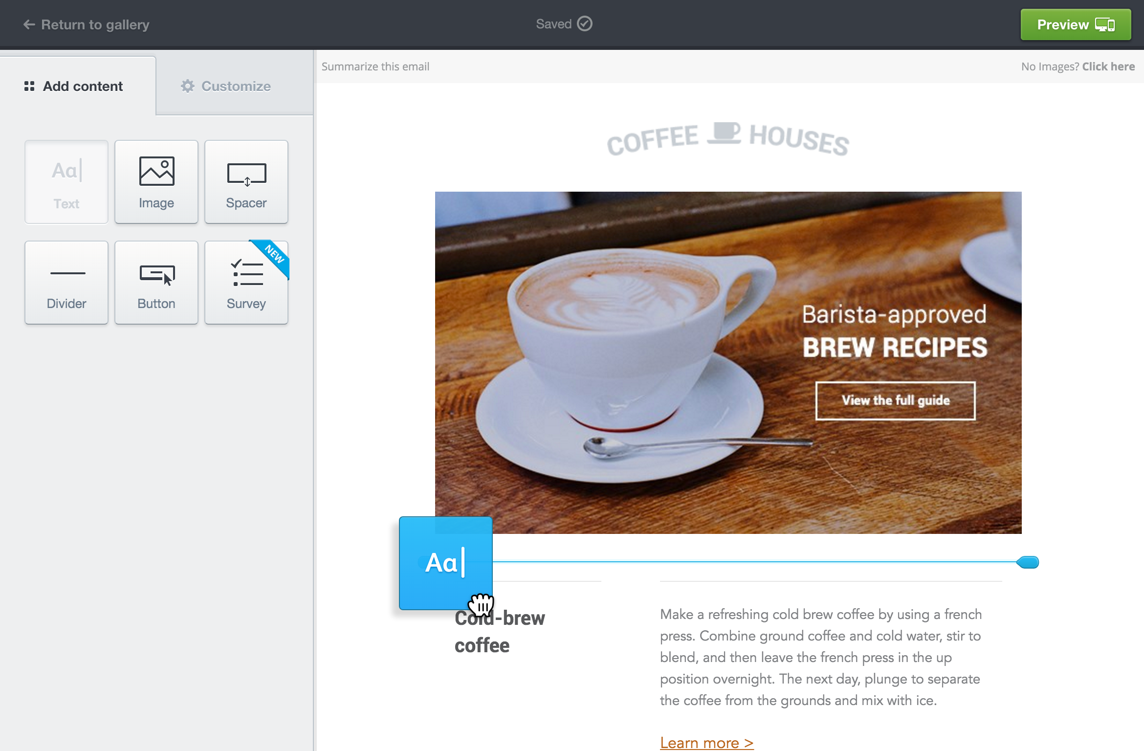
Start by choosing a platform that makes it easy. For example, a platform like Campaign Monitor offers drag and drop email builders. It makes inverted pyramid inspired emails quick and simple to build and they’re easy to edit. This is important because as you get to know your readers better, you’re going to want to modify your emails.
[Source]
The “Add Content” tab in Campaign Monitor gives you the flexibility to create a custom layout. You can use the tools within the tab to insert a bold image, create short, simple copy and a CTA button. You can also experiment with color and placement.
Because the email should have focus and be short, make use of options like the spacer. It uses whitespace to give your emails balance and the reader’s eyes breathing room to take in everything. More than anything it helps guide the reader through the email down to the bottom.
Now let’s take a look at how each section works and what you have to do to:
- Get readers attention
- Get them excited about the email
- Get them to click the CTA and convert
Grab attention by understanding subscriber needs
Half the battle of email campaigns is getting people to open them. When they do, you’ve got about 8 seconds before they decide whether or not to keep reading. When you start with a bold statement and image, you have a better chance of grabbing reader attention. Why? Our brains process visuals quicker than text, so use images that align with your core message.
The inverted pyramid method helps you start with a value proposition or promise with a high definition image. This gets readers’ attention and piques their interest. Knowing your audience is key to making this work. If you know what they like and offer it, you increase the chances of holding their attention longer.
To put this into action, start by creating segments for targeting. For example, have some of your subscribers told you about a specific need? Or something they wish they could do better? You can create segments based on these and tailor your headline.
Once you’ve honed in on specific needs, lead with a solution to their pain point.
[Source]
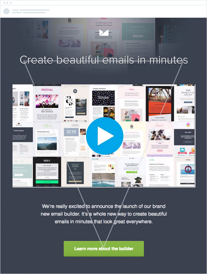
In this example, Campaign Monitor uses the headline to appeal to readers who want to create professional looking emails, but don’t know how to build one. These are readers who might not have access to a developer and don’t understand coding.
Then they use an image that is a collage of their email templates. This speaks directly to their ability to help solve the pain point — they have a library of “beautiful” templates. It’s a strong image because their email templates help users design emails that get noticed. There’s no need for them to learn HTML or CSS. They just choose a design and use the email builder to get the look and feel that they need to get noticed.
Takeaways:
- Learn about your readers. Ask questions or listen to their comments. This gives you an idea of what they need from you. Lead with this information first.
- Create different headers for different segments. As you grow your subscriber list and get to know them better, customize all your campaigns. The message can stay the same for all of them but the headline changes to be relevant to each group.
- Use an image that backs up your intro. Be bold and creative. You want to grab reader attention so start with something memorable.
Build anticipation with as few words as possible
Next comes the email body. This part of the email should support the information you offered up in the headline. It explains what readers are going to get out of doing something.
Depending on the goal and focus of the email — for example, a welcome, onboarding or promotional email — your main points have to be clear and concise.
With all the emails people get in a day, it’s no surprise that they scan them. They don’t read every single word. To compensate, lay out all the points you want to make and then pare down. Only include the most salient and exciting points. Do another round of trimming to make sure the copy’s easy to read.
Cut out distractions like fancy words and random images and buttons. This section is all about priming your readers with copy that backs up your headline and hints at what’s next. Don’t distract them with anything that will make them stop reading mid-email.
[Source]
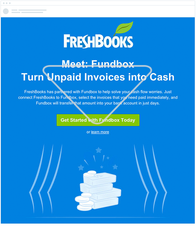
This is an excellent example from Freshbooks because it uses three short sentences to:
- Give proof to back up the value proposition and promise.
- Explain to readers what they have to do.
- Confirm the outcome if they follow-through.
Depending on what readers have done in the past — for example, they bought something — tailor your message so that it’s more personal. New subscribers can see something different compared to current subscribers.
This way you lead customers through the email based on what’s relevant to them.
Takeaways:
- Highlight what makes you unique. You have to explain why subscribers should choose you over anyone else. To do this, differentiate your content by using dynamic content. Use content that changes depending on values from your subscriber list. A popular one is offering different content for men and women.
- Prime readers with a snapshot of what’s to come. You don’t want readers to guess at what’s in it for them or what they have to do to see the value. Explain your solution, but do drag it out.
Use a clear call to action to improve conversions
Getting readers to click on the CTA button is the point of your email campaign. It doesn’t matter what kind of emails you send, you want people to click from the email to a landing page and then convert.
The inverted pyramid method leads readers on a short journey to a destination — the CTA. The body primes readers and gets them excited about what’s to come and the CTA closes the deal.
That’s why it has to stand out. So instead of using text links that can get lost in your content, use bold CTA buttons. They have a 28% conversion rate because they stand out and get noticed.
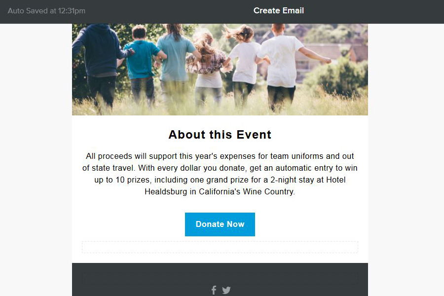
Remember whitespace from earlier? Make sure there’s enough of it around the CTA button. When you design your CTA button, it isn’t about making the button as big as possible. It’s about using whitespace to guide readers and draw attention to it.
[Source]
But be careful with how much whitespace you use. Too much and the message starts to feel disjointed. Keep the button close enough to the body text so that readers see the connection.
Before you press send, use a tool like Campaign Monitor’s A/B test feature to confirm the best location, size, color, and wording of your CTA buttons.

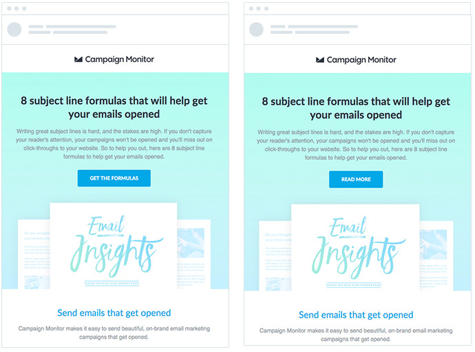
In the A/B test view of a new campaign, select “Email content.” Design two versions of your email and then test them with a sample of your subscriber list. Whichever CTA has the most conversions, that’s the version to send to the rest of your email list.
[Source]
Here the A/B test uses the words “get the formulas” and “read more.” Both offer a clear action based on the build up in the body:
“Get the formulas” tells readers what they have to do to close the loop. It’s a direct answer to the headline. With it, readers know exactly what they have to do to fulfill their need.
“Read more” appeals to the reader’s curiosity. If you’ve done a good job of showing them what you have to offer, they’ll be more than willing to take the next step to read on.
An A/B test is the only way to know which one resonates the most with subscribers. It’s better to have concrete data vs. guessing and going on a hunch.
Takeaways:
- Your CTA should be clear and specific. It should tell readers what to do right now. Avoid words like “submit” or “click here” There’s no urgency to act now. Plus, what are readers submitting? What does that have to do with your lead up to the CTA?
- Give yourself time to get results. It’s tempting to want to get an answer as soon as possible. But the truth is, you have to wait. Campaign Monitor lets you set how long your test will run. It doesn’t matter what the results say before the test is done, don’t stop it halfway through. The results are misleading otherwise.
Set yourself up for success
The method works so well because it removes distractions. Anything that stops people from reading through, or leaves them confused, hurts conversion. They’ll close the email without doing anything. Start with an objective and build your focus around that.
Finally, don’t forget about mobile. 63% of opens happen on mobile so make sure your designs are responsive and carry through. With Campaign Monitor, you can test your layout across different platforms. Make sure that readers understand the story you’re telling no matter where they read them
Now it’s your turn! Let us know what’s worked for you.


[…] Email Marketing You can’t just rely on social media platforms to spread the word about your blog post. Email marketing is impactful and can be the best investment you will make for your business. Once you use a lead building tool to help gather email subscribers, such as Sumo mentioned earlier, you now have access to email your audience. You’ll provide them free access to your blog posts along with behind the scenes information or storytelling to give them an insider’s look at your brand. Email marketing is pretty powerful! You can get the details on how to boost email conversions here. […]